Once upon a time, interpreting data was as simple as processing numbers. But with the volume of data collected multiplying exponentially every day, simply being able to analyze and interpret that data is no longer sufficient. Quickly providing data points and metrics without additional context and a story around what happened to produce the numbers and what to do about it is meaningless to business users who need to make decisions for their organization.
Enter the world of data storytelling, the art of communicating data-driven insights effectively. This approach embraces narrative analytics and weaves facts and numbers into actionable insights.
The prologue: Why data storytelling matters
Data-driven storytelling is the art of transforming complex data sets into a compelling narrative. This narrative uses context, visuals, and insights to engage a specific audience and ultimately influence their decisions or understanding. It should be an essential part of any organization’s data strategy for two main reasons:
1. Data storytelling fosters engagement
In business, engagement is not just a buzzword; it’s a strategic imperative. While raw or straightforward data might be the backbone of decision-making, it’s the narrative around that data that provides qualitative context for quantitative information and mobilizes teams to action. Combining both straightforward data with an illustrative narrative via data storytelling transforms abstract figures into a compelling story, fostering engagement and understanding at every level of your organization.
2. Data storytelling enables understanding across teams
Bridging the gap between technical experts and non-technical stakeholders is a challenge that data storytelling helps to address. It presents the data in a way that is accessible to business users regardless of their technical or analytical expertise. There is an increasing need across numerous industries to bring these two groups together via data storytelling. Read our blog about bridging that gap here and how we have been successful at bringing teams together for the benefit of the overall organization.
The plot: Elements of compelling data stories
The elements of compelling storytelling with data are like characters coming together to set the scene in your favorite novel. Consider your approach to the data story, how you’ll illustrate the story, and the potential impacts of your story with the following elements:
Audience-centric approach
In order to be effective, a data story must be crafted for the audience at hand. The storyteller must ensure they understand the motivating factors and perspectives of the intended audience. This oftentimes requires stakeholder discussions to build a clear understanding of metrics and KPIs that are relevant to respective audiences and/or persona groups. It also requires a solid partnership and mutual understanding of how stakeholders are using their data to make informed decisions. Without this context, storytelling around the data is much less effective.
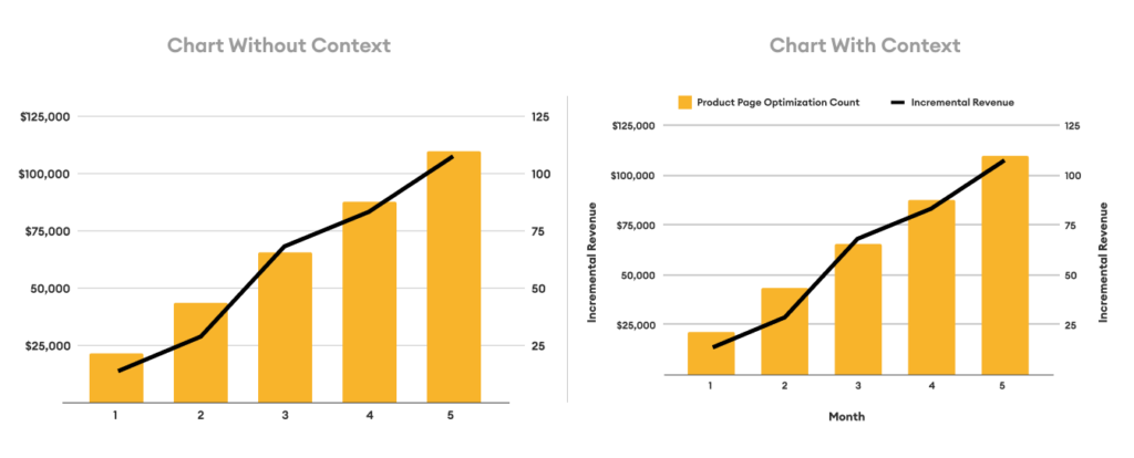
Visualizing data for clarity
Data visualization is the brushstroke that brings your data story to life. Data without visuals is like a story without illustrations—less engaging and prone to misinterpretation. However, it is important to explore the art and science of visualizing data for clarity. Certain data points might be best visualized in a scatter plot versus a bar chart and it is important to think through the best and most straightforward visualization for stakeholders. Visual literacy is a superpower. It is also critical that data visualizations do not leave anything to be misinterpreted. While it is important not to clutter and overly complicate visualizations, clear and succinct titles and labels can make or break a visualization. Take a look at our example below.
Psychological power of storytelling
The human brain craves stories. There is neuroscience behind storytelling and why stories stick. Engaging multiple parts of the brain enhances the memorability of your data narrative, creating lasting impressions that transcend the numbers. Doing so is akin to creating a symphony of cognitive responses. By triggering various brain regions simultaneously, a well-crafted narrative becomes an immersive experience, leaving a lasting imprint on the audience’s memory.
Giving data a narrative engages multiple parts of the brain for emotional and empathetic processing. This is where it becomes more about the story than the raw numbers. The story becomes an experience, a journey that the audience embarks upon, making the data more than just information—it becomes a memorable and impactful narrative. The data narrative becomes a part of the audience’s cognitive landscape, ready to be recalled and reflected upon.
Learn more about Data Strategy & Analytics Services at Tallwave.
Intermission: Tallwave’s data storytelling in action
Narrating the full sales picture: A real example
Let’s dive into a real-world application of data storytelling. During a typical monthly reporting cycle, one of our clients, an e-commerce company, identified declines in sales and revenue across multiple digital channels on their owned website. Initially focused solely on e-commerce sales, the team was alarmed by the decline in organic and paid search sales. However, a more comprehensive understanding of the full story, including sales through brick-and-mortar partners, 3rd party marketplaces, in-store, and phone orders revealed a different story—increases in sales with partners resulted in greater TOTAL sales, and naturally cannibalized some of the sales from other sources.
In order to better tell this story, Tallwave created customized, purpose-built, actionable dashboards in Google Looker Studio. These dashboards helped to mitigate risk of misinterpretation, presenting a clear and concise representation of the sales landscape. It is not uncommon for individual stakeholders to misinterpret data that they might have a personal or departmental bias toward and inadvertently lead other stakeholders astray. Nor is it uncommon for individual stakeholders to exert their own bias in a way that tells the story they believe to be true. This is why it is important to include cross-functional stakeholders involved in rounding out the data story or dashboard visuals to ensure consistent KPI understanding and consensus.
A purpose built dashboard identifying products with a low add to cart to view ratio that the organization should focus on improving this ratio by comparing competitor price points, inventory availability, lack of useful information listed on the product page, etc..
The resolution: Practical tips for effective data storytelling
Reducing complexity
In an era where information inundates every corner of our professional landscape, simplicity emerges as a guiding principle in effective data storytelling. The call is clear: advocate for simplicity in both language and visuals, ensuring your data story is accessible to all members of your audience.
Language Simplicity: Complex jargon and convoluted terminology can act as barriers to understanding. Embrace clear and concise language, choosing words that resonate with a broad audience. Your goal is not to showcase your vocabulary but to convey the essence of your data story in a way that everyone can grasp.
Visual Simplicity: Complexity in data visualizations often leads to confusion. You do not gain style points for making data visualizations complex and difficult to interpret. Instead, opt for visual simplicity. Choose charts and graphs that convey the message without overwhelming the viewer. Consider the power of minimalist design, where each visual element serves a clear purpose.
The art of simplicity in data storytelling lies in finding the delicate balance between conveying intricate insights and ensuring comprehensibility. Simplicity does not mean sacrificing depth; rather, it involves distilling complexity into a form that enlightens rather than perplexes.
The theme: Emotion and impact
In the realm of data, numbers tell a story, but it’s the human connection that makes it memorable. Data storytelling is not just about numbers; it’s about people.
Humanizing Data: Every data point represents a real-world scenario, a decision, or an outcome that impacts individuals. Infuse life into your data by humanizing it. Share anecdotes, testimonials, or real-life examples that resonate with your audience. By connecting data to real people, you create a narrative that goes beyond statistical significance.
The true power of emotion in data storytelling lies in its ability to inspire action. An emotionally resonant story is more than a set of charts; it’s a call to action.
Within a compelling data story each element contributes to the overall harmony. It is also important to maintain consistency in your data narrative.
The twist: Can AI effectively assist in data storytelling?
AI in data storytelling: A double-edged sword
Data and analytics are always evolving and changing. Along with many other use cases, Artificial Intelligence (AI) emerges as a powerful tool to aid in crafting compelling narratives. However, this opportunity also comes with its complexities and challenges. Let’s explore how AI can effectively assist in data storytelling, its responsible usage, and the potential pitfalls that counteract efforts to tell a story with data.
AI’s role in enhancing data storytelling
AI offers the ability to sift through vast datasets, identifying patterns and trends that a human might overlook. Automation from AI can also assist in uncovering key narratives without as much of an exhaustive manual effort. With the help of AI, data stories can be tailored for specific audience segments, considering individual preferences and comprehension levels. This personalization ensures that the narrative resonates with diverse stakeholders, enhancing engagement and understanding.
Using predictive analytics can also be a big factor in forecasting future trends based on historical data. Integrating these predictions into data stories provides a forward-looking dimension, empowering decision-makers with strategic insights.
Responsible use of AI in data storytelling
It is important to be transparent about how you use AI algorithms to contribute to data storytelling. Specifically, outlining how AI is being used to process data ensures that stakeholders understand the methodology behind automated insights. This is critical for building trust with your audience.
While AI assists in streamlining the data analysis process, human oversight is absolutely imperative and neglecting the need for human oversight when building a data story could result in a less effective narrative. Human intuition and contextual understanding add a nuanced layer to storytelling that AI may lack. Striking a balance between AI assistance and human interpretation is key to responsible usage.
There is also a risk of AI identifying correlations without establishing causation. This can lead to misinterpretation of data relationships, potentially distorting the narrative and steering decision-makers in the wrong direction.
If you endeavor to use AI as a tool in your toolkit, to enhance your story, rather than using it as a crutch to tell your story, you will be exponentially more effective.
The resolution: Navigating success in data storytelling
By acknowledging and addressing complex datasets, avoiding unnecessary complexity to prevent misinterpretation, and encouraging data literacy across various teams, organizations can transform the potential impediments into catalysts for success in data storytelling. At Tallwave, our data experts are equipped to support your data storytelling needs. We can help you embrace technical advancements, foster a culture of collaboration, and prioritize education to bridge the knowledge gap. Let us help you tell a comprehensive data story today!

