CUSTOMER PORTAL STRATEGY | NATURAL GAS INDUSTRY

Modernizing how natural gas customers connect to the data they need

Summary

Taking Tenaska’s customer connect portal to the next level through deeply considered design and development

Tenaska’s customer portal is a large service-oriented channel for their Marketing Ventures business. It gives customers easy access to purchase data and other vital information for running their own downstream businesses. In the energy industry, having these digital portals is not uncommon, but the quality of service Tenaska provides is second to none. 


Recognizing the value of their customer portal experience as a competitive differentiator, Tenaska wanted to ensure competitiveness into the future. They approached us to review the current state customer portal to identify opportunities to improve and modernize the experience. This kicked off a multi-phased evaluation engagement to illuminate what was working and what wasn’t and synthesize our findings into a practical roadmap of prioritized upgrades to move them toward what would ultimately become their next-generation customer portal.


This initiated phase 1 of our engagement with them which entailed performing several critical tasks on analyzing what may be working and not working in the current state of their customer connect portal.


Over the course of just three months, we gathered perspectives and first-hand inputs from customers and internal stakeholders representing multiple functional areas, including sales, customer service, and product. With inputs from over 16 hours of interviews and over 5 hours of in-depth heuristic evaluation of the current state portal, we were able to illuminate what customers value most from the experience today and where the greatest areas of opportunity existed to improve the experience and increase that value. These insights informed the creation of a playbook to help guide future business decisions regarding the portal experience to help Tenaska protect and nurture this competitive differentiator.

Services

By empathizing with customers’ struggles while also identifying what they love about the current portal experience, we emboldened ourselves to think beyond what customers expect from brands in this industry and envision what a more effective and efficient experience could look like.

Paving the way for a next generation customer portal

Dream

Imagining the future of servicing and customer experience for an energy industry portal

Part of creating something new and innovative is opening your imagination to the possibilities of an experience unlike what anyone else in your industry offers. By empathizing with customers’ struggles while also identifying what they love about the current portal experience, we emboldened ourselves to think beyond what customers expect from brands in this industry and envision what a more effective and efficient experience could look like. This exercise in imagining the art of the possible inspired our shared vision for what a next generation portal could achieve.

Discover

Uncovering user needs and pain points through thoughtful evaluation

Our discovery process entails learning everything we can about our customer’s business, including their brand differentiators and what objectives they are trying to achieve. One of the best ways to understand this quickly is to interview stakeholders and customers. Our customer interviews posed questions to 10+ Tenaska customers and internal administrators to understand their pain points, goals, and ideas on what kinds of enhancements would make the most positive impact on their portal experience. These interviews uncovered the primary use cases of the portal as a delivery system for the critical documents and vital data that administrators need to send to customers and customers’ needs and desires in having a portal that successfully fulfills this function.


With primary use cases and customer perspectives clarified, the next step was to execute a heuristic evaluation to understand how this delivery service loop needs to look and feel within the UX and UI of the new portal and what improvements would need to be made to get there. A heuristic evaluation entails applying the laws of good UX/UI as codified by the internationally recognized Nielsen Norman Group in the evaluation of a digital product and its interface. This audit reinforced the need for improvement to an experience that didn’t reflect modern heuristic standards.


Our combined discovery efforts produced a comprehensive 50+ page playbook detailing how we conducted these discovery  methodologies, what we discovered along the way, and the final recommendations on what a portal modernization should entail. As part of this process, we knew that usability was high on the priority list and taking the time to create a new product from the ground up might take more time that customers were willing to wait. In the spirit of creating near-term value for both Tenaska and their customers, we also prioritized identifying quick wins to improve on the customer experience within the existing portal while a new version was being designed and developed.

Defining moment

Modern inside and out: How we realized the new portal would need to become a 2-in-1 evolution

Our defining moment came when we discovered that all customers experienced the portal not simply as a digital platform, but as an enabler to the delivery of a service. The role the portal was playing wasn’t that of a traditional UX/UI-driven portal, but as a staging area for critical resources and documents required for internal Tenaska administrators to audit invoices as a service offered to their customers. This was a critical insight that meant that modernizing the portal didn’t just mean completely overhauling the look and feel of it’s interface (which we did via the heuristic evaluation findings); it meant ensuring the changes made to the internal Tenaska portal administrator experience enabled them to deliver better, faster, more valuable service as well. This propelled our strategy forward with the goal of creating not just one entirely new portal, but in effect, two.

Do

Execution, front and back

Ensuring that authoring, publishing, and managing portal content for business efficiency is an often overlooked but critical piece of designing an excellent overall experience. With the clarity of our defining moment—that our work would entail creating two whole new portals completely designed from scratch for both external customers and internal portal administrators—we knew we’d be designing a new portal experience not just for customers, but for administrators and business users. We started the portal design process with a deep dive into how various features work today and how they should work for the updated portal within the context of the use cases of portal usage for administrators and customers gleaned by the heuristic evaluation and interviews. We worked with Tenaska to prioritize which features would get designed, and then later developed.


Next it was time to put pen to paper (or more accurately, pixel to screen). We were tasked with not only designing the entire UX/UI of these experiences, introducing numerous new features to improve the quality of life of all user groups, but our charge was also to develop a majority of these new features in React, a front-end JavaScript library that would help us further accelerate time to market for the new portal through a component-based approach to interactive UI design.


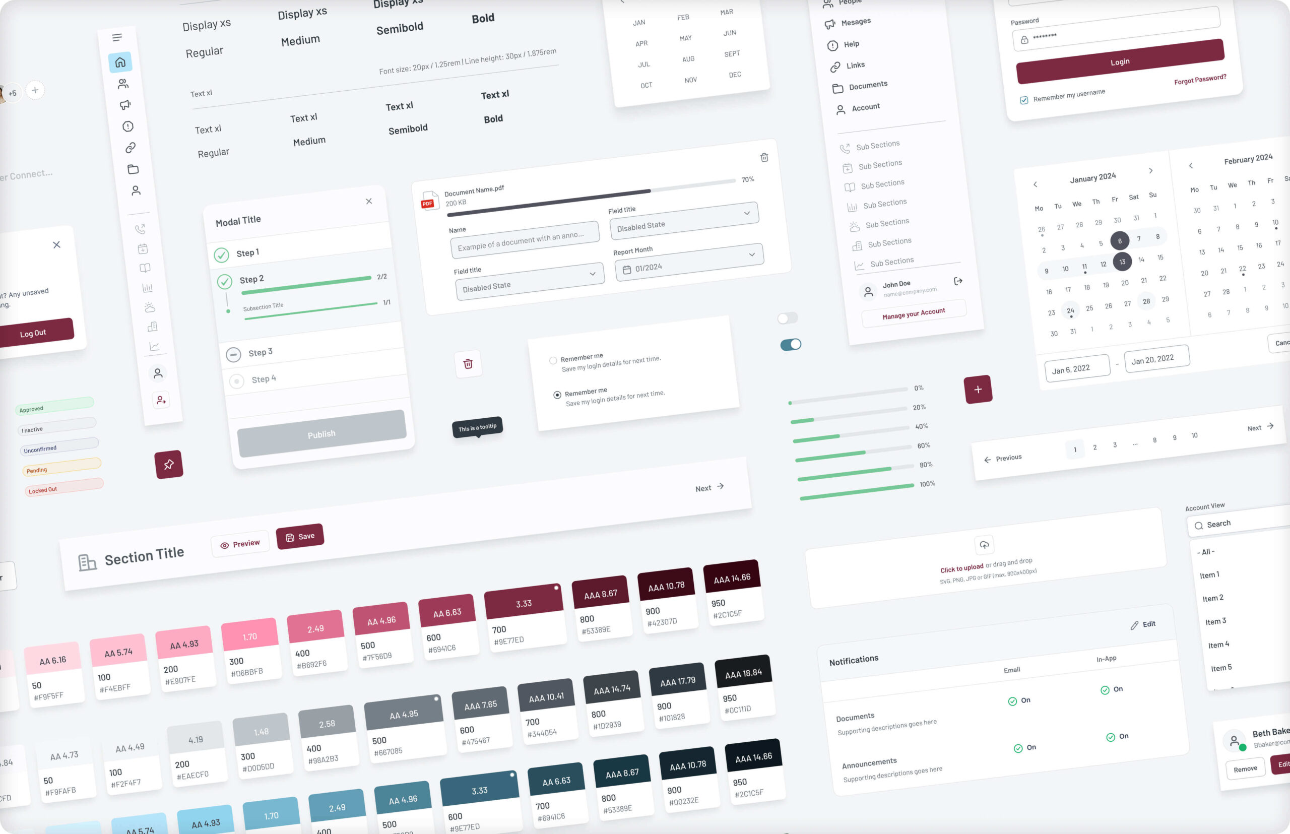
In an effort to be more efficient in design, we leveraged a pre-built design system that would afford us more speed to design features in a consistent manner that were both easy to use and visually pleasing to the eye. Then, we collaborated closely with development to build out the customer homepage in a way that could complement the manner in which data visualizations would need to be feasibly displayed. As the homepage grew into something elegant, with modern considerations in how much breathing room everything had, how navigation would be handled, and the freedom we could afford customers with well labeled buttons and interactions, we decided to pivot to designing and completing the administrator portal. This felt necessary because it is the administrator portal that would populate every page of the customer portal beyond the foundation of the homepage as we had determined it.

Decorative image showing a modern portal.

Designing the administrator portal turned out to be a complex and enriching challenge. Tons of considerations had to be made as we essentially designed and developed a robust enterprise tool capable of creating customer portals and then managing them. This involved making countless features and interactions, such as devising a new easy set-up wizard for walking administrators through all steps necessary to get a customer portal up and running. We also introduced the ability to connect primary portals to linked portals so that new capabilities could be offered, such as bulk document upload from primaries to all linked or importing users from one linked company to another amongst other additions. Managing portals also took on a new look and feel as it no longer required administrators to use a rather antiquated approach from the previous portal to utilize two dropdown menus to choose which customer portal to edit and which aspect of it they were doing so. Now, the interactions behaved as expected since our decisions were guided by our heuristic findings. Users could simply choose a client portal and use tabs to go to whichever page they wished to edit in a straightforward manner with error prevention to indicate and confirm the impact of edits being made, toast message confirmations to read back the system status once a change has been made, and all other heuristics guidelines that outline just what it means to create a usable and modern experience.


After completing the administrator portal, we proceeded to finish the customer experience by designing how all decisions on the administrator side would display for customers in their portals. This meant building our document centers, report pages, custom report modules, recent activity panels, org charts, and more. By first comprehending all the tools administrators would need to set up a portal, we were able to move quickly to provide customers with streamlined UX/UI that allowed them to know exactly what documents and data were available to them and how to access it just as easily. We even introduced on-page notifications and a mobile experience. The response from our prototype usability tests were outstanding with customers expressing excitement to see just what new quality-of-life improvements we were cooking up for them.

Do Better

Devising a post-launch data strategy

At the completion of our first phase of work, we identified a plethora of features that could potentially make their way into the future portal design. While a large percentage of those did in fact get designed and developed in the new portal experience, we created a backlog of additional prioritization considerations, creating a launchpad for continued evolution of the portal beyond the next generation experience we designed and delivered to deliver new, high-value features.


But our feature backlog isn’t the only source for driving continuous improvement in Tenaska’s newly designed portal experience. We’ll also be monitoring Google Analytics 4 to keep a close eye on customer behavior on the new portal to determine what’s working, what could be improved, and where the most value is being delivered by the new experience. This ensures that launching is just step one in a continuous road of enhanced customer satisfaction and valuable portal utility.

Differentiate better

Our work to create the next generation Customer Connect Portal helped Tenaska accomplish what they sought out to do at the beginning of our engagement with them: modernize the portal so that it remains a key value differentiator in the market. Our goal was to deliver on this ambitious goal without sacrificing development feasibility or usefulness for completing users’ requisite day-to-day tasks.  By thoughtfully and conscientiously first understanding all the opportunities to improve upon the former portal and cataloging those into a strategic roadmap of prioritized features destined for the new portal, we achieved just that. Their new portal is easier to use for both customers and administrators, overall more useful with a host of new features introduced, and a visual delight keeping with the latest aesthetic trends.


We look forward to our continued partnership with Tenaska in their journey for increasing value to customers and differentiation through a best-in-class customer portal experience.

Got a project for us? We’re on it.

Case Study: AudioEye
A rebrand that solidified AudioEye's leadership in the market
See the work
Case Study: Natural Grocers
Creating a PCI compliant site in time for the holidays
See the work
Case Study: Bunger Steel
Using SEO and content strategy to drive qualified traffic to new website
See the work
Previous slide
Next slide
Play Video

Bunger Steel

Doing some things and making some impacts