2026 might feel far off, but your window to adapt is closing fast.
The way customers discover products and services, and decide which brands will earn their dollars, has changed more in two years than in the previous twenty. Generative AI, shifting social platforms, and emerging search behaviors are rewriting the rules, often before brands even notice. Planning cycles haven’t caught up. But the brands that do? They’re already gaining ground.
Growth strategy planning for 2026 in a shifting reality
It’s that time again: spreadsheets, strategy decks, offsites. The strategic planning treadmill is moving fast. Everyone is planning for 2026 right now. But most are planning like it’s still 2022. The world outside your org chart has changed dramatically, and the impact of that change is having an outsized impact on marketing strategies.
The usual suspects—channel plans, departmental OKRs, quarterly lead targets—feel familiar. But they’re colliding with a much bigger disruption: AI is reshaping how customers discover, compare, and decide.
Brand discovery today happens through opaque, shifting systems, and shaped more by algorithms than intention. Discovery now spans AI summaries, social platform algorithms, voice assistants, zero-click content experiences, and aggregated reviews. If you’re not influencing these surfaces, you’re invisible, even before the search begins.
Your customers no longer follow your funnel, they follow their curiosity. And increasingly, that curiosity is shaped by algorithms you don’t control.
Search is the next frontier in the AI evolution
Search still matters, and curiosity still flows. But it’s no longer a simple typed query in a clean Google bar.
It’s an increasingly complex web of competing influences with varying degrees of veracity, including things like:
- A confident, final-sounding LLM answer from ChatGPT, one of the 1.8 billion AI-generated responses users consume daily.
- A TikTok with no link and no context, yet 51% of Gen Z say they use it as a search engine.
- A Reddit thread resurfacing in Perplexity, summarizing your competitor’s edge, often with 100k+ views.
- A YouTube video, created by a third party with no affiliation to you, that outranks your homepage in search results.
- Hours lost rewriting prompts, scrolling low-quality results, and bouncing between platforms until your customer gives up.
Decisions are made before your brand even enters the conversation. Brands are losing visibility in once-winnable moments of potential brand discovery because they’re still optimizing for a search behavior that no longer exists.
Discovery is fragmented, AI-mediated, and happening at an increasing distance from brand-owned environments. You’re not losing the click and the consideration before it even begins.
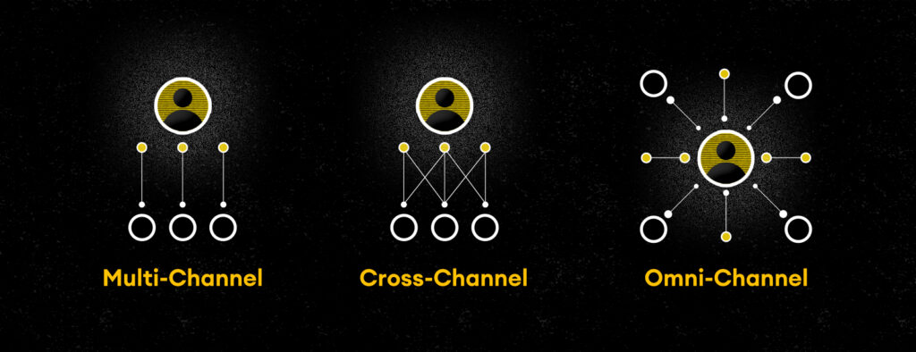
From channels to journeys to discovery systems
The most urgent mindset shift for 2026:
Stop planning by channel.
Stop organizing by function.
Start building for how real people discover and evaluate your brand.
Tallwave calls this: Journey-Driven Discovery.
It starts by asking:
- How are people encountering your brand in 2025?
- What do they see, hear, or compare before they ever reach your site?
- How does AI shape their perception before your first impression?
- How is the discovery journey likely to continue evolving in 2026 and beyond?
This is no longer theoretical. Social platforms optimize for discovery behavior. Search engines reward experience depth and intent clarity. AI assistants shortcut straight to the “best” answer, sometimes skipping your brand entirely.
Your content is now being used to influence people before they even know your name.
The brands that understand and embrace this shift win before others even know the game has changed.
Learn more about how Tallwave’s discovery process fuels growth.
Forward-looking brands are adapting their approach to growth planning
This isn’t about “trying SEO 2.0.” It’s about rethinking your digital visibility from the ground up. The best brands are already:
- Mapping real-world discovery journeys across AI, social, and other search platforms
- Implementing content strategies structured for AI summarization, not just crawlability
- Investing in digital experience where brand, search, and UX converge
- Using simulation tools and generative queries to evaluate how AI surfaces, summarizes, and positions their brand today
- Defining and tracking findability through real-world discovery signals, not just keyword rankings or reach metrics
These aren’t thought experiments. They’re live initiatives we’re driving with clients right now to reclaim attention in an AI-first world. This means we’re structuring content and implementing strategies ripe for AI summarization: clear headings, concise value statements, first-party expertise, and schema that reinforces context.
If you’re leading growth strategy, this is the moment to make real change:
- Rewire your understanding of “search” think AI interaction, not just query typing
- Align content, performance, and experience into one unified growth strategy
- Budget for presence, not just paid reach
- Be prepared to answer the critical question: What happens when my customer doesn’t come to me, but asks an AI about me?
Call to action: How Tallwave can help you get there
If you’re serious about owning your discovery moment in 2026, here are three ways we can help you prepare to deploy a journey-driven discovery strategy today:
1. AI discovery baseline and competitor benchmark
A 3-week deep dive into how your brand shows up across AI platforms, search engines, and social discovery surfaces compared to your top competitors.
Outcome: Visibility gaps, competitive deltas, and where you’re winning or losing attention that inform discovery-driving strategies tailored for an evolving and increasingly AI-mediated discovery journey.
2. Discovery journey mapping + readiness assessment
We map your real-world customer discovery journeys across AI and LLMs, search, social, and digital touchpoints, and assess how your brand performs at each stage. Using this kind of signal mapping and digital intelligence, we identify where and how your brand is showing up, what’s being surfaced, and how we can build a plan to improve.
Outcome: A discovery journey model highlighting signal strengths, visibility gaps, and prioritized activation paths to improve discoverability.
3. Go-to-market playbook for the discovery economy
Not just insights. A full GTM strategy that connects your content, UX, and AI discoverability into one cohesive roadmap.
Outcome: An actionable playbook to help you compete where your customers are, not where they used to be.
As you’re planning your growth strategies for 2026, let’s make sure you’re planning for the world that’s coming, not the one that’s fading. Let’s map your path, and build the systems that will make you findable, memorable, and chosen. We’re ready when you are.


