Categories
Digital Marketing Highlights Product Design UX Design

The 5 Second Test: Designing for instant impact

First impressions happen fast—sometimes in as little as 50 milliseconds—and in the digital world, design is often the first thing users notice. But great design isn’t just about aesthetics; it’s about creating an emotional connection, telling a story, and leaving a lasting impression. A well-crafted design can establish trust, build credibility, and spark engagement, while a poor one can drive users away in seconds. In this blog, we’ll explore why first impressions in design matter so much and how tools like the 5 Second Test can help ensure your design communicates its primary message effectively and captures attention from the start.

Why first impressions matter

First impressions aren’t just fleeting moments—they set the stage for how users perceive and interact with a brand or product. Whether it’s a website, app, or digital ad, the initial experience can determine whether someone stays to learn more or clicks away. Here are the key reasons why these first moments matter so much:

Psychological impact: The role of cognitive bias in shaping user perceptions

Humans are wired to make snap judgments—it’s a survival instinct. In design, this instinct manifests through cognitive biases, such as the halo effect, where a positive first impression of one element (e.g., an attractive layout) influences perceptions of everything else (e.g., content credibility). Conversely, a cluttered or confusing design can elicit the opposite effect, leaving users skeptical or uninterested. Colors, spacing, typography, and imagery all play subtle yet powerful roles in shaping these immediate perceptions. Understanding these psychological cues allows designers to craft experiences that resonate emotionally and intellectually from the very first glance.

Trust and credibility: How design elements influence trustworthiness

Trust is a fragile matter, and design is often the first signal users rely on to determine if they’re in the right place. Clean layouts, professional typography, consistent branding, and high-quality imagery all contribute to a sense of reliability. In contrast, poor design choices—such as broken links, outdated visuals, or cluttered interfaces—can trigger doubt and hesitation. According to research from Stanford University, 75% of users judge a brand’s credibility based on its website design alone. Simply put, users are far more likely to engage with and trust a platform that looks polished, intentional, and user-friendly.

Engagement vs. abandonment: Consequences of a strong or weak first impression

In a digital space overflowing with options, users have little patience for confusion or frustration. A positive first impression draws people in, encourages them to explore, and increases the likelihood of conversions—whether that’s signing up for a newsletter, making a purchase, or reaching out for services. On the flip side, a weak first impression—caused by slow load times, cluttered visuals, or unclear calls to action—often leads to immediate abandonment. Studies show that 88% of online users are less likely to return to a site after a poor experience. In essence, a strong first impression isn’t just about aesthetics; it’s about setting the foundation for a meaningful and lasting interaction.

Key elements that shape design first impressions

First impressions in design are shaped by a combination of visual and functional elements that work together to captivate users, communicate a brand’s message, and meet user needs. Each of these elements plays a critical role in determining whether users stay engaged or bounce. Below are the key components that have the greatest influence on design first impressions:

Visual hierarchy: Guiding the user’s eye

Visual hierarchy refers to how elements are arranged on a page to direct a user’s focus. Through strategic use of size, color, contrast, and spacing, designers can highlight key information, like a call-to-action button or an important headline. A well-executed visual hierarchy ensures that users can quickly identify what’s most important without feeling overwhelmed or lost.

Pro tip: Make sure your most critical information is immediately visible and easy to digest within the first glance.

Color and typography: Setting the mood

Colors evoke emotions, and typography communicates tone. Together, they create a brand’s visual voice. Bright, bold colors can convey energy and excitement, while muted tones suggest sophistication and calmness. Typography complements this by ensuring readability while reflecting the brand’s personality. For example, sans-serif fonts feel modern and approachable, whereas serif fonts suggest tradition and reliability. Mismatched colors or hard-to-read fonts can disrupt the user experience and dilute the design’s impact.

Pro tip: Stick to a consistent color palette and choose fonts that align with your brand’s personality and readability standards.

Imagery and branding: Creating emotional connections

High-quality images, graphics, and icons can instantly communicate messages and emotions more effectively than words alone. Branding elements, such as logos and consistent design patterns, help build recognition and trust. When users see a cohesive design that feels intentional, they’re more likely to associate it with professionalism and credibility.

Pro tip: Establish a design system to drive a consistent experience across touchpoints.

Content clarity: Communicating the message instantly

Even the most stunning visuals can fall flat if the core message isn’t clear. Users should immediately understand what the product, service, or value proposition is within moments of landing on a page. Clear headlines, concise copy, and intuitive navigation all play a role in delivering that clarity.

Pro tip: Ask yourself: If a user only spends five seconds on this page, will they understand the primary message? 

Load speed and technical performance: The silent first impression

Before users even see your design, the page must load—and it needs to do so quickly. Slow load times frustrate users and can result in immediate abandonment. Optimized images, efficient code, and reliable hosting all contribute to a seamless experience.

Pro tip: Use tools like Google PageSpeed Insights to ensure your pages load quickly and efficiently.

When these key elements align, they work together to create a cohesive and impactful experience. Each detail—no matter how small—plays a part in forming that all-important first impression, laying the foundation for trust, engagement, and lasting connections.

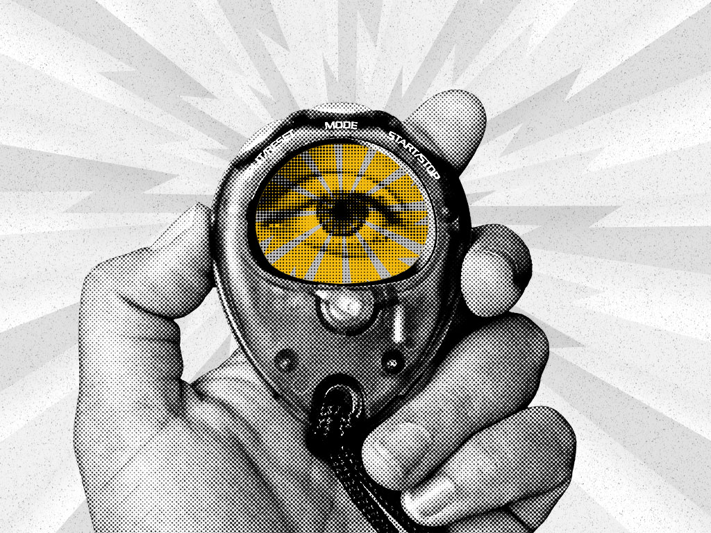
Introducing the 5 Second Test: A quick gauge of first impressions

In a world where users make snap judgments in seconds, understanding how effectively your design communicates its core message is crucial. That’s where the 5 Second Test comes in—a quick, powerful usability and UX testing method designed to evaluate a user’s initial reaction to a design.

What is the 5 Second Test?

The 5 Second Test is a usability testing technique where participants are shown a design—such as a website homepage, landing page, or ad—for just five seconds. Afterward, they’re asked questions to gauge their immediate impressions and key takeaways. Common questions include:

  • What do you think this website is about?
  • What stood out to you the most?
  • Did you notice a call-to-action?

The goal is to measure whether the most important elements of the design are clear, memorable, and aligned with the intended message.

Why use the 5 Second Test?

The test serves as a reality check for how well your design performs under the constraints of limited time and attention. Key benefits include:

  • Immediate feedback: Understand if your design is communicating its core message effectively.
  • Spot weaknesses: Identify unclear messaging, poor visual hierarchy, or distractions.
  • Optimize engagement: Refine design elements to better capture and maintain attention.

The simplicity and speed of the test make it an efficient way to gather actionable insights without requiring complex setups or lengthy surveys.

Use cases for the 5 Second Test

The 5 Second Test can be applied across various scenarios, including:

  • Website homepages: Ensure users instantly understand the brand’s purpose and primary offering.
  • Landing pages: Verify that key calls-to-action (e.g., “Sign Up” or “Buy Now”) are immediately noticeable.
  • Ad designs: Check if the core message or value proposition stands out in display or social ads.
  • App interfaces: Assess whether users can quickly grasp the app’s functionality and purpose.

Whether you’re launching a new product, redesigning a website, or fine-tuning an ad campaign, the 5 Second Test helps validate your design decisions through real user feedback.

In short, the 5 Second Test acts as a spotlight, highlighting whether your design delivers clarity, focus, and impact—all within the brief moment you have to capture a user’s attention.

Great design isn’t just about aesthetics—it’s about creating experiences that resonate. First impressions influence trust, credibility, and engagement in seconds. When done right, design goes beyond aesthetics to tell a story, evoke emotion, and leave a lasting impact that builds loyalty and recognition. Whether it’s through intuitive navigation, clear messaging, or visually striking elements, every design choice contributes to how users perceive and connect with a brand. By understanding the psychology behind first impressions and leveraging tools like the 5 Second Test, businesses can ensure their designs don’t just capture attention—they hold it. In a world where every second counts, great design isn’t optional; it’s essential.At Tallwave, our team of expert digital experience designers knows all about great design. Ready to elevate your digital design and leave a lasting first impression? Let’s talk.

Categories
Product Design Reaching New Customers SEO Strategy UX Design

Embracing mobile-first responsive design: A must for digital success

In today’s fast-paced digital world, mobile devices have become the primary gateway to the internet for billions of users worldwide. Did you know that as of 2024, close to 60% of global web traffic originates from mobile devices? This staggering statistic underscores the critical importance of adopting a mobile-first responsive design strategy. Whether you’re a business leader, digital marketer, or content creator, understanding and implementing mobile-first design is no longer optional; it’s essential for your digital success.

As mobile technology continues to evolve, so do user expectations. Consumers now demand fast, intuitive, and seamless interactions on their smartphones and tablets. Ignoring these demands can lead to missed opportunities, decreased engagement, and lost revenue.

Understanding mobile-first responsive design

Mobile-first responsive design is a design philosophy that prioritizes the mobile user experience before scaling up to larger screens like tablets and desktops. Unlike traditional responsive design, which starts with desktop layouts and adapts downward, mobile-first ensures that your website or app delivers an optimal experience on the smallest screens first. This approach addresses the unique challenges of mobile devices, such as limited screen real estate, varying device capabilities, and different user behaviors.

By focusing on mobile users initially, designers and developers are compelled to prioritize essential content and functionalities. This leads to cleaner, more efficient designs that load faster and provide a better user experience across all devices. Moreover, a mobile-first strategy aligns with the current trend of increasing mobile usage, ensuring that your digital presence remains relevant and competitive.

The evolution of web design

Web design has undergone significant transformations over the past decade. Initially, designers focused primarily on desktop users, creating elaborate layouts that often fell short on mobile devices. The rise of smartphones and tablets introduced new challenges, as these devices featured smaller screens, touch interfaces, and varying performance capabilities. Early attempts to adapt desktop designs to mobile often resulted in cluttered, slow-loading websites that frustrated users.

However, with the exponential rise in mobile usage, the industry shifted towards mobile-first approaches. This shift is not just a trend but a response to the undeniable reality that mobile users demand fast, intuitive, and seamless interactions. Mobile-first design encourages simplicity and efficiency, stripping away unnecessary elements and focusing on what truly matters to the user. 

Advancements in technology—like responsive frameworks, progressive web apps, and modern mobile browsers—have made it easier than ever to deliver sophisticated, seamless experiences on mobile. This means we can start with the most essential needs and constraints of mobile users first, ensuring the experience is fast, intuitive, and effective no matter where or how someone interacts with it.

SEO implications for mobile-first responsive websites

Google’s mobile-first indexing means that the mobile version of your website is now the primary version used for indexing and ranking. This change emphasizes the need for mobile-first design, as it directly impacts your search engine visibility. A well-executed mobile-first responsive design can significantly enhance your SEO performance, driving more organic traffic to your site.

Mobile-first design impacts several key SEO factors:

  • Page load speed: Mobile users expect fast-loading pages. Search engines prioritize websites that load quickly, especially on mobile devices. Optimizing for speed can lead to better rankings and lower bounce rates.
  • User experience (UX): Google considers user engagement metrics, such as time on site and bounce rate, when ranking pages. A mobile-friendly design enhances UX, encouraging users to stay longer and interact more with your content.
  • Content accessibility: Ensuring that your content is easily accessible on mobile devices, with clear headings, readable fonts, and intuitive navigation, helps search engines understand and index your site more effectively.
  • Structured data: Implementing structured data correctly in your mobile design can improve your chances of appearing in rich snippets and other enhanced search results.

By adopting a mobile-first responsive design, you not only meet user expectations but also align your website with the latest SEO best practices, ensuring better visibility and higher rankings in search engine results pages (SERPs).

Benefits of mobile-first responsive design

Adopting a mobile-first responsive design approach offers numerous benefits that can significantly impact your business’s digital success. Here’s a deeper look into these advantages:

Enhanced user experience

A mobile-first approach ensures that your website is user-friendly on all devices. By focusing on simplicity and essential functionalities for mobile users, you create a seamless navigation experience that translates well to larger screens. Faster load times and improved performance are natural byproducts of this design philosophy, leading to higher user satisfaction.

Consider these key aspects that enhance UX:

  • Intuitive navigation: Mobile-first design often incorporates hamburger menus, swipe gestures, and other touch-friendly navigation elements that make it easy for users to find what they’re looking for.
  • Readable content: Prioritizing content hierarchy ensures that the most important information is easily accessible, with clear headings, concise text, and appropriate use of white space.
  • Interactive elements: Touch-friendly buttons and interactive elements enhance engagement, making it easier for users to interact with your site.

Increased conversion rates

Optimizing for mobile often leads to higher engagement and conversion rates. Mobile users are more likely to take immediate actions, such as making a purchase or filling out a contact form, when they encounter a streamlined and intuitive interface. By reducing friction in the user journey, mobile-first design directly contributes to your bottom line.

Consider these conversion-boosting strategies:

  • Simplified forms: Reducing the number of fields in forms can increase completion rates. Mobile-first design emphasizes simplicity, ensuring that forms are easy to fill out on small screens.
  • Clear call-to-actions (CTAs): Strategically placed and easily tappable CTAs guide users towards desired actions, whether it’s signing up for a newsletter or making a purchase.
  • One-click checkout: Implementing features like one-click checkout can significantly reduce cart abandonment rates, making the purchasing process seamless.

Better SEO performance

As mentioned earlier, mobile-first design plays a crucial role in SEO. Websites that are optimized for mobile devices tend to rank higher in search engine results pages (SERPs), attracting more organic traffic. Additionally, faster loading times and improved usability are factors that search engines consider when ranking sites.

Consider the following potential SEO benefits:

  • Higher rankings: Mobile-optimized sites are favored by search engines, leading to better visibility (including coveted featured snippets and AI overviews),  and more organic traffic.
  • Lower bounce rates: A well-designed mobile experience keeps users engaged, reducing bounce rates and signaling to search engines that your site provides value.
  • Increased dwell time: Engaging content and a seamless user experience encourage users to spend more time on your site, further boosting SEO rankings.

Future-proofing your digital presence

The digital landscape is ever-evolving, with new devices and technologies emerging regularly. A mobile-first approach ensures that your website is adaptable to future trends, such as Progressive Web Apps (PWAs) and voice search optimization. By staying ahead of the curve, you maintain a competitive edge in the market.

Consider the following areas for future adaptability:

  • Scalability: Mobile-first designs are inherently scalable, allowing for easy adjustments as new devices and screen sizes emerge.
  • Technological integration: Incorporating modern technologies like PWAs and AI-driven personalization ensures that your site remains relevant and engaging.
  • User-centric design: Continuously focusing on user needs and behaviors ensures that your design remains effective and user-friendly as trends change.

Cost-effectiveness

Designing with a mobile-first mindset can streamline your design and development processes. By addressing the most critical user needs upfront, you can avoid costly redesigns and adjustments later on. This efficiency not only saves time and resources but also accelerates your time-to-market.

Consider the following cost saving measures associated with mobile first design:

  • Reduced development costs: Focusing on essential features for mobile reduces complexity, leading to lower development costs.
  • Maintenance savings: A streamlined design is easier to maintain and update, reducing ongoing maintenance expenses.
  • Faster time-to-market: Efficient design processes allow for quicker launches, enabling you to capitalize on market opportunities promptly.

Key best practices for mobile-first responsive design

Implementing a successful mobile-first responsive design requires adherence to several best practices. These guidelines ensure that your design is not only aesthetically pleasing but also functional, user-friendly, and optimized for performance.

Prioritize content hierarchy

Focus on delivering essential content and features for mobile users. Prioritizing what matters most ensures that your audience receives the key messages without being overwhelmed by unnecessary elements. Here are some tips:

  • Identify core content: Determine the most important information your users need and ensure it’s prominently displayed.
  • Use clear headings: Organize content with clear, descriptive headings that guide users through the page.
  • Minimize clutter: Avoid excessive use of images, animations, and text that can distract or confuse users.

Simplify navigation

Use intuitive menus and touch-friendly elements to make navigation effortless. Simplified navigation enhances user experience and reduces bounce rates, keeping visitors engaged longer.

Here are some ways you can keep it simple:

  • Hamburger menus: Utilize hamburger menus to hide navigation links until needed, saving valuable screen space.
  • Sticky navigation: Implement sticky headers or navigation bars that remain visible as users scroll, providing constant access to important links.
  • Breadcrumbs: Use breadcrumb trails to help users understand their location within the site and easily navigate back to previous pages.

Optimize images and media

Implement responsive images and efficient media handling to ensure fast loading times. Tools like responsive image techniques and lazy loading can significantly improve performance without compromising quality.

You can do this by implementing these tips:

  • Responsive images: Use srcset and sizes attributes to deliver appropriately sized images based on the device’s screen size and resolution.
  • Image compression: Compress images without sacrificing quality using tools like ImageOptim or TinyPNG (we’re embarrassingly fond of the panda mascots).
  • Lazy loading: Load images and media only when they are about to enter the viewport, reducing initial load times and saving bandwidth.

Implement responsive typography

Ensure that your text is readable across various screen sizes. Responsive typography adjusts font sizes and line heights based on the device, enhancing readability and overall aesthetics.

Here are some ways to make responsive typography work:

  • Fluid typography: Use relative units like em or rem instead of fixed units (px) to allow text to scale naturally.
  • Optimal line length: Maintain an optimal line length (typically 50-75 characters per line) for better readability on all devices.
  • Contrast and accessibility: Ensure sufficient contrast between text and background to improve readability, especially for users with visual impairments.

Optimize for performance

Enhance loading speeds and overall performance by minimizing code, leveraging browser caching, and optimizing assets. Performance optimization is crucial for retaining mobile users who expect swift interactions.

Here are a few ways to optimize performance:

  • Minify CSS and JavaScript: Reduce file sizes by minifying CSS and JavaScript files using tools like CSSNano and UglifyJS.
  • Browser caching: Enable browser caching to store static resources locally, reducing the need for repeated downloads.
  • Content Delivery Networks (CDNs): Use CDNs to distribute content across multiple servers worldwide, decreasing load times for users regardless of their location.

Design for accessibility

Design for all users, including those with disabilities. Incorporate features like alt text for images, proper contrast ratios, and keyboard navigation to make your site accessible to everyone.

We did a deep-dive on accessible app design in a previous post, but here are some TL;DR tips:

  • Alt text for images: Provide descriptive alt text for all images to aid users who rely on screen readers.
  • Keyboard navigation: Ensure that all interactive elements can be navigated using a keyboard, enhancing accessibility for users with motor impairments.
  • ARIA landmarks: Use Accessible Rich Internet Applications (ARIA) landmarks to define regions of your web pages, improving navigation for assistive technologies.
  • Color contrast: Maintain high contrast ratios between text and background to ensure readability for users with visual impairments.

Future trends in mobile-first responsive design

The realm of mobile-first responsive design is continually evolving, driven by advancements in technology and changing user behaviors. Staying ahead of these trends can help you maintain a competitive edge and provide exceptional user experiences. Here are some future trends to watch:

Emerging technologies

Progressive Web Apps (PWAs) are gaining traction, offering app-like experiences on mobile browsers. PWAs combine the best of web and mobile apps, providing offline functionality, push notifications, and fast load times without requiring users to download from app stores. Integrating PWAs into your mobile-first strategy can enhance user engagement and retention, offering a seamless and immersive experience that rivals native apps.

Native and hybrid app solutions

While PWAs are transforming mobile-first strategies, native and hybrid app solutions remain vital for delivering high-performance user experiences.

  • Native apps: Tools like SwiftUI (iOS) and Jetpack Compose (Android) allow for platform-specific development, fully utilizing device features and offering top-tier performance.
  • Hybrid apps: Frameworks like React Native and Flutter enable cross-platform development with a single codebase, combining scalability with near-native experiences.

Incorporating native or hybrid apps alongside PWAs ensures your mobile-first strategy meets diverse user needs, balancing performance, scalability, and engagement.

AI and personalization

Artificial intelligence enables personalized user experiences by analyzing user behavior and preferences. Leveraging AI can help tailor your mobile interface to meet individual user needs, driving higher satisfaction and loyalty. Personalized content recommendations, dynamic interfaces, and intelligent chatbots are just a few ways AI can enhance the mobile experience. By understanding and anticipating user needs, AI-driven personalization can significantly improve engagement and conversion rates. Learn more about personalization in marketing.

Voice search optimization

With the rise of voice-activated assistants like Siri, Alexa, and Google Assistant, designing for voice search is becoming increasingly important. Incorporating voice search capabilities into your mobile design can improve accessibility and user convenience. Voice search optimization involves structuring your content to answer common voice queries, using natural language, and ensuring your site is compatible with voice-activated commands. As voice search continues to grow, optimizing for it can provide a significant competitive advantage.

Augmented Reality (AR) and Virtual Reality (VR)

AR and VR technologies are transforming mobile interactions, offering immersive experiences that engage users in new ways. Integrating these technologies into your mobile-first design can set your brand apart and attract tech-savvy audiences. AR can enhance shopping experiences by allowing users to visualize products in their environment, while VR can provide immersive storytelling and interactive experiences. As AR and VR become more accessible, incorporating them into your design strategy can create unique and memorable user experiences.

Dark mode design

Dark mode has become increasingly popular, offering a visually appealing alternative to traditional light themes. Designing for dark mode enhances user experience by reducing eye strain, especially in low-light environments, and can also save battery life on devices with OLED screens. Incorporating dark mode into your mobile-first design strategy provides users with flexibility and improves overall satisfaction.

In our mobile-first responsive design era

In an era where mobile devices dominate the digital landscape, mobile-first responsive design is not just a best practice, it’s a necessity. By prioritizing the mobile user experience, you can enhance usability, boost conversions, and improve your SEO performance. Embracing this approach future-proofs your digital presence, ensuring that you stay ahead in a competitive market.

Adopting a mobile-first strategy offers numerous benefits, from improved user experience and increased conversion rates to better SEO performance and cost-effectiveness. By following key best practices you can create a mobile experience that delights users and drives business success.

Implementing mobile-first responsive design involves careful planning, strategic design practices, and rigorous testing. By following a step-by-step guide, utilizing the right tools, and addressing common challenges, you can effectively integrate mobile-first principles into your projects. Additionally, staying informed about future trends—such as emerging technologies, AI and personalization, voice search optimization, AR and VR, dark mode design, and sustainable practices—ensures that your mobile experience remains cutting-edge and relevant.

At Tallwave, we specialize in creating mobile-first responsive designs that drive results. Our team of digital experience design experts understands the intricacies of mobile design and is dedicated to helping you achieve your digital goals. Whether you’re looking to revamp your website, develop a new app, or optimize your existing mobile presence, we have the skills and experience to deliver exceptional solutions tailored to your needs. Let’s chat.

Play Video

Bunger Steel

Doing some things and making some impacts