Categories
Customer Engagement Paid Media Product Design Reaching New Customers SEO Strategy UX Design

The future is brat: Gen Z marketing and why it matters

Alright, besties. It’s time to bffr. 

Translation for us elder generations: Let’s have a real heart-to-heart about the generation that’s turning the marketing world upside down: Gen Z.

“Brat Summer” might be winding down (cue the collective sigh of relief from Millennials, Gen Xers, and Boomers everywhere), but the Gen Z vibes are here to stay. If you’re still marketing like it’s 1999 (or even like it’s 2019), well, you’re about as relevant as a VHS tape or floppy disk.


As these digital natives step into adulting (yes, I cringed while typing that) and start making their mark on the world, their impact on how we communicate is nothing short of revolutionary. They have more spending power than we give them credit for, and they feel empowered to  use it on brands that align with their values.

So, how do we, as marketing leaders and strategists, get on their level? Let’s unpack the Gen Z marketing mindset and explore strategies to help you win their hearts and minds (and wallets).

Gen Z: Decoding the digital generation

Gen Z was born between 1997 and 2012. This means only a handful of them even existed before the September 11 attacks. They’ve always had access to social media and reality television, and none of them remember the sense of relief we all felt when the supposed Y2K bug was actually nothing. 

We’re talking about a generation with a unique mindset shaped by a lifetime of digital immersion, a constantly evolving world, and an unfortunate series of unprecedented events. And they’re not just rolling with the punches they’ve been dealt; they’re thriving . Gen Zers are buying homes earlier than previous generations. They are entering the post-grad job market with a rosy outlook. And Gen Z seriously values work-life balance and mental health. It’s almost like they’re learning from our mistakes.

Gen Z values experiences over possessions, and they’re quick to call out brands that don’t walk the walk. They’re not just consumers; they’re activists, advocates, and change-makers. And they have deep pockets, representing more than $450 billion in global spending power.

But there’s even more to it than that. Here are a few additional things that make Gen Z stand out:

Diversity and inclusion matter 🌈

They’re all about authenticity, social responsibility, and diversity. And it shows in numbers. While they are the last generation projected to have a non-Hispanic white majority (51%), one-quarter of Gen Z individuals identify as Hispanic, and 15% are non-Hispanic Black. Their diversity extends beyond race and ethnicity; nearly one in five Gen Z adults identify as LGBTQ+, compared to less than one in ten of all U.S. adults. As a result, they seek out brands that reflect their diverse community. With their support, companies owned by POC and LGBTQ+ innovators  have taken off, including Byoma, Telfar Global, and Mented Cosmetics (just to name a few). 

They’re digital natives 📲

Members of Gen Z were practically born with smartphones in their hands. In fact, they log almost 9 hours of screen time every day. They consume content at lightning speed, multitask across multiple platforms, and expect brands to keep up with their fast-paced digital lifestyles.

Values drive decision-making 💗

Now, here’s where it gets interesting. While it’s important to understand Gen Z’s demographics (age, location, etc.), it’s their valuegraphics that truly drive their decisions. Gen Z consumers want brands to stand for something, to make a positive impact on the world, and to reflect their own values and beliefs. And if the brands don’t live up to their values, it shows on the bottom line. Just ask Starbucks, whose CEO was recently ousted after a sales slump many associate with the company’s response to the conflict in Palestine.

The power of community 🫂

Gen Z is all about community and connection. They crave a sense of belonging and actively seek out brands that foster a sense of community and shared purpose. One recent survey found that 82% of Gen Z participants actively want to be part of a community. And with this desire for connection in mind, platforms like TikTok, Twitch, and Discord have exploded in popularity because they allow users to converse with others who share their interests, creating a strong sense of community around shared hobbies and passions. 

The Gen Z effect on marketing

Gen Z isn’t just disrupting the field; they’re rewriting the rulebook. This means traditional marketing tactics just don’t cut it anymore. Gen Z craves personalized, interactive experiences that speak to their values and make them feel seen and heard.

Here are a handful of ways that marketing to Gen Z might differ from marketing to older generations:

  • Authenticity and transparency: Forget slick sales pitches and airbrushed perfection. Gen Z can spot inauthenticity a mile away. They want brands to be real, relatable, and transparent about their practices, even if it means showing their flaws.
  • Social media dominance: TikTok and Instagram and Snapchat, oh my! These platforms are Gen Z’s playgrounds. If you’re not there, you’re missing out on a huge opportunity to connect with them where they spend most of their time.
  • Short attention spans: We’re talking goldfish-level attention spans here. Under Gen Z’s marketing rulebook, your content needs to be snappy, engaging, and get to the point fast. Think bite-sized videos, eye-catching visuals, and concise messaging.
  • The rise of micro-influencers: Forget mega-influencers with millions of followers. Gen Z is more likely to trust recommendations from micro-influencers who feel like friends and share their values. 
  • The demand for social responsibility: Gen Z expects brands to take a stand on social and environmental issues. They want to support businesses that are making a positive impact on the world. 

Looking to make a difference for the planet and connect with conscious consumers? Learn more about green marketing ​​🌱

Marketing to Gen Z: Strategies that work

Let’s keep it simple: you need to know how to market to Gen Z.  Here are some strategies to get you started:

User-generated content (UGC)

Gen Z trusts their peers more than big brands. Encourage them to create and share content about your brand. Run contests, challenges, or campaigns that tap into their creativity and give them a platform to express themselves. Reddit is a good source for UGC, and won’t hurt your SEO efforts either.

Influencer marketing

We’ve talked about the connection between SEO and influencer marketing before, but it hits differently when you’re marketing to Gen Z. Partner with Gen Z influencers who resonate with your target audience and embody your brand values. Remember, authenticity is key and micro-influencers matter. 

Personalization and customization

Use data to tailor your marketing messages to individual preferences. Show them that you understand their needs and interests. This might include serving them retargeting ads for similar products or sending them emails that tells a story about the content they engaged with. For example, if a company is promoting a supplement that has many benefits including sleep aid, gut health, and mental acuity, and a user engages with just sleep aid content, email them one of your articles about the potential causes of poor sleep. 

Give them an experience

Gen Z doesn’t want marketers to talk at them. They seek engagement and interaction. Brands that engage with Gen Z consumers through experiences will be more effective. Consider Nike By You. The brand’s latest venture caters to younger sneakerheads by giving them a playground to select materials and colors to match their style. The result is a customized product that expresses unique individuality.

Mobile-first approach

Gen Z lives on their phones. Make sure your website and content are optimized for mobile devices. Think fast loading times, strong Core Web Vitals, easy navigation, and thumb-friendly design.

Embrace humor and pop culture

Gen Z loves a good laugh and appreciates brands that can tap into their sense of humor and pop culture references. From using their language in your copy to tagging trending pop songs in your Instagram Stories, there are many ways to get on their level. Some government entities are nailing this.

Meet them where they are

Don’t rely solely on the advertising channels you’ve used in the past. Explore new platforms and formats that resonate with Gen Z, such as gaming platforms, streaming services, and podcasts. You might even consider creating immersive experiences that allow Gen Z to interact with your brand in a meaningful way. Think AR filters, gamified content, and live events.

Gen Z marketing matters more now than ever

Marketing to Gen Z is both a challenge and an incredible opportunity. By understanding their values, behaviors, and preferences, you can create campaigns that truly resonate and drive results. Remember, Gen Z isn’t just the future; they’re the present. And they’re shaping the marketing landscape in ways we’re only beginning to understand.Need help navigating the ever-changing world of Gen Z marketing? Tallwave is here to help! We specialize in executing integrated marketing, product design, and data strategies that connect with audiences across generations. Let’s talk.

Categories
CRO Customer Engagement Mindfulness Paid Media Product Design Reaching New Customers SEO Strategy Uncategorized UX Design

From stressed to streamlined: Cognitive Load Theory in UX design

As someone who thrives with a little extra external structure in my life (a common aspect of ADHD), I know the importance of clear instructions and streamlined processes. That’s why I’m obsessed with Cognitive Load Theory in UX design and its power to create frictionless user experiences in everything from mobile apps to complex enterprise software.

Let’s face it: our brains are busy places. Juggling life, family and friends, work, hobbies, and even that never-ending social media feed leaves little room for mental gymnastics (probably even for Simone Biles). Cognitive load refers to the total amount of mental effort required to process information and complete a task. You might think of it as your brain’s bandwidth. 

When a website, app, or even a customer portal dumps too much information on you at once, your cognitive load skyrockets. This can lead to frustration, errors, and, ultimately, users abandoning ship. By leveraging cognitive load principles in UX design, we can help users achieve their goals with minimal mental strain. 

Understanding Cognitive Load Theory: The brain’s bandwidth

Cognitive Load Theory has been near and dear to educators’ hearts for decades. Pioneered by psychologist John Sweller in the 1980s, it posits that our working memory has limited capacity, and overloading it can hinder learning and performance. And since then, Cognitive Load Theory has evolved from classroom applications to become a cornerstone in UX design. By understanding how cognitive load impacts users and consumers, we can design experiences that are optimized for their mental resources.

Cognitive load is a complex beast with three primary facets:

  • Intrinsic load
  • Extraneous load
  • Germane load

Intrinsic load is inherent to the task itself. For instance, learning calculus is inherently more complex than ordering pizza. While we can’t alter the task’s complexity, we can significantly influence the other two facets.

Next comes extraneous load, the design’s enemy. This is the mental overhead caused by distractions like flashy animations, overwhelming layouts, or confusing navigation.

Finally, we have germane load, the good stuff. This is the mental effort directly invested in understanding and completing the task. It’s like building muscle; the more you engage with the task, the better you become at it. 

Effective UX strategically reduces extraneous load to free up cognitive resources. By simplifying interfaces and eliminating irrelevant information, designers can help users focus their mental efforts on germane activities — those that genuinely enhance understanding and task mastery. Carefully managing these cognitive loads means designers can create experiences that feel effortless and enjoyable.  The goal is to not overwhelm the user while facilitating a deeper engagement with the content or functionality. This will ultimately make even complex tasks feel more intuitive and manageable.

Removing friction: UX design strategies for reduced cognitive load

Now that we’ve dissected the different types of cognitive load, let’s explore a few practical strategies to create designs that are as smooth as butter.

Content chunking: Bite-sized brilliance 

Breaking down complex information into smaller, digestible chunks is like serving a delicious multi-course meal. Instead of overwhelming users with a massive wall of text, offer them a series of smaller bites. Use bullet points, numbered lists, and clear headings to guide their attention. Extra fun bonus: This is good for SEO and winning featured snippets on the SERPs, too.

Example: A complex product description can be broken down into a bulleted list of key features and benefits, each in its own section.

Visual hierarchy: A clear path forward 

Our eyes are drawn to certain elements more than others. By strategically using size, color, and contrast, we can create a visual hierarchy that directs users’ focus. Think of it as a roadmap that guides them through the page.

Example: A prominent call-to-action button with contrasting colors stands out amidst less important elements.

Progressive disclosure: Less is more 

Don’t bombard users with information upfront. Instead, reveal details as needed. This technique is particularly useful in forms and registration processes, and can be an essential step in optimizing conversion rates. Focusing on the most vital steps reduces cognitive overload and improves completion rates.

Example: Instead of overwhelming travel consultants with a barrage of disclosures, servicing standards, and compliance checks upfront, deliver this information dynamically as needed throughout the booking process. 

Error prevention and recovery: User-friendly failsafes

Mistakes happen, but they shouldn’t derail the customer’s journey. Anticipate potential errors and provide clear, helpful guidance. Avoid cryptic error messages and offer constructive suggestions for resolution.

Example: A form field that validates input in real-time, preventing invalid entries and providing helpful suggestions.

Scanning patterns: Designing for how people see

Research from Nielsen Norman Group shows that users often follow an F-shaped pattern when scanning web pages. They start at the top left, scan across, and then move down the left side. Understanding these patterns allows you to place important information for maximum visibility strategically.

Example: Place the most important information in the top left corner of a page and use bold headings to draw attention.

Accessibility: Designing for everyone 

We’ve said it before, but let’s say it louder for those in the back: Inclusivity is key. Accessibility isn’t just a feature; it’s a fundamental aspect of user-centric design. By ensuring our solutions are accessible, we not only comply with legal standards but also open our digital doors to a wider audience, enhancing user engagement, customer experience, and satisfaction.

Example: Provide clear instructions for screen reader users and transcripts for video and audio content.

Testing and iteration: The heartbeat of UX design

Testing is the lifeblood of any successful design project. By observing how real users interact with your product, you can gain invaluable insights into their experiences. Tools like user testing, A/B testing, and heatmaps can help you identify areas where cognitive load is high.

What does that look like in practice? Consider the A/B testing of different layout options to determine which one results in lower task completion times and higher user satisfaction.

It’s also important to remember that great design is a journey, not a destination. Continuously gather feedback, analyze user behavior, and refine your designs based on the insights you gain. This iterative process ensures your product evolves to meet your users’ changing needs.

Beyond the screen: Expanding cognitive load in UX horizons

As you can see, the principles of cognitive load extend far beyond the classroom as Sweller originally theorized. You’ll even find these notions in play beyond websites and apps. Cognitive load principles apply equally to physical products, IoT devices, telephony, and even service design. 

Consider the mental effort required to assemble furniture, operate a smart home system, or navigate a complex customer service process. Cognitive Load Theory in UX is essential when:

Conclusion: Happy brains, happy users, increased conversions

By prioritizing cognitive load in the design process, we’re not just creating visually appealing interfaces but building experiences and products that respect users’ mental capacity. Users who can effortlessly navigate your product are more likely to not just engage, but also convert and become loyal advocates. So, let’s collaborate to design experiences that are not only beautiful but also brain-friendly. We can transform your digital landscapes into intuitive, inclusive environments. Take a few minutes to learn more about Tallwave’s digital experience design services, and when you’re ready, let’s talk.

Categories
Customer Engagement News Product Design SEO Uncategorized UX Design

Leveling up: How gamification in UX drives engagement 

Imagine this: you open an app, complete a task, and a delightful chime rings out as a virtual trophy pops up on your screen. You feel a surge of satisfaction, a small rush of accomplishment, and maybe even a drop of dopamine activates in your brain. This is the subtle power of gamification in UX design.

What is gamification in UX design? It is simply the strategic use of game-like mechanics in non-game contexts, and it has become an undeniable force in the digital landscape. As consumers, we increasingly expect playful engagement in the apps and products we interact with, even if we don’t realize it. 

But for marketers and business decision-makers, understanding the science behind gamification and its impact on user behavior can be a game-changer (pun intended) for driving long-term engagement and success.

The game is afoot: Why gamification in UX design works

So, what’s the secret sauce behind the effectiveness of gamification in UX? It all boils down to a powerful trio: motivation, reward, and positive reinforcement.

Studies have proven over and over that our brains are wired to respond to challenges and rewards. Gamification taps into this inherent human desire by:

  • Introducing elements of competition: Leaderboards, point systems, progress bars, and other visual game elements trigger a sense of healthy competition, motivating users to strive for the top.
  • Unlocking rewards: Whether it’s virtual badges, exclusive content, amassing points, or even merch and discounts, the promise of a reward incentivizes users to complete tasks and keep coming back for more.
  • Delivering positive reinforcement: The aforementioned chime, a congratulatory message, or even just a simple progress bar filling up all provide positive reinforcement, triggering the release of dopamine, the increasingly rare neurotransmitter associated with pleasure and motivation.

This positive reinforcement loop keeps users engaged, fosters a sense of accomplishment, and ultimately drives desired user behaviors, whether it’s completing a learning element or module, consistently using an app, or making repeat purchases.

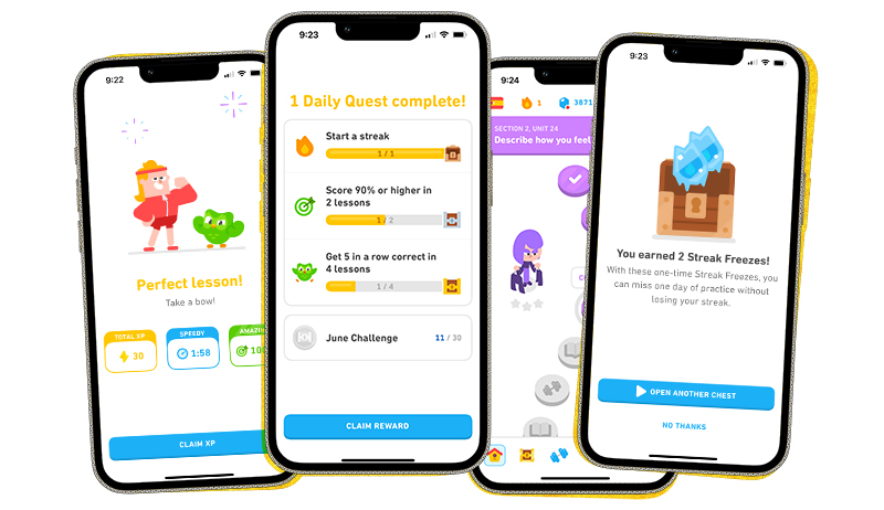
Image showing gamification in UX design.

The science of fun: Who does gamified UX appeal to?

(Spoiler alert: It’s everyone.)

While gamification might conjure up images of overly anxious Millennials amassing stars to swap for coffee at Starbucks or Boomers swiping away at Candy Crush, the reality is that the appeal of gamification in UX is far-reaching. 

The core psychological principles behind gamification are universal human motivators, tapping into our deep-down desires for accomplishment, recognition, and social connection.

Studies have shown that gamification can be effective across various demographics and in all kinds of applications:

  • Learning and development: Gamified learning platforms can make educational content more engaging and improve knowledge retention for all ages.
  • Employee engagement: Gamified internal applications can boost employee motivation, productivity, and collaboration. And we all know the employee experience matters.
  • Wellness and fitness: Fitness trackers and health apps incorporating gamification elements encourage users to adopt and maintain healthy habits.
  • Ultimately, gamification speaks to the inner competitor, the reward seeker, and the social butterfly within us all.

Learn more about how Tallwave creates outstanding digital experiences through design.

Image showing gamification in UX design.

Beyond the badge: The power of personalized gamification

While leaderboards and badges were the early pioneers of gamification, today’s approach goes beyond the superficial. Forward-thinking gamification personalizes the experience, tailoring rewards and challenges to individual user preferences and behavior. This means:

  • Dynamic difficulty: The difficulty level can adjust based on user performance, ensuring an enjoyable experience for both beginners and seasoned users.
  • Adaptive rewards: Rewards can be personalized based on user preferences, making them feel valued and motivated. 
  • Segmented experiences: Gamification elements can be tailored to specific user segments to drive relevant actions, like encouraging first-time users to complete onboarding steps or incentivizing loyal users to try new features.

This personalized approach fosters a deeper connection between users and the product, fostering long-term loyalty and brand advocacy. 

The future of personalized gamification in UX is even brighter with the integration of Artificial Intelligence. AI can leverage user data (assuming consumer consent and privacy requirements are met) to recommend relevant rewards and suggest social connections within the app, creating a truly individualized and engaging experience for each user. This level of personalization can further boost user motivation, satisfaction, and loyalty.

Real-world wins: Gamified UX success stories

Seeing the power of gamification of UX in action is as simple as opening up your smartphone or clicking over to your favorite retailer’s online storefront. Here are some inspiring examples of brands using gamification to achieve remarkable results:

Duolingo

This language learning app extensively uses gamification, with points, badges, leaderboards, and a daily streak system to keep users motivated and engaged in their language learning journey. The result? Duolingo boasts a high user retention rate and a loyal following. A social media presence dominated by an unhinged owl helps, too.

Starbucks Rewards

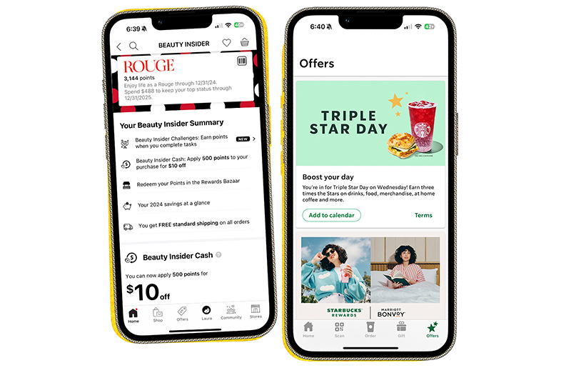
The Starbucks loyalty program is a masterclass in gamification. Users earn stars with every purchase, unlocking rewards and exclusive benefits. This program incentivizes purchases, builds brand loyalty, and encourages repeat visits.

Image showing gamification in UX design.

Sephora Beauty Insider

Sephora’s loyalty program, Beauty Insider, is a prime example of gamification done right. It uses a tiered system with point accumulation and rewards that incentivize purchases and brand loyalty. Members earn points for various actions, like making purchases, leaving reviews, and celebrating their birthdays. These points translate into rewards ranging from exclusive discounts and samples to early access to new products and invitations to special events. The program also incorporates a progress bar element, visually showing members how close they are to reaching the next tier (Insider, VIB, Rouge). It adds a touch of friendly competition and motivates them to keep engaging. This gamified approach fosters a sense of accomplishment and keeps customers returning for more, solidifying Sephora’s position as a leader in the beauty industry.

These examples showcase how gamification can seamlessly integrate into various applications to drive user engagement and achieve business goals.

Ready to help your brand win with gamified UX?

By incorporating gamification principles into your UX design, you can unlock a world of possibilities:

  • Increased user engagement: Gamification keeps users coming back for more, fostering long-term product loyalty.
  • Improved learning and onboarding: Gamified experiences can make learning and onboarding processes more engaging and effective.
  • Enhanced brand advocacy: Positive user experiences fueled by gamification can turn users into brand champions who spread the word.
  • Measurable results: User behavior data from gamified elements provides valuable insights to optimize your UX strategy further.

But wait, there’s more: Best practices for winning results

Here are some key considerations when implementing gamification into your digital product experience:

  • Align with your goals: Ensure gamification elements directly support your overall product objectives. Don’t just add points for the sake of adding points!
  • Keep it relevant: Tailor gamification mechanics to your target audience and the specific actions you want to encourage.
  • Don’t overdo it: Too many bells and whistles can overwhelm users. Keep it simple and seamlessly integrate gamification elements.
  • Measure and iterate: Track user behavior data to see what’s working and what’s not. Be prepared to refine your gamification approach based on insights

By strategically incorporating gamification into your UX design, you can create a more engaging and rewarding experience for your users, ultimately driving success for your business.

Partner with a digital agency that understands gamification

At Tallwave, we believe in the power of gamification to elevate the user experience. Our team of UX design experts can help you develop a gamified digital product strategy that seamlessly integrates with your overall vision and goals. Let’s work together to create a user experience that’s functional, fun, and engaging. We’re waiting to hear from you.

Categories
Customer Engagement Product Design Reaching New Customers Strategy UX Design

UX for all: Accessible app design for diverse users

Mobile apps are an indispensable part of our daily lives. They connect us, inform us, and entertain us. But for those of us with disabilities, some apps can be frustrating or even unusable due to accessibility barriers. We must recognize that accessibility in app design isn’t just about functionality and UX digital experience design—it’s about creating a welcoming, productive space for everyone and meeting legal standards such as ADA (Americans with Disabilities Act) and other international regulations.

Developing accessible apps not only reflects a commitment to ethical design but also offers significant benefits:

  • Reaching a wider audience: Accessible apps open doors to a vast and diverse user base, increasing your potential reach and market share.
  • Enhanced user experience: When everyone can navigate and interact with your app seamlessly, it increases user satisfaction and engagement.
  • Positive brand reputation: Demonstrating inclusivity through accessible design fosters brand loyalty and positions your company as a leader in responsible innovation.

The proof is in the pudding. See how Tallwave’s digital product design services team helped disrupt the status quo with an app made for those on the move.

Why inclusive app design matters now more than ever

While inclusive and accessible design is often discussed in the context of providing greater access for people with disabilities, it’s a high tide that raises all ships. Consider the curb cut, one of the most iconic physical examples of accessible design. When the first official curb cut was installed at an intersection on Telegraph Avenue in Berkeley, California, in 1972, a move that sparked the installation of hundreds of thousands more curb cuts all across the country, sidewalks became more accessible for people in wheelchairs. But they also became more accessible to parents with strollers, runners, kids on skateboards, and people wheeling loads, from workers with dollies and hand carts to business travelers with luggage. This application of accessible design didn’t just improve the experience of people with disabilities—it improved the experience for everyone. This phenomenon became known as the “curb cut effect,” and it applies as much to digital design as it does physical design.

With so many benefits to ethical and inclusive design for everyone, app accessibility standards are no longer a nicety but a core expectation for users with and without disabilities. As such, standards and guidelines are in place to drive designers toward accessibility.

The World Wide Web Consortium’s (W3C) Web Content Accessibility Guidelines (WCAG) are the foundation for all accessibility standards. These guidelines apply to web pages and mobile applications, encompassing both native and hybrid app formats. WCAG provides principles, guidelines, and success criteria to ensure web and app platforms are accessible to users with diverse disabilities. This promotes inclusion and prevents discrimination in daily online experiences. 

The WCAG is part of the W3C’s Web Accessibility Initiative (WAI). This initiative reflects a commitment to removing barriers for users with disabilities, ensuring they can navigate websites and interact with mobile apps as seamlessly as everyone else. With the introduction of WCAG 3.0 in May 2024, the guidelines are continuously evolving to address emerging technologies and more nuanced accessibility needs.

UX for accessibility: Creating user-friendly app experiences

The foundation of accessible app design lies in understanding the needs of diverse users. According to the CDC, up to 1 in 4 adults in the United States (more than 61 million people) has a disability. This includes people with visual impairments (4.8% of U.S. adults), hearing impairments (6.1% of U.S. adults), cognitive disabilities (12.8% of U.S. adults), motor limitations (12.1% of U.S. adults), and more. 

By conducting user research that involves people with disabilities and analyzing user data, you can identify potential challenges they face when interacting with apps. You’ll want to consider the kinds of assistive technologies your user base relies on to make the mobile app experience possible. These include refreshable braille displays for silent access to content, eye-tracking systems for navigation and typing, and sip-and-puff devices for controlling functions. Adaptive devices like specialized keyboards and styluses are often used by individuals with motor limitations to navigate mobile apps.

Leveraging user personas representing individuals with disabilities and conducting usability testing with diverse groups can provide valuable insights into making your app more accessible. Here are some basic considerations when incorporating UX for accessibility and accommodating assistive technologies in your app design:

Visual impairments 

  • Employ high color contrast between text and background to ensure readability.
  • Ensure compatibility with screen reader software for users who rely on audio cues.
  • Provide clear and concise text alternatives for all images (alt text).

Hearing impairments

  • Offer captions and transcripts for all video and audio content.
  • Allow users to adjust audio volume levels within the app.
  • Consider visual alerts alongside sound notifications.

Cognitive disabilities 

  • Use simple and straightforward language that’s easy to understand.
  • Implement clear and predictable layouts with consistent navigation patterns.
  • Offer multiple ways to complete tasks, catering to different user preferences and needs.

Motor limitations

  • Design touch-friendly interfaces with large, well-spaced buttons and icons.
  • Integrate voice control options for users who have difficulty interacting with the screen.
  • Ensure smooth keyboard navigation for users who rely on assistive technologies.

Beyond UX design: Content strategy for accessibility and inclusivity

The words and content within your app play a vital role in accessibility. Following guidelines like those provided by the A11Y Project and WCAG ensures that your content is accessible to everyone. Specifically, clarity and word choices matter. Accessible content is written clearly and concisely, avoiding jargon and complex sentence structures. Aim for a reading level that caters to a broad audience, usually between a 6th- and 8th-grade reading level.

Other important considerations for creating accessible content in apps include:

  • Plain language is powerful: Use everyday language that’s easy to understand. Avoid technical terms or industry jargon that may be unfamiliar to some users.
  • Alt text paints a picture: Don’t leave screen reader users out! Always include concise descriptions of images using alt text. Include details about the function the image serves on the page as well. Is it decorative? Is it an image of a product? 
  • Captions and transcripts for everyone: Make multimedia content accessible by providing captions for videos and transcripts for audio content.

Building brand loyalty: The positive impact of inclusive app design

Investing in accessibility and inclusive app design isn’t just the right thing to do; it’s a smart business decision. When users can interact with your app easily, they’re more likely to spend time within the platform, leading to higher engagement and increased retention. Businesses prioritizing accessibility see higher customer satisfaction and loyalty, giving them a competitive edge. Additionally, accessible apps remove barriers for a significant portion of the population, allowing you to tap into a previously untapped market segment.

Building inclusive and accessible apps: A journey, not a destination

By prioritizing accessibility, you’re creating an app experience that welcomes everyone. This opens doors to new users, strengthens your brand reputation, and sets you apart from the competition.

Ready to build an inclusive and accessible app or improve accessibility within an existing app? At Tallwave, we understand the power of design that works for everyone. Our team of experts specializes in user experience (UX), accessibility audits, and inclusive content strategy. Contact us today to discuss how we can help you create a user-friendly and accessible app that meets all industry standards.

Categories
News Reaching New Customers SEO UX Design

How can businesses benefit from a CDP vs. a CRM?

Think about all the different ways and places you’re interacting with your customers today. They’re visiting your website, interacting with your social channels, seeing your ads, engaging with your sales people, receiving emails from you, participating in loyalty programs, the list goes on. It takes a diverse lineup of tools and platforms to make all those interactions happen, each leveraging different data sets to drive and inform their operations and each creating and collecting data as those interactions happen. 

Data is the lifeblood of modern digital marketing ecosystems. But with the ever-growing data deluge, managing and leveraging it effectively can feel like you’re dealing with a data tsunami. Enter two essential tools: Customer Relationship Management (CRM) platforms and Customer Data Platforms (CDPs). While CRMs have been a mainstay for sales teams for years, CDPs can be game-changers for marketers. Let’s break down their distinct roles and how they can work together to supercharge your marketing efforts.

CRMs: The building blocks for customer relationships

Not only is it true that not all CRMs are created equal, they aren’t all designed to fulfill the exact same roles. In fact, there are 3 main types of CRMs, all of which are designed to enable businesses in different ways:

  • Collaborative CRMs: These are designed to combine and integrate marketing, sales, and customer service data to support a more effectively orchestrated customer journey. They’re used for interaction and channel management to illuminate the customer journey from initial touchpoint to conversion.
  • Analytical CRMs: These are designed to gather and analyze customer data to uncover customer insights. They’re used for data warehousing, mining, and online analytical processing (OLAP) tools to deliver actionable customer insights.
  • Operational CRMs: These are designed to simplify and streamline sales and marketing processes to enable and accelerate the path to conversion. They’re used for automation of marketing and sales activity, CX improvement, and driving to and tracking high-value actions.

More often than not, our clients are using operational CRMs to help sales and marketing teams manage customer interactions and relationships and track, assign, and manage action on leads, opportunities, and accounts. They enable sales teams to nurture and maintain long-term client relationships and maintain a clear view of the sales pipeline. However, it’s important to understand the limitations of CRMs when it comes to marketing:

  • Data silos: CRM data often exists in isolation, offering a snapshot of sales interactions but lacking the broader picture of customer behavior across different channels.
  • Limited personalization: While CRMs might support basic segmentation based on demographics or purchase history, they generally lack the sophisticated data analysis capabilities needed for truly personalized marketing campaigns.
  • Limited activation capabilities: While CRMs can be effective for enabling activation against customer data in channels like email and social, they often don’t offer sufficient capabilities to activate on all the channels marketing campaigns need to enter to meet customers where they are.

CDPs: Helping solve the customer journey Rubik’s Cube for digital marketing success

Remember all those channels and touchpoints where your customers could be engaging with you and all the data being leveraged and created through those interactions? That data is hard to take advantage of when pieces of it live in different places. A CRM might address some of them, but the complete picture, encompassing the full spectrum of customer behavior, remains elusive. This is where a CDP shines. 

For marketing teams, a customer data platform provides a solution for achieving a persistent, unified customer database. CDPs ingest vast amounts of online and offline data from many sources then match and merge this information into a single customer view. This includes:

  • Online and offline channels: Website interactions, purchase history, email clicks, social media engagement, CDPs gather it all, painting a holistic picture of customer activity across digital touchpoints.
  • Transactional data: Purchases, product preferences, abandoned carts, no detail escapes the CDP’s watchful eye, providing insights into customer buying habits and preferences.
  • Behavioral data: Website behavior, content consumption, search queries, CDPs unveil a detailed portrait of customer actions and interests, revealing how they engage with your brand.

This provides businesses with much greater insight into who their customers are and what they’re doing throughout their journeys. But the real value of a CDP is making that multi-source data actionable for marketing teams, giving them the insights they need to reach the right audiences at the right time, with the right message, across multiple channels, empowering them to:

  • Craft laser-focused campaigns: Analyze customer behavior, preferences, and interactions across all touchpoints to deliver personalized messages that resonate deeply. Imagine sending birthday discount codes to loyal customers or recommending products based on their past purchases.
  • Align with buyer needs: Understanding the buyer’s journey is essential for effective marketing. CDPs enable businesses to align their marketing efforts with buyer needs and cycles, ensuring that messaging is timely, relevant, and impactful. For example, if you ran an ecomm puzzle business and found that customers purchasing large, complex puzzles were also consuming blog content puzzle tips and strategies, this insight would allow you to proactively serve up content on advanced puzzle-solving techniques and special offers on puzzle glue designed for large projects.
  • Optimize marketing spend: A CDP can help you track which marketing channels are most effective at reaching your target audience and driving conversions so you can allocate resources efficiently. For example, you might see that your social media ads are generating more sales than your email campaigns and then adjust your budget to allocate more resources to social media advertising. This data-driven approach ensures you get the most bang for your marketing buck.
  • Measure campaign effectiveness: CDPs allow you to track the effectiveness of marketing campaigns across all channels to more effectively analyze impact and identify areas for improvement. For example, being able to track how many purchase conversions came from traffic that was generated from specific channels and campaigns allows you to measure ROI and optimization performance across multiple channels.

 A real-life example of a CDP solution

Now that we have outlined some of the business benefits of a CDP, let’s take a look at some concrete examples of how a niche cable provider uses their CDP to improve their business:

CDPs streamline sales and lead management

The company uses a CDP to track and manage sales opportunities across multiple channels, including online inquiries, inbound calls, and retail store visits. The CDP integrates data from various sources, such as website interactions, lead forms, and customer inquiries, to create a unified view of sales prospects within a single system. With all this data in a single system, when a customer submits an online inquiry about cable services, the CDP captures the lead information and assigns it to the appropriate sales representative based on predefined criteria, such as geographic location or service area. The sales representative receives a real-time notification and can follow up with the prospect promptly, updating the lead status and progress within the CDP.

CDPs foster deeper relationships and personalized experiences

They also use their CDP to enhance customer relationships by personalizing interactions and delivering tailored communications based on individual preferences and behaviors. The CDP aggregates data from customer interactions across various touchpoints, including website visits, support calls, and billing inquiries. If a customer contacts the customer service department to inquire about upgrading their service plan, the CDP retrieves the customer’s historical data, including past purchases, service requests, and usage patterns, to provide the representative with a complete view of the customer’s account. Armed with this information, the representative can offer personalized recommendations tailored to the customer’s needs and preferences, such as suggesting a bundled package with additional channels or faster internet speeds.

CDPs can maximize growth

With the CDP, they are able to easily analyze customer data and identify opportunities for upselling and cross-selling additional products and services. The CDP leverages built-in predictive analytics and machine learning algorithms to identify customers who are most likely to respond positively to targeted offers and promotions.

For example, when they launched a promotional campaign to encourage existing customers to upgrade to a premium cable package with exclusive sports channels, they used the CDP to identify customers who frequently watch sports-related content and have expressed interest in premium channel packages in the past. The CDP generates personalized offers tailored to each customer’s viewing preferences and history, such as discounted upgrade packages or free trial periods. By targeting the right customers with the right offers at the right time on the right communication channel, the cable provider can drive revenue growth and increase customer satisfaction.

Integrating CDPs and CRMs for enhanced insights

While CDPs and CRMs offer distinct functionalities, integrating these platforms can unlock powerful insights and synergies:

  • Deeper data integration: Seamlessly integrating CDP and CRM systems allows businesses to leverage customer data effectively across the entire organization. By breaking down data silos and enabling cross-functional collaboration, integration enhances visibility, efficiency, and decision-making.
  • Supercharged segmentation and targeting: Rich customer data from CDPs and CRMs enables businesses to create targeted segments based on demographic, behavioral, and psychographic attributes. By tailoring messaging and offers to specific audience segments, marketers can increase relevance and engagement, driving higher conversion rates and ROI. Especially when it comes to targeting, utilizing your existing first-party customer data is likely to yield a much more accurate view of lookalike audiences for example versus purchasing these audiences from a third party.
  • Powered-up personalization: Personalization is no longer a nice-to-have; it’s a must-have for modern marketers. CDPs and CRMs empower businesses to deliver personalized experiences at scale by leveraging AI and machine learning algorithms to analyze customer data, predict preferences, and automate content delivery across multiple channels.
  • Leveled-up lifecycle marketing: Customer journeys are complex and nonlinear, spanning multiple touchpoints and channels. CDPs and CRMs enable businesses to orchestrate personalized, omnichannel marketing campaigns that guide customers through the entire lifecycle, from awareness to advocacy.

Navigating ethical considerations and data privacy

CDPs are central to the ongoing and real-time collection, storage, and utilization of customer data for marketing purposes. As such, they play a crucial role in the age of data privacy regulations and heightened consumer awareness. It is critical to ensure ethical considerations and data privacy practices are upheld within marketing strategies according to the following:

  • Transparency and consent: CDPs aggregate data from various sources, including customer interactions, transactions, and engagements. Marketers leverage this comprehensive view of customer data to personalize marketing campaigns and improve customer experiences. However, to do so ethically, businesses must ensure that customers are fully informed about how their data is collected, used, and protected within the CDP. This transparency fosters trust between businesses and customers, enhancing the legitimacy of data-driven marketing efforts facilitated by the CDP.
  • Data security and compliance: Protecting customer data is not only a legal requirement but also a moral imperative. Businesses must implement robust security measures and comply with data protection regulations to safeguard customer information from unauthorized access, breaches, and misuse.
  • Fairness and bias mitigation: AI and machine learning algorithms have the potential to perpetuate biases and discrimination if not carefully monitored and mitigated. Businesses must ensure fairness and equity in algorithmic decision-making by regularly auditing models, testing for bias, and implementing corrective measures.

Implementing CRMs and CDPs with a dedicated partner 

CDPs and CRMs are complementary and indispensable tools and can be a powerful duo in a business’s digital marketing toolbox. While CRMs excel at managing customer interactions and sales activities and providing a record of individual customer journeys, CDPs illuminate customer behaviors across all touchpoints, drive more nuanced customer segmentation, and activate marketing efforts against customer data across all channels at scale. When used together, they offer a holistic view of the customer, enabling marketers to craft highly targeted campaigns, personalize content and offers, and optimize marketing spend.

However, it’s crucial to choose CDPs that integrate seamlessly with existing CRMs and to invest in the data discovery—requirements gathering, data architecture, and data classification and mapping—and data retrieval and harmonization efforts required to ensure smooth data flow, avoid creating data silos, and set your implementation up for success. It’s also important to adopt a responsible approach to data management that prioritizes transparency, security, and fairness to uphold ethical standards and foster customer trust. An experienced partner can help you unlock the combined data-driven power of a CDP and CRM to fuel higher performing digital marketing strategies while applying responsible practices for data privacy. ready to build out your business use cases for implementing a CRM or a CDP, or integrating the two, let’s talk.

Categories
Customer Engagement News Product Design Uncategorized UX Design

It’s never the end: Continuously evolving product improvement

About this series: Great products are built using good problem-solving, and the best way to solve problems is to define needs and then meet them in every user interaction. Alignment across teams and channels ensures that expectations are set correctly and delivered on effectively at every stage of the user journey. Great design starts way back at defining the problem and extends through the entire product lifecycle, continuing long after launch and into the ongoing iterations of product development. Great design is a cornerstone for great products, driving great business, and creating opportunity. Read on to learn how ongoing iteration and innovation in the product design process makes great product design and the business value it creates sustainable. If you missed the first two installments, be sure to check out the other blogs in our series: 

The design journey continues post-launch

Embarking on a successful product launch is a journey that requires planning, strategic collaboration, and continuous improvement. Crafting an effective launch strategy is the foundation, involving comprehensive market research, targeted messaging, and utilizing diverse marketing channels to build awareness and demand. Integrating a motivated and informed team becomes paramount as the launch unfolds, fostering a collaborative environment where each member contributes to the product’s success. Post-launch, the journey doesn’t end; it transforms into a dynamic cycle of continuous improvement. User feedback emerges as a guiding force, steering the development team toward iterative enhancements that align with evolving user needs. The importance of great design in this phase cannot be overstated, as design systems, seamless handoffs, and branding alignment contribute to a visually cohesive and engaging user experience. 

Crafting effective launch strategies for product success

Launching a new product is challenging and the foundation for success is laid in the earliest stages of product development with a well-thought-out strategy centered around a clear and strong problem statement. That problem statement should provide connective tissue through the product development process and into planning for the product launch, including product positioning and go-to-marketing messaging. Ensuring that your product strategy as a whole is driven by a clear problem statement will help ensure consistency and alignment at every stage of the product journey. Additionally, you must leverage the right mix of marketing channels based on your target audience’s preferences and behaviors, such as social media, email, and influencers. This ensures a broad reach and sustained interest leading up to the launch. This comprehensive approach creates excitement and establishes a strong foundation for the product’s success in the market.

An effective internal launch paves the way for a successful external launch. Creating buzz and anticipation across your cross-functional team is a crucial aspect of a successful product launch. A cohesive team that is well-informed and motivated can significantly impact the outcome. Communication is key; share the vision, goals, and milestones with your team to foster a sense of unity and purpose. This will ensure that a single vision will be promoted across the team and translate seamlessly into the customer experience. When every person on the team knows how the pitch will go, they can all use their collective resources to lean into launch.

Allowing team members to contribute their unique perspectives by encouraging open dialogue and idea-sharing is also important as you consider external launch. By involving everyone in the process, from marketing and sales to product development, you harness the collective energy and expertise of your team. This collaborative approach not only generates creative ideas, but also ensures that everyone is aligned and committed to the launch’s success. Crafting an effective internal and external launch strategy is a dynamic process that requires adaptability and ongoing assessment to ensure the success of your product in the ever-evolving market.

Learn more about Tallwave’s Digital Experience Design Services.

Driving iteration with user feedback in the continuous improvement process

As a new product is launched to the market, it’s easy to assume that’s where the product team’s job ends and the marketing team’s job begins. But in truth, product launch is a phase that should bring these teams even closer together to bring the product to market while closing the feedback loop to drive continuous product improvement. Following launch, monitoring the performance of the product and features is paramount. This holistic approach to performance evaluation provides valuable insights into customer preferences and behavior. Utilize analytics tools to track key metrics, such as user engagement, conversion rates, and customer feedback. By analyzing the broader landscape, you can adapt your strategies and address any issues that may arise swiftly. 

Continuous improvement is a cornerstone of long-term success, and by keeping a close eye on performance metrics, you can make data-driven decisions to refine your product and marketing strategies for sustained growth. Regular updates and releases based on user insights not only demonstrate responsiveness to customer needs but also foster a sense of trust and loyalty. This iterative approach transforms the product development process into a dynamic, user-centric journey, where each iteration builds upon the last, leading to a more refined and valuable end product.

The role of design in continuous improvement strategies

Great design plays a critical role in driving iteration and responding to user feedback effectively. Design systems provide a framework for consistency, enabling seamless integration of new features while maintaining a cohesive user experience. Additionally, well-managed handoffs between design and development teams streamline the implementation of design changes, reducing friction and accelerating the iteration process. Aligning branding elements across marketing channels and into the product will ensure user expectations are met at every turn. During iterations, a holistic approach to design, design systems, handoffs, and branding alignment ensures that the process is not only efficient but also results in a cohesive and engaging user experience.

Product success factors and the pursuit of excellence

In the ongoing journey of product development, launch is never the end; it’s the beginning and it launches the team into a cycle of perpetual refinement. Our products can exceed audiences’ expectations by embracing user feedback and integrating it into the continuous improvement process. The collaborative spirit within teams and the strategic planning behind launches form the basis of success. Throughout this dynamic journey, it’s important to celebrate the milestones achieved, learn from the challenges faced, and remain committed to the pursuit of innovation. The combination of effective launch strategies, user needs-driven iteration, and thoughtful design ensures that  products stay relevant and evolve into solutions that resonate deeply with users. Here’s to the continuous pursuit of excellence in product development and the exciting possibilities that lie ahead on this ever-evolving path of innovation.

Are you ready to pursue product design excellence with a team that understands cross-functional teams and embraces continuous innovation? We are. Let’s talk.

Categories
UX Design

Unlocking success: The impact of collaborative product development

About this series: Great products are not just about great functionality, pretty graphics, or even revenue. Great products are about solving problems for the people who use them so well that they return again and again. It’s easy to miss the needs those humans have when focusing on the individual components from a specific (and inherently limited) perspective. Each department in your business sees a different part of the story and a different way that customers engage with products. As we continue to explore the business value of great design, remember that only the BEST problem statements deliver the best designs. And when it comes to delivering the best problem statements, cross-functional teams have the advantage. Let’s unlock the potential of great design as the ultimate path to great business and how cross functionality advances it.

See the first installment of our three-part series here: Define the problem, not the solution.

What happens when teams align?

Design excellence requires more than individual brilliance; it demands diverse talents and perspectives. Digital products today are so easy to build that great digital products must shine brighter than most, which means solutions must be sourced from across the business landscape and not just from one person or team. Collaboration is pivotal for exceptional design and each player has a vital role toward innovation in product development and customer experience. 

There is power that arises when different disciplines converge, contributing their unique insights to sculpt a solution and then align on building that experience together. Let’s look at the magic that happens when teams align for collaborative product development.

Introduction to cross-functional teamwork

The concept of cross-functional teamwork is easy to grasp; when more perspectives are available, there should be fewer gaps during design and build. Executing well on a cross-functional team, however, can be incredibly challenging and depends on many factors, including leadership, organizational structure, time and talent available, and individual personalities. Much of the challenge of effective teamwork in general is alignment. It can be difficult for a company to work toward a single strategic goal if one team is doing something radically different. Cross-functional teams have a distinct advantage in this situation as they can draw on team members’ experiences from various disciplines to move toward a singular goal. Collaborative product development enhances efficiency and becomes a cornerstone for cultivating a culture of creativity and adaptability within an organization.

When companies organize by customer experience or mission rather than by feature or technology stack, there is a lot of opportunity to build cross-functional teams with shared goals. This strategic approach allows a customer outcome to be analyzed and improved from various perspectives, unlocking gaps or opportunities that might have otherwise been missed. Think about a customer that is signing up for a new software product. In that single customer experience, they will likely encounter the general marketing of the company and the product itself, as well as welcome emails, onboarding tutorials, and probably a community of users, not to mention new targeted social media ads. In a cross-functional team, there are a lot fewer gaps than if different team members handle each of those customer touch points. 

Building cross-functional teams

At the heart of building effective cross-functional teams lies the intentional structure of diverse skill sets to propel creative problem-solving. That doesn’t mean that all skill sets are required all the time. Building a cross-functional team is as much about communication and timing around when and how skill sets are brought together. Understanding how and when to bring team members in and out of the conversation (with the right amount of context and background) is a skill that each organization must build and refine. 

As we shared in the first part of this series, great design starts with a strong problem statement. But problem statement development can also be the starting point for effective cross-functional collaboration.  Sharing qualitative and quantitative UX research results across a diverse team to build a great problem statement will ensure that the right team members are being consulted for the cross-functional team to create the best customer experience to solve that problem. It’s useful to bring various stakeholders together during a solutioning conversation, essentially beginning with the ‘entire’ team to get perspectives on the customer experience and potential solutions. It might seem like a design or marketing team is all that’s needed in this ideation stage, but it’s incredibly valuable to bring varying perspectives in at this point. After that, it’s more useful to think of all of those participants as stakeholders who need to be ‘informed,’ but the responsibility will shift from department to department as the development progresses. 

As in the example above, there are various customer touchpoints that different teams might own, but all of the stakeholders involved need to be informed each step of the way in order to ensure a cohesive customer experience. For example, when the marketing website for a new product is being launched, the product design team needs to ensure that the expectations set on the marketing website reflect the realities of the final product. Similarly, the customer success team needs to ensure they aren’t asking customers for information they’ve already provided via the marketing website or other pre-sales activity. By keeping these cross-functional team members informed, they can hold each other accountable for gaps, missed opportunities or missed expectations throughout the customer experience.

We know a thing or two about communication across teams. Learn more about how Tallwave builds bridges between business and technology.

Critical information for critical stakeholders

Cross-functional teamwork is vital to the success of a good product but that doesn’t mean that each stakeholder must be present for each conversation. Being efficient when sharing critical information can really elevate the communication across team members. Documentation and communication needs to go beyond live, collaborative communication to consider how to effectively institutionalize critical information in a way that contextualizes it for different stakeholders while driving alignment to an overarching vision and topline business goals. These versatile communications become more than just documents or “updates;” they evolve into powerful tools that communicate a unified vision, fostering cohesion and alignment among teams and organizations. A well-built roadmap is an excellent example of a flexible communication strategy that can share the most critical information to a variety of stakeholders. When presenting to leadership, the roadmap can be collapsed to only show the highest level strategy and initiatives. As conversation is required and/or different stakeholders are included, the roadmap can be expanded to show various tasks and strategies that will come together to deliver the initiatives. Leveraging communication tools that can adapt to the intended audience is a valuable way to keep communication up to date across team members.

Summing it up: Embrace a collaborative process

Creating and fostering a strong cross-functional and collaborative culture may not be the most obvious enabler to exceptional product design. But the impact of driving diverse perspectives into the product design process is key to unlocking its full business value. It can be difficult to create a highly collaborative environment, particularly when time is tight, the strategic importance of collaboration isn’t clear, and organizational silos get in the way. Enlisting the help of a neutral third party can be an effective way to broker buy-in on the value of strong cross-functional collaboration, align priorities across different teams and departments, and challenge historical organizational silos. Beyond the product design strategy and execution support we provide to our clients, we often find that the role we play in uniting cross-functional teams behind a common goal and achieving a shared point of view is equally valuable. 

Are you ready to embrace a cross-functional and collaborative design process led by a strategic partner? Tallwave is ready to get to work and help your organization excel. Let’s talk.

Categories
Customer Engagement Product Design Reaching New Customers UX Design

UX design: Define the problem, not the solution

About this series: In the fast-paced business world, it’s all too common to hear about companies striving to become “product-led” and chasing after metrics like velocity and conversion rates. While these numbers undoubtedly hold significance, they often overshadow the underlying force that drives the success of great products: design. Design is not just about aesthetics; it’s about understanding your customers, empathizing with their needs, and crafting solutions that meet and exceed their expectations. In this exciting three-part blog series, we will dive deep into the realm of design and design strategy and its pivotal role in achieving business goals. Let’s unlock the potential of great design as the ultimate path to great business.

Understanding the cornerstones of great product design

In the ever-evolving landscape of product design, success hinges on the ability to navigate a maze of user needs and expectations. Understanding the need at hand and then defining the actual problem is a crucial first step that can make or break the entire journey. You might have a fantastic idea for a product but if you aren’t drilling down to the true problem that this product is solving, then you aren’t going to be able to truly satisfy customers. This design stage uncovers true pain points for customers to ensure your product is solving the right problem and a real problem. Understanding user needs and defining the problem are cornerstones of successful products, ultimately paving the way for continually high business value.

Empathy: The heart of a user’s needs

User needs are the foundation of good design, placing the customer at the very heart of the product development process.  It’s imperative to empathize with users’ unique experiences, desires, and pain points when creating designs that resonate. User needs specific to a problem serve as a constant reminder that humans (specifically users) are at the core of the design process. By placing the human at the center of design, user needs act as constant reminders that the end goal is not just a product but a solution that addresses real-life challenges.

Moving from good to great design requires more than just a surface-level understanding of desired functionality. It requires a combination of both qualitative and quantitative UX research techniques that delve deep into user needs. First, quantitative UX research methods provide a structured and data-driven approach to learning about user behavior and preferences. Understanding the numerical data and statistical analysis can help you quantify user interactions, preferences, and performance. Surveys, questionnaires, A/B testing, and analytics tools are common examples of quantitative research techniques. Teams don’t need to use all of them every time, but carefully selecting a combination of methods will bring some helpful data to the surface as you assess user needs. These methods allow for the identification of patterns and trends, enabling UX researchers to create informed hypotheses about user needs. Quantitative research complements qualitative research by offering a more objective and measurable perspective, providing the necessary data to think through problems and have support for business decisions.

Qualitative user experience research methods provide valuable insights into the intricacies of user behavior, emotions, and perceptions. These methods delve deep into the more nuanced and harder to quantify psychological aspects of user interactions, aiming to understand what users do and why they do it. Qualitative research techniques, such as in-depth interviews, usability testing, and ethnographic studies, offer a way to channel the individual perspectives and experiences of users. Open-ended questions and real-time observations can help researchers uncover users’ needs, pain points, and desires, shedding light on the nuances that quantitative data often cannot capture. Qualitative research is an indispensable tool for human-centered design, enabling designers and businesses to truly understand user needs on a deeper level.

User needs are the baseline of effective design and encapsulate the essence of what the user truly desires and values. Before jumping to solutions or pixels, design teams must first empathize with their target audience, truly understanding their hopes, aspirations, and pain points. Taking the time to crystallize the human-focused needs and desires of the users ensures that every design decision is rooted in empathy and a genuine desire to enhance the user experience. Businesses that research, prioritize, and build products for these needs are not only better equipped to stay competitive in an ever-changing market but also to forge lasting, meaningful connections with their customers.

We know a thing or two about consumer values. Check out our post on the new persona playbook.

Crafting the perfect product design problem statement

With a solid understanding of user needs in hand, next up is crafting a clear problem statement to fuel product creation. A well-defined problem statement encapsulates the precise challenge that needs to be addressed, serving as instructions for design teams. Outlining the problem’s scope and context ensures that the design effort remains aligned with the customers’ real pain points and needs, allowing for a solution that truly resonates with them. This clarity and alignment fosters creativity and innovation in finding the optimal solution. It ensures that the entire team is headed in one direction, toward solving one problem. A well-crafted problem statement that is based on solid UX research guides the design process toward an excellent customer experience.

When thinking about the parts of a perfect problem statement, you must consider the person as well as the problem. This might be a problem that only a certain type of person has or a problem that lots of people have but only at specific moments in their lives. The person in the middle of the problem is just as important as the problem itself and cannot be separated from the problem statement. In addition to the who, problem statements must also consider the why but without the how. When the right amount of research has been done, there should be no trouble succinctly explaining for whom the problem exists and why. As the team sets out to create a solution for this problem, user needs and problem statements come into play. The goal is to reach an actionable problem statement that defines for whom you’re  building the product or feature and why.

The positive impact of a clear problem statement reverberates through the entire business ecosystem. First and foremost, it reduces the risk of costly missteps in product creation. By defining the problem clearly, teams can avoid the pitfall of investing time and resources into solutions that do not address the root issues. It ensures that design efforts are aligned with the actual needs and pain points of the target audience and that the team is setting out to solve for the user and their why. As a result, products are more likely to resonate with and create value for users, leading to enhanced customer satisfaction, loyalty, and advocacy. A great problem statement empowers businesses to differentiate themselves in the market, gain a competitive edge, and drive sustainable growth. In sum, a clear problem statement acts as the catalyst for great design, and when design excels, so does business.

Learn more about Tallwave’s Digital Experience Design Services.

Wrapping Up: Great design, greater user experience

In the realm of product design and business success, two critical elements stand out as paramount: crafting well-defined user needs statements and clear problem statements. These statements act as the guiding light that illuminates the path to exceptional design and, in turn, outstanding business performance. User needs statements distill the essence of what customers truly value, enabling design teams to create products that resonate, cultivate customer loyalty, and fuel lasting trust. Clear problem statements also serve as a map for design, defining the challenge, scope, and objectives. They streamline decision-making, stimulate innovation, and ensure that design efforts align with real customer needs, ultimately reducing the risk of costly errors. The result is a positive ripple effect that enhances customer satisfaction, differentiation in the market, and sustainable business growth. In sum, these foundational statements are the key to unlocking the synergy between great design and great business.

Are you ready to embrace great design and improve customer experiences? We’re all ears. Let’s talk about your next project. And there’s more on the way; stay tuned for the second installment of this series! We’ll delve into how collaboration leads to the best design outcomes.

Play Video

Bunger Steel

Doing some things and making some impacts