Categories
Strategy

Design Studios 101: What, Why, & How to Use Them For Innovation

Most companies share three universal struggles: Breaking down siloed teams, overcoming limited long-term thinking, and resolving internal misalignment around  goals and strategies. So, when it comes time to brainstorm for innovation, these issues cause teams and companies to get stuck in what exists now, rather than envisioning services, products, and experiences that could exist tomorrow.


In some ways – that’s a good thing. Pragmatism and realism are essential to growing and scaling any business. But sometimes – and more often than not – it limits teams from meeting their goals, crafting simple, valuable, and meaningful experiences, and driving market demand. On top of that, when numerous puzzle pieces are moving at the same time, the cross-functional sharing of ideas and integration of work streams can suffer, ultimately delivering a less efficient and effective end result and customer experience. All of which can hinder customer engagement and value realization. 


Enter: Design studios.


Definition of Design Studio

What Are Design Studios & Who Are They Right For?

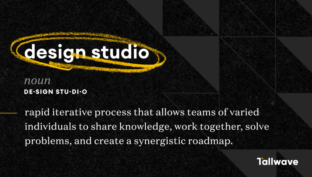
A design studio is a rapid iterative process that allows teams of varied individuals to share knowledge, work together, solve problems, and create a synergistic roadmap. It’s all about quick collaboration, ideation, and idea creation to find efficiencies in the work, tackle multiple user needs simultaneously, and create a more streamlined and impactful user experience that lends itself to higher conversions, increase customer engagement, and value realization.


And design studios aren’t just for product design teams. Sure, they’re most effective when a team is working towards solving problems that have some sort of visual aspect, but they can be utilized for conceptualization, as well. The design thinking practices used throughout Design Studios help push ideation beyond opportunity and optimization, and encourage new ways of aligning and envisioning the future state of a service or product for all teams and work streams. For example, when design thinking is applied to defining the scope and length of media strategies, performance marketing teams can cultivate alignment around target demographics, communication styles, engagement opportunities, and projected outcomes.

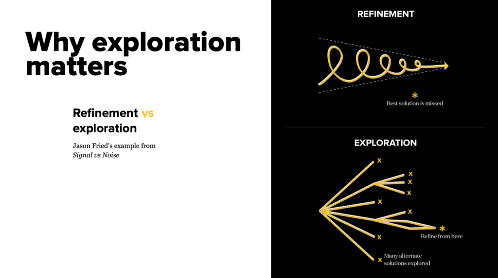
Refinement is not the goal, exploration of multiple and near-indefinite ideas is.

7 Ways Design Studios Help Teams

Design studios help people communicate pain points, opportunities, and day-to-day issues in a natural, uninhibited way, which ultimately uncovers moments of truth that maybe wouldn’t have been pinpointed in formal conversations. Because of this, design studios help teams:


  1. Establish a framework for teams to fully understand design challenges.
  2. Hear ideas from all perspectives within the team.
  3. Share, iterate, and solidify team ideas.
  4. Break down siloed team initiatives and, instead, empowers a culture of shared ownership.
  5. Generate many ideas within a short span of time.
  6. Encourage open and honest critique in a safe, judgement-free space that allow teams to break down barriers within organizations in a positive way.
  7. Force team members to defend their ideas and negotiate with other team members, establishing productive and useful habits long-term.

From the business development side, design studios help teams assess and identify root causes of internal obstacles and misalignment. Perhaps there are gaps that haven’t been explored because the right questions haven’t been asked. Design studios provide a unique opportunity for leaders and partners to understand the company’s problems through a variety of lenses, and encourages cross-functional collaboration to build on ideas and learn from each other.


The biggest thing to remember is that exploration is key and the ultimate goal of a design studio. Too often, teams focus on refining one idea, rather than welcoming and considering new ones. If real commitment to exploration isn’t integrated into the process, opportunities to refine and uncover potentially better solutions may be lost. So, refinement is not the goal, exploration of multiple and near-indefinite ideas is. Once all the ideas have been shared and outlined, refinement can begin.


Refinement vs. exploration in Design Studios

How to Host a Design Studio

First, make sure all participants have a clear understanding and definition of the target or buyer personas. Questions to answer before a design studio include:


  • Personas: Who are you designing for?
  • Scenario: What situation are you designing for?
  • Design Principles: What guidelines should you consider?
  • Business Requirements: What are business requirements, if any?
  • Layout Studio Organization: What does everyone need to do?


Step-by-step design studio instructions

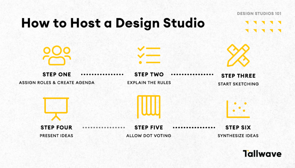
Step 1: Assign roles & make Design Studio decisions

You should have one person designated as the facilitator, the timekeeper and the recorder.


The facilitator essentially runs the show and ensures all rules are followed and a safe, collaborative environment remains intact throughout the process. It’s the facilitators’ job to problem solve on the fly, as needed, to ensure  all Design Studio steps are completed from start to finish.


The timekeeper does just that – keeps time.


The recorder takes notes on all expressed pain points, presentations, disagreements, negotiations, ideas, and agreements that surface throughout the process, as well as outlines the plan for initial next steps.


This team of Design Studio leaders should decide how many design iterations will take place and the timeline for each step. The time allocated and number of iterations largely depends on the size of the group and the total time you have for the Design Studio in its entirety. The leaders should figure out “the math” and then create a brief itinerary to be shared with all participants at the beginning of the studio.

Tip: When we host Design Studios, we usually allocate five minutes for people to present and explain their sketches.

Step 2: Explain the Rules

Whether in-person or hosting a Design Studio virtually using Zoom or other digital conference tool, kick-off off the exercise by sharing the three cardinal rules:

  1. Everyone sketches! All participants in a design studio are doers, not viewers, even if they’ve never done this type or work before. Forcing everyone to actively participate illuminates a huge opportunity for digital experience teams in the organization to come together to work toward one common goal.
  2. No whiteboarding. It has its place and purpose, but it doesn’t belong in a design studio. If your group, team, or table is talking, you’re using group think, not generating new, unique ideas.
  3. Have fun and be creative! The goal for the design studio is to reimagine what’s possible in a creative safe zone. Often, companies focus on an opportunity and have a hard time thinking beyond current limitations and capabilities of technology. Instead of imagining what the experience could be or should be, they identify a specific project, workflow, or stage within the existing user experience they want to improve, but the point of the studio is to give team members an opportunity to reimagine. Disagreements can be verbalized, but it should be done in a kind, drama-free way. And remember, no idea is “too big” or “too crazy.” Encourage your team to push the envelope – or even bust it wide open.

This is also a great time to share the Design Studio agenda and field any remaining questions!

Also read: How to Set Content & Design Teams Up For CX Success

Step three: Start sketching

As outlined in the rules, everyone in the Design Studio is required to sketch. If hosting an in-person Design Study, all participants should be armed with lined or dotted letter paper, black pens for drawing, and colored pens for annotating. You can choose to provide sharpies for creating bold lines, light gray markers for filling in background areas, highlighters or colored markers for emphasis on call-to-action buttons, and post-its, as well. Digital sketching tools, such as drawing apps on a tablet, are also acceptable.


Virtual Design Studios require a bit more equipment to pull off – planning is key. Everyone will need a phone, camera, or scanner for taking photos of their sketches. We often suggest an iPevo camera. Additionally, a digital board – like Miro or InVision – will need to be set up to collect and organize sketches.


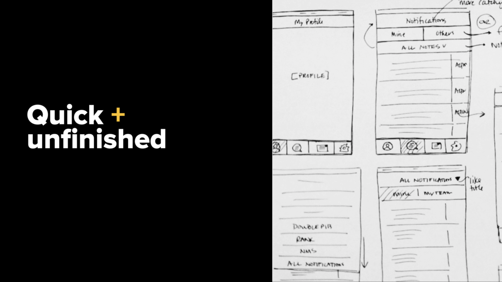
Sketches can be quick and unfinished, communicative, and iterative. All participants should avoid getting too sketchy – straight lines are best – and keep color and illustrations (people, stars, avatars) to a minimum.


Examples of unfinished sketches in a Design Studio

Step four: Present ideas

If in-person, all participants should present their designs and then hang their drawing on the wall.


If hosting a virtual Design Studio, all sketches should be uploaded to a group chat or designated Invision or Miro board. If uploaded to a group chat, the facilitator is responsible for adding them to an Invision or Miro board. Ideally, participants would then present their sketches in real-time using an iPevo camera.

But what about feedback and questions? Ideally, participants should be encouraged to ask questions after each sketch presentation and time should be allocated at the end of each iteration for everyone to chat about the ideas. But, ultimately, it is up to the facilitator to determine if the conversation at hand is worth the time it’s taking. You should empower people to collaborate, ask questions and challenges ideas as they are freshly presented, but if the timeline for the Design Studio is very tight, you can save all conversations for the end.

Tip: When hosting virtual Design Studios, we utilize and upload all images to Invision boards. It’s well organized and allows all ideas to be in one place for every single group, every iteration. This is one great way to overcome logistical challenges associated with hosting remote design studios.

Step five: Allow dot voting

This is the step within the Design Studio when everyone evaluates all completed sketches and – using their assigned number of dots (we allocate five per iteration to each participant), distribute their dots according to preference and favorability. So, say, for example, someone was really excited about one idea. They could give it all five of there dots to that singular concept – that denotes highest value. Or grant single dots to individual components or features that were sketched.


The voting stage is just as important as the sketching stage! Everyone must participate in order to identify the ideas that are strongest and drive ultimate agreeance and alignment. If you run out of time and can’t execute this step during the Design Studio session, you can enable dot voting after the fact, but be sure to communicate a due date for all votes to be in.


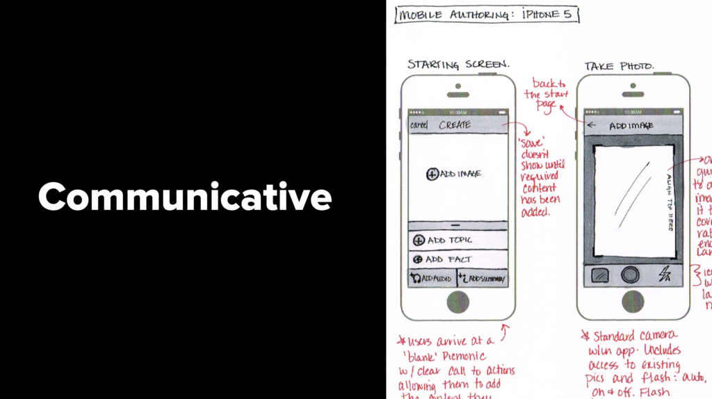
Examples of communicative sketches in a Design Studio

Step 5: Synthesize all sketches, ideas, and voting results

Have a product designer or UX expert synthesize all sketches and ideas, group them into themes, outline insights, and recommend a plan for next steps. This synthesis should then be sent to all stakeholders across departments for validation and final buy-in.

Step 6: Start defining and project planning

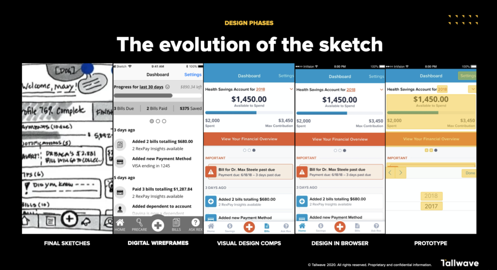
Next, identify and organize design phases so that concepting can begin.


The evolution of the sketch in a Design Studio


Also read: How to Holistically Map the Entire Customer Journey

The Bottom Line:

Design Studios are incredibly useful when trying to break down silos, create integrated workflows, establish shared ownership, and innovate around existing experiences or solve problems. By bringing numerous perspectives, ideas, experts, and opinions into one room, they can pave the way for innovative ideas and visions for the future, and help improve cross-functional collaboration, communication, ownership, and alignment across stakeholders and departments, which ultimately impacts the final customer experience, increases customer engagement, and improves value realization.


By executing or working with partners to power Design Studios regularly, companies can encourage proactive future thinking and help cultivate a stronger, more collaborative work culture that’s focused around the customer experience and ongoing improvement.

Categories
News This Week in CX

This Week in CX: 3 Big Healthcare Tech Companies & Providers Announce Future CX Plans

The healthcare industry was always going to need to integrate and provide more personalized digital-first experiences for patients. The 2020 pandemic just sped up that demand.


Patient experiences in healthcare – and how to improve them – is something we talk about a lot. Whether with prospects, our current healthcare clients or internal teammates, we’re always hypothesizing, testing, and implementing new data-driven strategies designed to solve the acquisition, engagement, and retention challenges that many organizations are facing. These solutions always have one theme in common: They’re developed with humans at the core and with heart.


This week, a number of companies dedicated to developing technologies and holistic strategies that streamline healthcare experiences and improve patient engagement made announcements that will help organizations get one step closer to delivering truly personalized CX. No matter your CX speciality, these stories serve to showcase the ways in which companies are getting creative with innovative technologies and may provide some much-needed inspiration into CX takeaways for businesses small and large.


Here are the biggest business, tech and data developments that occurred this past week and will most certainly impact how we design and deliver the customer experiences of tomorrow.


HIPPA Just Gave a New Telehealth Video Feedback & Engagement Platform the Green Light


Twenty-first century technology is so cool. A new “video feedback and engagement platform” designed for healthcare providers and pharmaceutical companies fits that bill. Medallia, Inc., a SaaS company that develops technologies for customer experience management, is getting ready to change how healthcare needs are heard and understood with their newest product, Medallia LivingLens.

It all comes down to making patients feel seen, heard, understood, and authentically cared for.

The video solution – which achieved HIPPA compliance this past week – gathers real-time customer and employee sentiment (feelings, perceptions or attitudes that arise during experiences) during telehealth sessions. Using proprietary AI technology, the solution “captures six times more information with video feedback than tradition, open-ended text based solutions, including nonverbal communication, such as body language.” This results in action-based insights that enable practitioners to predict and overcome barriers associated with providing optimal care and exceptional telehealth experiences.


One company currently using the solution, Just Worldwide, says the Medallia LivingLens allows them to analyze patient “video diaries,” understand how patients feel, and uncover what they wish their caregivers knew. “We use it to get the emotional impact of a patient,” explained Sally Udayakumar, Research Manager at Just Worldwide.


This is going to open up a whole new world of care that practitioners are able to provide to patients – including preventative care.


“Organizations and practitioners can only truly be lifelong partners if they are emphasizing and providing preventive care to patients,” says Tallwave Product Designer Chelsey Gloetzner. “Those who are proactively providing preventative and whole-person care will naturally improve patient engagement in-between sick visits.”


Also read: Innovators Q&A: How Avidon Is Solving the Patient Engagement Problem In Healthcare

It all comes down to making patients feel seen, heard, understood, and authentically cared for. Previously, practitioners could only know what patients verbally told them or they could physically observe. Now, Medallia LivingLens allows them to dig so much deeper, and provide a level of care that they’ve never been able to before. And it will only contribute to increased satisfaction and loyalty.


“Patients that know and believe you have their best interest in mind will more willingly partner and trust healthcare providers long term,” says Chelsey.


But will this technology – and telehealth appointments – still persist as the pandemic chapter comes to a close? You can count on it.


“Many patients who have become comfortable with telehealth will still prefer this type of appointment in a post-COVID world,” predicts Chelsey. “More doctors are experiencing the benefits of taking these types of appointments as well. In the future, it is feasible that telehealth will not lose its demand.”


That doesn’t mean all telehealth challenges are resolved. In fact, there’s one outstanding problem that we’re currently helping clients solve for: The need for increased education to help onboard older generations.


“It is a unique challenge because those who would greatly benefit from telehealth appointments due to age, physical limitation or challenges finding transportation to appointments, tend to have the most difficult time utilizing the technology,” Chelsey says. “Without the proper introduction and training for this technology, a large demographic of potential users will not be able to benefit from telehealth appointments. Putting walkthroughs or training within the technology itself will not meet the needs of those who must learn how to utilize this type of technology and the devices they would use it on.”


So, once you know how to connect with your practitioners via the internet, you can bet that computer or mobile phone lens is allowing them to peer right into your soul.

Microsoft’s Healthcare Bot Migrates to the Azure Platform


If you haven’t noticed, you’re surrounded by robots.


Internet bots, that is (think chatbots, Alex, Siri – you get it). And if healthcare organizations weren’t using them before, you can bet they’ll be embedding them into their customer experiences soon.


Microsoft announced their plans to migrate their Healthcare Bot to the Azure platform, enabling healthcare developers to customize bots for both clinical and/or operational uses and build new conversational tools. Additionally, organizations will be able to use the new Azure Health Bot as virtual health assistants, ensure compliance requirements related to privacy and security mechanisms, and merge electronic medical records into touchpoints to drive more personalized, holistic experiences.


“It’s really great to see healthcare companies leveraging and investing in technology to remove barriers and friction from the customer experience,” says our Senior Product Designer Alyssa Hayes. “Healthcare on its own can be notoriously complicated and stressful. Even the routine stuff, especially when you toss in some unexpected illnesses or accidents, can be a burden to navigate. Using technology to naturally provide personalized care – while delivering an experience that’s more approachable and predictable – will help put patients at ease and enable them to understand what they need to do to achieve better health. It gives them one less thing to worry about.”


That’s something everyone could use a little more of, these days.


Also read: Real People Tell Us What They Want From Healthcare In 2021

"This type of bot technology is providing great opportunities for healthcare practitioners and organizations to build trust and provide care that is truly valuable."

“There’s nothing more personal than your own health,” says Alyssa. “This type of bot technology is providing great opportunities for healthcare practitioners and organizations to build trust and provide care that is truly valuable.”


Our Chief Operations Office Ed Borromeo is also on the bot train. “It’s great to see this technology advance,” he says. “It provides so many opportunities to improve experiences within the healthcare space, overall – for both patient and healthcare workers.”


And the benefits aren’t exclusive to the healthcare industry. “We see increasing use of this class of innovation in a lot of other verticals: Banking, travel, even HR. Bots have a lot of utility and, frankly, they’re super cool. Beyond efficiencies, those who can seamlessly transition a bot user experience to, say, a human-to-human user experience with no clunkiness will be winners in the CX space.”


Note for all businesses out there: If your customers already explain their problems to bots, don’t make them repeat it when connected to human representatives. Make the changeover from robot to representative as smooth as a cut from a scalpel.

Walgreens Taps Microsoft & Adobe to Drive New Personalized Experiences For Shoppers

Walgreens is doing big things.


On the heels of an 18 month partnership with Microsoft, in which the two companies worked together to modernize technology and move their health-related operations to the cloud, Walgreens announced a second phase this past week – one that brings Adobe into the powerful fold to help craft next-level experiences and improve engagement with the store’s customers, both in-store and online.


By partnering Walgreen’s global customer data with Microsoft’s cloud-based data platforms and Adobe’s Customer Experience Management solutions, the trio will design holistic CX strategies that connect pharmacy, immunization, and retail interactions.

"Having a personalized experience like this can help customers feel like their time and business matters.”

One example of this is what they’re calling “individually tailored” prescription experiences: Today, customers are contacted numerous ways – by text message, email, phone call – when prescription refills are ready. In the near future, instead of being bombarded through multiple channels, none of which drive a valuable experience, they’ll receive an email that not only reminds them about the refill, but provides a “landing page” filled with information that encomapsses dosage, prices and other educational resources.


And since so much of a great customer experience is saving customers time, shoppers will also receive alerts that refills are available when inside Walgreen stores, so they don’t have to make a second trip later.


“Customers want to have your undivided attention,” says Alejandra Guillen, a Tallwave Content Specialist. “They want to feel like they matter and like businesses actually care about them. Having a personalized experience like this can help customers feel like their time and business matters.”


And Walgreens’ goal to connect their in-store and online experiences are key to sustaining customer affinity and loyalty.


“Before, in-store purchases were the gold standard,” explains Alejandra. “Now, especially with the pandemic, online shopping is becoming crucial. While people will always make in-store purchases, online shopping will continue to thrive even after the pandemic for convenience.”

One brand doing this well? According to Alejandra, Target.


“The Target app remembers your in-store purchases and combines them with your in-app purchases to deliver personalized deals and reminders to buy goods you have purchased in the past. This method is great for both an excellent customer experience and boosting a company’s profits.”


And last, but certainly not least, Walgreens’ new strategy to educate shoppers when reminding them about prescriptions will increase the bond and attachments customers have with them.


“Customers want to know what they’re buying and what they’re putting in their bodies. When it comes to prescriptions, no one is reading the long pamphlets that come with medications,” says Alejandra. “Formatting this crucial information into easy-to-understand landing page content will help customers build and establish longtime trust with Walgreens.”


Anyone else switching their regular pharmacy to Walgreens?

Play Video

Bunger Steel

Doing some things and making some impacts