Categories
CRO Customer Engagement Mindfulness Paid Media Product Design Reaching New Customers SEO Strategy Uncategorized UX Design

From stressed to streamlined: Cognitive Load Theory in UX design

As someone who thrives with a little extra external structure in my life (a common aspect of ADHD), I know the importance of clear instructions and streamlined processes. That’s why I’m obsessed with Cognitive Load Theory in UX design and its power to create frictionless user experiences in everything from mobile apps to complex enterprise software.

Let’s face it: our brains are busy places. Juggling life, family and friends, work, hobbies, and even that never-ending social media feed leaves little room for mental gymnastics (probably even for Simone Biles). Cognitive load refers to the total amount of mental effort required to process information and complete a task. You might think of it as your brain’s bandwidth. 

When a website, app, or even a customer portal dumps too much information on you at once, your cognitive load skyrockets. This can lead to frustration, errors, and, ultimately, users abandoning ship. By leveraging cognitive load principles in UX design, we can help users achieve their goals with minimal mental strain. 

Understanding Cognitive Load Theory: The brain’s bandwidth

Cognitive Load Theory has been near and dear to educators’ hearts for decades. Pioneered by psychologist John Sweller in the 1980s, it posits that our working memory has limited capacity, and overloading it can hinder learning and performance. And since then, Cognitive Load Theory has evolved from classroom applications to become a cornerstone in UX design. By understanding how cognitive load impacts users and consumers, we can design experiences that are optimized for their mental resources.

Cognitive load is a complex beast with three primary facets:

  • Intrinsic load
  • Extraneous load
  • Germane load

Intrinsic load is inherent to the task itself. For instance, learning calculus is inherently more complex than ordering pizza. While we can’t alter the task’s complexity, we can significantly influence the other two facets.

Next comes extraneous load, the design’s enemy. This is the mental overhead caused by distractions like flashy animations, overwhelming layouts, or confusing navigation.

Finally, we have germane load, the good stuff. This is the mental effort directly invested in understanding and completing the task. It’s like building muscle; the more you engage with the task, the better you become at it. 

Effective UX strategically reduces extraneous load to free up cognitive resources. By simplifying interfaces and eliminating irrelevant information, designers can help users focus their mental efforts on germane activities — those that genuinely enhance understanding and task mastery. Carefully managing these cognitive loads means designers can create experiences that feel effortless and enjoyable.  The goal is to not overwhelm the user while facilitating a deeper engagement with the content or functionality. This will ultimately make even complex tasks feel more intuitive and manageable.

Removing friction: UX design strategies for reduced cognitive load

Now that we’ve dissected the different types of cognitive load, let’s explore a few practical strategies to create designs that are as smooth as butter.

Content chunking: Bite-sized brilliance 

Breaking down complex information into smaller, digestible chunks is like serving a delicious multi-course meal. Instead of overwhelming users with a massive wall of text, offer them a series of smaller bites. Use bullet points, numbered lists, and clear headings to guide their attention. Extra fun bonus: This is good for SEO and winning featured snippets on the SERPs, too.

Example: A complex product description can be broken down into a bulleted list of key features and benefits, each in its own section.

Visual hierarchy: A clear path forward 

Our eyes are drawn to certain elements more than others. By strategically using size, color, and contrast, we can create a visual hierarchy that directs users’ focus. Think of it as a roadmap that guides them through the page.

Example: A prominent call-to-action button with contrasting colors stands out amidst less important elements.

Progressive disclosure: Less is more 

Don’t bombard users with information upfront. Instead, reveal details as needed. This technique is particularly useful in forms and registration processes, and can be an essential step in optimizing conversion rates. Focusing on the most vital steps reduces cognitive overload and improves completion rates.

Example: Instead of overwhelming travel consultants with a barrage of disclosures, servicing standards, and compliance checks upfront, deliver this information dynamically as needed throughout the booking process. 

Error prevention and recovery: User-friendly failsafes

Mistakes happen, but they shouldn’t derail the customer’s journey. Anticipate potential errors and provide clear, helpful guidance. Avoid cryptic error messages and offer constructive suggestions for resolution.

Example: A form field that validates input in real-time, preventing invalid entries and providing helpful suggestions.

Scanning patterns: Designing for how people see

Research from Nielsen Norman Group shows that users often follow an F-shaped pattern when scanning web pages. They start at the top left, scan across, and then move down the left side. Understanding these patterns allows you to place important information for maximum visibility strategically.

Example: Place the most important information in the top left corner of a page and use bold headings to draw attention.

Accessibility: Designing for everyone 

We’ve said it before, but let’s say it louder for those in the back: Inclusivity is key. Accessibility isn’t just a feature; it’s a fundamental aspect of user-centric design. By ensuring our solutions are accessible, we not only comply with legal standards but also open our digital doors to a wider audience, enhancing user engagement, customer experience, and satisfaction.

Example: Provide clear instructions for screen reader users and transcripts for video and audio content.

Testing and iteration: The heartbeat of UX design

Testing is the lifeblood of any successful design project. By observing how real users interact with your product, you can gain invaluable insights into their experiences. Tools like user testing, A/B testing, and heatmaps can help you identify areas where cognitive load is high.

What does that look like in practice? Consider the A/B testing of different layout options to determine which one results in lower task completion times and higher user satisfaction.

It’s also important to remember that great design is a journey, not a destination. Continuously gather feedback, analyze user behavior, and refine your designs based on the insights you gain. This iterative process ensures your product evolves to meet your users’ changing needs.

Beyond the screen: Expanding cognitive load in UX horizons

As you can see, the principles of cognitive load extend far beyond the classroom as Sweller originally theorized. You’ll even find these notions in play beyond websites and apps. Cognitive load principles apply equally to physical products, IoT devices, telephony, and even service design. 

Consider the mental effort required to assemble furniture, operate a smart home system, or navigate a complex customer service process. Cognitive Load Theory in UX is essential when:

Conclusion: Happy brains, happy users, increased conversions

By prioritizing cognitive load in the design process, we’re not just creating visually appealing interfaces but building experiences and products that respect users’ mental capacity. Users who can effortlessly navigate your product are more likely to not just engage, but also convert and become loyal advocates. So, let’s collaborate to design experiences that are not only beautiful but also brain-friendly. We can transform your digital landscapes into intuitive, inclusive environments. Take a few minutes to learn more about Tallwave’s digital experience design services, and when you’re ready, let’s talk.

Categories
CRO Customer Engagement News Paid Media Product Design Reaching New Customers SEO Strategy

Planting the seeds: A guide to authentic green marketing

The climate crisis is no longer a looming threat; it’s a pressing reality demanding action. 

Marketers have a unique opportunity to influence consumer behavior and promote positive impact, including those related to climate change and environmental responsibility. Enter green marketing, a powerful tool for businesses to not only connect with environmentally conscious consumers but also make a genuine difference for the planet.

What is green marketing?

Green marketing, also known as environmental marketing or eco-marketing, is a business practice that promotes products, services, or practices that are environmentally friendly. It’s about going beyond simply selling a product to actively contributing to a more sustainable future.

Green business practices that can be marketed to consumers might encompass a wide range of initiatives:

  • Modifying existing products: Developing products with recycled materials, promoting reusability, or focusing on energy efficiency.
  • Changing production processes: Implementing sustainable manufacturing practices, minimizing waste, and utilizing renewable energy sources.
  • Using eco-friendly distribution processes: Optimizing logistics for reduced fuel consumption and exploring greener delivery options.
  • Using sustainable packaging: Opting for biodegradable or recyclable packaging materials to reduce landfill waste.
  • Modifying advertising: Crafting messaging that emphasizes the environmental benefits of your product or service and avoiding misleading claims.
  • Creating new products that reduce a consumer’s carbon footprint: Developing products designed for long lifespans, repairability, or energy efficiency.
  • Making public donations to nonprofit organizations with sustainability initiatives: Demonstrating your commitment to environmental responsibility beyond your core business practices.

Why go green? The benefits of green marketing

The shift toward sustainability isn’t just a trend (though it is trending— more on this later); it’s a fundamental change in consumer behavior. Here’s how green marketing and environmentally friendly business strategies can benefit your business:

Meeting consumer demand

Studies consistently show a growing preference for eco-friendly products and companies with strong sustainability practices. By embracing green marketing, you tap into a rapidly expanding market segment.

Brand reputation

Consumers are increasingly associating environmental responsibility with brand trust and loyalty. Green marketing allows you to build a positive brand image and foster deeper connections with environmentally conscious consumers.

Competitive advantage

In a crowded marketplace, green marketing can differentiate your business from competitors. Sustainable practices and a commitment to the environment can set you apart and attract environmentally responsible partner organizations and consumers.

Increased efficiency

Embracing a sustainable approach often leads to cost savings, even if it requires an extra upfront investment. Reduced resource consumption, waste minimization, and energy efficiency can all translate to improved profitability in the long run. For example, switching to LED lighting in your facilities might be expensive upfront, but will ultimately reduce energy consumption and utility costs.

Regulatory compliance

Environmental regulations are constantly evolving and impact a wide array of business sectors. Proactive green marketing efforts can help you stay ahead of the curve and avoid potential legal or financial repercussions.

Seeing green: Examples of green marketing in action

The benefits of green marketing are clear, but how does it translate into real-world campaigns? Let’s take a look at some innovative companies that are putting their sustainability commitments into action:

Patagonia’s “Don’t Buy This Jacket” Black Friday ad

Way back in 2011, Patagonia ran a full-page ad in the New York Times that gave readers one simple instruction: Don’t buy this jacket

This unconventional campaign challenged consumer culture and promoted product longevity. Patagonia encouraged customers to repair their existing jackets instead of buying new ones, highlighting their commitment to sustainable practices and reducing environmental impact. And even though more than a decade has passed since this ad put us all in an environmentally minded chokehold (and even though Patagonia has been in the news for less-admirable measures recently), this campaign still discussed in marketing boardrooms and college classrooms.

This isn’t the first time we’ve admired Patagonia. Learn more about organizational growth strategies that align purpose with practice.

Coca-Cola’s PlantBottle campaign

More recently, Coca-Cola addressed plastic waste concerns with its still-ongoing PlantBottle initiative. These bottles are partially made from plant-based materials, showcasing the company’s commitment to innovation and reducing its environmental footprint. The company seeks to collect and recycle or reuse 100% of what it sells by 2030 and support a Net Zero carbon goal for 2050.

IKEA’s “People & Planet Positive” campaign

IKEA’s campaign highlights its commitment to sustainability throughout its supply chain by balancing social impact and environmental protection. Its focus is on using recycled materials in its furniture, promoting energy efficiency in its products, and sourcing wood from responsibly managed forests. IKEA states that its sustainability ambitions and commitments are set for 2030 in line with the UN Sustainable Development Goals. The company also promotes its “zero-waste” mindset through a new circularity campaign in which IKEA offers furniture buy-back and resale options in certain markets to further promote sustainability.

Green marketing on TikTok

Another (and perhaps more surprising) place where green marketing practices are growing is TikTok. In early July 2024, a handful of creators started making “underconsumption core” videos showcasing their simple lifestyles on the platform. In the few short weeks since then, thousands have followed suit. The “underconsumption core” or “underconsumerism” trend on TikTok is all about rejecting excessive consumerism and embracing a more minimalist lifestyle. 

@yasmeennjesusgonzaga

The way i could make so many of these videos 🙂‍↕️ #underconsumption #minimalist

♬ original sound – speedz!

But this trend goes beyond just personal choices. It has surprising connections to the world of green marketing. The trend focuses on reducing environmental impact and quality over quantity. It’s a sharp contrast to typical influencer marketing involving product consumption, and the trend showcases shifting consumer values in a new way. 

Influencer marketing amplifies awareness, even when it’s about underconsumption. See how it aligns with SEO and other ways to boost online visibility.

These examples showcase different approaches to green marketing. Some green marketing strategies focus on product innovation (PlantBottle), others emphasize ethical sourcing and production practices (IKEA), while Patagonia’s campaign and the recent TikTok trend directly challenge consumer behavior. The key takeaway is that successful green marketing goes beyond messaging; it requires a genuine commitment to environmental responsibility.

Implementing green marketing strategies: A framework for success

As you can see in the examples above, going green isn’t just about slapping a recycled symbol on your packaging. Authentic green marketing requires a holistic approach that integrates sustainability throughout your business practices. Here are some key strategies we can extract from the successes above to consider implementing in your green campaigns:

  • Showcase sustainability: Transparency and authenticity are paramount. Don’t just tell consumers you’re green; show them. Highlight your ongoing efforts to reduce your environmental footprint and prioritize genuine transparency in your messaging. 
  • Prioritize sustainability in all operations: Your green marketing strategy must align with a green business strategy. Consider a product lifecycle assessment to identify areas for improvement. Prioritize sustainable sourcing practices throughout your supply chain to minimize your environmental footprint.
  • Secure partnerships and engage the community: Collaborate with environmental organizations or support local sustainability initiatives. Building partnerships showcases your commitment to a broader movement and allows you to leverage the expertise of established organizations.
  • Measure your impact: Track and report on the environmental benefits of your green marketing and business efforts. Data and metrics are powerful tools that demonstrate the effectiveness of your strategies and hold you accountable for your sustainability goals.

Learn more about Tallwave’s data strategy and analytics services and how we can help you measure impact.

How is green marketing different from greenwashing?

Green marketing is a powerful tool, but it needs to be wielded responsibly. Greenwashing, or making misleading or unsubstantiated claims about environmental benefits, erodes consumer trust and ultimately backfires. You can avoid falling into this trap with transparency and authenticity in your campaigns. You must back your claims with data, certifications, and science. This will help you avoid cliches that come across as disingenuous. You also must focus on the journey. Green business practices and marketing aren’t “one-and-done.” They require serious long-term commitment. 

It isn’t easy being green (but working with us is)

So, is it easy being green? Well, it takes effort and commitment. But with the right approach and a dedicated partner like Tallwave, you can make a real difference while connecting with environmentally conscious consumers and achieving your business goals.

Here at Tallwave, we’re passionate about helping businesses navigate the world of green marketing. We understand the importance of authenticity and transparency, and we work closely with our clients to develop data-driven strategies that genuinely align with their values. 

We’re also committed to partnering with clients who share our values and are dedicated to making a positive environmental impact. See how we helped an environmental nonprofit break revenue goals through a full-funnel paid media strategy.

Ready to cultivate a greener marketing strategy? Tallwave can help you plant the seeds for a thriving, sustainable brand. Let’s discuss how we can help your business blossom with authentic green marketing practices. Let’s work together to cultivate a greener future, one campaign at a time.

Categories
CRO Customer Engagement Data Strategy Reaching New Customers SEO Uncategorized

5-star strategy: How to ask customers for reviews

It’s a scorching summer afternoon. A potential customer, brows furrowed in concentration and drenched in sweat, scrolls through her phone on a crowded sidewalk. 

She is very obviously on a mission: she must find the perfect iced coffee to cool down and fight off the 2 p.m. slump. Suddenly, a standout shop bursts forth and piques her attention, illuminated by a chorus of glowing five-star reviews raving about “the most refreshing cold brew in town” served over “nugget ice, AKA the good ice.” 

Intrigued, she taps the screen, ready to learn more and order online. This is the power of online reviews harnessed for maximum impact.

But how do you, the savvy coffee shop owner, unlock this potential and transform satisfied customers into your biggest online cheerleaders? This guide dives deep into the art of the “how to ask for customer reviews” question. We’ll explore not only the strategic request itself, but also the ways to weave those reviews into your content strategy and leverage them to skyrocket your online reputation and local SEO strategy.

So, grab your own iced coffee (preferably with nugget ice) and settle in to read. By the end of this post, you’ll be equipped with a five-star strategy to cultivate a chorus of positive reviews that will have thirsty customers like our sweltering friend lining up at your physical and virtual doors.

Review signals: How Google uses reviews to rank local businesses

Google Business Profile (formerly Google My Business) reviews integrate with Google Maps and are the key to unlocking local SEO success. Google’s search engine algorithm craves review signals, a trifecta of quantity, quality, and recency, to determine local search ranking. The more positive reviews you have, particularly on your Google Business Profile, the higher you’ll climb in local search results, making your business more discoverable by potential customers searching for your products or services.

Google isn’t the only player in the review game. Platforms like Yelp, Facebook, and industry-specific review platforms (Happy Cow, for example) carry weight too. While Google Business Profile reigns supreme for local SEO, a diverse online review portfolio across various platforms strengthens your social proof and builds trust with potential customers who frequent these sites.

The power of Google Business Profile Reviews (and why they matter most)

Think of your Google Business Profile as your digital storefront’s welcome sign. Positive reviews on your profile act as glowing neon lights, beckoning potential customers in. Studies show that businesses with a higher volume of positive reviews rank higher in local searches and experience a significant boost in click-through and conversion rates. In fact, positive reviews are more than just gold stars or recommendations. They’re a cornerstone of trust and credibility for businesses of all kinds, especially those with a purely online presence.

Another way to boost CTR? Winning featured snippets. Learn more about the benefits of featured snippets in your SEO strategy.

Positive reviews are a trust-building powerhouse that go beyond SEO. Put yourself in the shoes of a customer: Would you be more likely to choose a coffee shop with a handful of generic reviews or one boasting dozens of detailed descriptions of exceptional beverage and barista experiences? Positive reviews establish credibility, showcasing your commitment to delivering exceptional customer experiences for businesses with and without a physical storefront.

The art of the ask: Encouraging a flood of 5-star reviews

Now that you understand the power of reviews, let’s explore how to request them from satisfied customers strategically. Here are some key tactics:

Make it easy

Reduce friction by providing clear instructions on how to leave reviews on your preferred platforms (Google Business Profile, Yelp, Facebook, etc.) Include links or QR codes directly to your review pages on your website, email signatures, and even receipts.

Timing is key

The timing of your request can significantly impact response rates. Ask for reviews when the positive experience is fresh in the customer’s mind, following a successful purchase, service completion, or exceptional customer service interaction.

Multiple channels, maximum impact

Don’t restrict yourself to a single platform. Yes, Google Business Profile reviews might reign supreme, but consider encouraging reviews across channels like your website, email marketing campaigns, and social media posts.

Learning from feedback: Addressing negative reviews strategically

Negative reviews shouldn’t send shivers down your spine. While they can bring down your score slightly, how you handle them is crucial. A prompt and professional response acknowledging the customer’s concerns and outlining steps taken to address the issue demonstrates your commitment to customer satisfaction. This can actually strengthen your credibility and show potential customers you’re willing to go the extra mile.

Negative reviews, while not ideal, present a valuable opportunity for growth. Treat them as constructive criticism, offering insights into areas where you can improve your customer experience. Here are some key steps to take when addressing negative reviews:

  • Respond promptly: Don’t leave the customer hanging! A timely response shows you care about their feedback.
  • Acknowledge concerns: Validate the customer’s experience and show empathy.
  • Outline solutions: Explain the steps you’re taking to address the issue and prevent similar occurrences.
  • Maintain professionalism: Avoid getting defensive or argumentative. 
  • Take the conversation offline: If the issue requires further discussion, offer to move the conversation to a private channel (e.g., email, phone call).

Following these steps can turn a negative review into a positive customer service experience, demonstrating your commitment to improvement. 

Putting it into action: ‘Your coffee sucks.’

Plot twist: Let’s say the customer above, we’ll call her Karen (predictable, we know), was less than impressed with the beverage she was served at your coffee shop. She left a one-star review on your shop’s Google Business Profile.

It would be easy to respond with something like: 

“We’re sorry you didn’t like our coffee. Everyone has different tastes. We can’t please everyone.”

While not technically incorrect, there are more productive ways to engage. This response is dismissive and does not address her concerns. It might also discourage other customers from leaving reviews for fear of a negative response. And worst of all, it might dissuade potential customers from visiting your shop in the first place.

Here’s what a five-star response to her one-star review might look like:

“Thank you for taking the time to leave a review, Karen. We’re sorry to hear that your upside-down iced caramel mochaccino wasn’t what you expected. We take pride in using high-quality ingredients and are disappointed that we didn’t meet your standards.

Would you be willing to tell us a bit more about what you found lacking? Your feedback is valuable to us and helps us continuously improve our products.

We’d love the opportunity to offer you a complimentary beverage on your next visit, so you can experience the quality we strive for. Please feel free to reach out to us directly at [phone number] or [email address] so we can make this right.”

This response acknowledges her disappointment, is committed to quality, and offers to investigate the issue further. It also provides a specific solution (a free drink) and a way for the customer to connect directly. This shows the customer that their feedback is valued and demonstrates a willingness to go the extra mile to ensure customer satisfaction.

Harnessing the power of social proof: Using reviews to build trust

Positive reviews are goldmines for credibility and encouraging special proof! Consider showcasing them on your website, landing pages, social media platforms, and marketing materials. They act as persuasive testimonials, convincing potential customers that your business delivers exceptional experiences.

Take it a step further and leverage the power of social media reviews. Encourage satisfied customers to share snippets of their positive reviews on your social media pages and tag your business in their social posts. User-generated content featuring glowing reviews adds authenticity and resonates deeply with potential customers.

See how user-generated content from one particular platform is shaking up the SERPs in our recent post about Reddit for SEO.

The voice of the customer: Using reviews to improve CX

Reviews are a treasure trove of valuable customer insights. Don’t just bask in the glow of positive reviews; consider diving a little deeper! Identify recurring themes in both positive and negative reviews. Positive feedback highlights what you’re doing right, while negative reviews pinpoint areas for improvement. From there, you might use this information to:

  • Refine your offerings: Based on customer feedback, consider expanding your product or service offerings to better cater to customer needs.
  • Optimize your customer journey: Identify pain points and streamline your customer journey to create a more seamless and enjoyable experience.
  • Exceed expectations: Use positive feedback as a springboard to brainstorm ways to exceed customer expectations and consistently delight your audience.

Turning feedback into action: Taking advantage of customer insights

Don’t let valuable customer feedback gather dust! Implement a system for gathering, analyzing, and taking action based on review insights. Here are some tips:

  • Track progress and measure results: Monitor the impact of changes implemented based on customer feedback so that you can tell a meaningful story about the time you’re investing in your customer review strategy.
  • Assign a dedicated team member: Designate someone to monitor reviews across platforms and compile key insights. You might integrate reviews into monthly reporting and make it easy to monitor on a Looker Dashboard.
  • Schedule regular review analysis sessions: Dedicate time with your internal team to analyze reviews and brainstorm actionable steps based on the feedback received.

Establishing a system for leveraging customer feedback can continuously improve the customer experience, foster brand loyalty, and drive sustainable business growth.

Asking for customer reviews: The five-star formula for success

By understanding the power of customer reviews, implementing strategic request tactics, and utilizing the insights they provide, you can unlock a potent formula for success. 

Remember, positive reviews are more than just a vanity metric: they’re the cornerstone of building trust, attracting new customers, and, ultimately, achieving long-term business growth.Ready to take your online reputation and local SEO strategy to the next level? We are. Our team of digital marketing experts can craft a customized strategy to help you leverage the power of customer reviews and dominate your local search rankings. Let’s talk.

Categories
Customer Engagement News Product Design SEO Uncategorized UX Design

Leveling up: How gamification in UX drives engagement 

Imagine this: you open an app, complete a task, and a delightful chime rings out as a virtual trophy pops up on your screen. You feel a surge of satisfaction, a small rush of accomplishment, and maybe even a drop of dopamine activates in your brain. This is the subtle power of gamification in UX design.

What is gamification in UX design? It is simply the strategic use of game-like mechanics in non-game contexts, and it has become an undeniable force in the digital landscape. As consumers, we increasingly expect playful engagement in the apps and products we interact with, even if we don’t realize it. 

But for marketers and business decision-makers, understanding the science behind gamification and its impact on user behavior can be a game-changer (pun intended) for driving long-term engagement and success.

The game is afoot: Why gamification in UX design works

So, what’s the secret sauce behind the effectiveness of gamification in UX? It all boils down to a powerful trio: motivation, reward, and positive reinforcement.

Studies have proven over and over that our brains are wired to respond to challenges and rewards. Gamification taps into this inherent human desire by:

  • Introducing elements of competition: Leaderboards, point systems, progress bars, and other visual game elements trigger a sense of healthy competition, motivating users to strive for the top.
  • Unlocking rewards: Whether it’s virtual badges, exclusive content, amassing points, or even merch and discounts, the promise of a reward incentivizes users to complete tasks and keep coming back for more.
  • Delivering positive reinforcement: The aforementioned chime, a congratulatory message, or even just a simple progress bar filling up all provide positive reinforcement, triggering the release of dopamine, the increasingly rare neurotransmitter associated with pleasure and motivation.

This positive reinforcement loop keeps users engaged, fosters a sense of accomplishment, and ultimately drives desired user behaviors, whether it’s completing a learning element or module, consistently using an app, or making repeat purchases.

Image showing gamification in UX design.

The science of fun: Who does gamified UX appeal to?

(Spoiler alert: It’s everyone.)

While gamification might conjure up images of overly anxious Millennials amassing stars to swap for coffee at Starbucks or Boomers swiping away at Candy Crush, the reality is that the appeal of gamification in UX is far-reaching. 

The core psychological principles behind gamification are universal human motivators, tapping into our deep-down desires for accomplishment, recognition, and social connection.

Studies have shown that gamification can be effective across various demographics and in all kinds of applications:

  • Learning and development: Gamified learning platforms can make educational content more engaging and improve knowledge retention for all ages.
  • Employee engagement: Gamified internal applications can boost employee motivation, productivity, and collaboration. And we all know the employee experience matters.
  • Wellness and fitness: Fitness trackers and health apps incorporating gamification elements encourage users to adopt and maintain healthy habits.
  • Ultimately, gamification speaks to the inner competitor, the reward seeker, and the social butterfly within us all.

Learn more about how Tallwave creates outstanding digital experiences through design.

Image showing gamification in UX design.

Beyond the badge: The power of personalized gamification

While leaderboards and badges were the early pioneers of gamification, today’s approach goes beyond the superficial. Forward-thinking gamification personalizes the experience, tailoring rewards and challenges to individual user preferences and behavior. This means:

  • Dynamic difficulty: The difficulty level can adjust based on user performance, ensuring an enjoyable experience for both beginners and seasoned users.
  • Adaptive rewards: Rewards can be personalized based on user preferences, making them feel valued and motivated. 
  • Segmented experiences: Gamification elements can be tailored to specific user segments to drive relevant actions, like encouraging first-time users to complete onboarding steps or incentivizing loyal users to try new features.

This personalized approach fosters a deeper connection between users and the product, fostering long-term loyalty and brand advocacy. 

The future of personalized gamification in UX is even brighter with the integration of Artificial Intelligence. AI can leverage user data (assuming consumer consent and privacy requirements are met) to recommend relevant rewards and suggest social connections within the app, creating a truly individualized and engaging experience for each user. This level of personalization can further boost user motivation, satisfaction, and loyalty.

Real-world wins: Gamified UX success stories

Seeing the power of gamification of UX in action is as simple as opening up your smartphone or clicking over to your favorite retailer’s online storefront. Here are some inspiring examples of brands using gamification to achieve remarkable results:

Duolingo

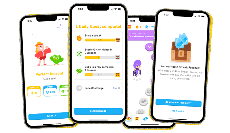
This language learning app extensively uses gamification, with points, badges, leaderboards, and a daily streak system to keep users motivated and engaged in their language learning journey. The result? Duolingo boasts a high user retention rate and a loyal following. A social media presence dominated by an unhinged owl helps, too.

Starbucks Rewards

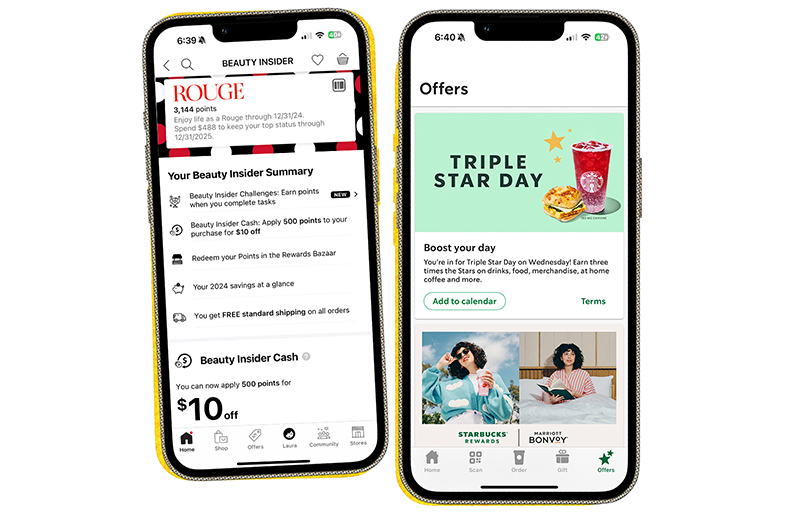
The Starbucks loyalty program is a masterclass in gamification. Users earn stars with every purchase, unlocking rewards and exclusive benefits. This program incentivizes purchases, builds brand loyalty, and encourages repeat visits.

Image showing gamification in UX design.

Sephora Beauty Insider

Sephora’s loyalty program, Beauty Insider, is a prime example of gamification done right. It uses a tiered system with point accumulation and rewards that incentivize purchases and brand loyalty. Members earn points for various actions, like making purchases, leaving reviews, and celebrating their birthdays. These points translate into rewards ranging from exclusive discounts and samples to early access to new products and invitations to special events. The program also incorporates a progress bar element, visually showing members how close they are to reaching the next tier (Insider, VIB, Rouge). It adds a touch of friendly competition and motivates them to keep engaging. This gamified approach fosters a sense of accomplishment and keeps customers returning for more, solidifying Sephora’s position as a leader in the beauty industry.

These examples showcase how gamification can seamlessly integrate into various applications to drive user engagement and achieve business goals.

Ready to help your brand win with gamified UX?

By incorporating gamification principles into your UX design, you can unlock a world of possibilities:

  • Increased user engagement: Gamification keeps users coming back for more, fostering long-term product loyalty.
  • Improved learning and onboarding: Gamified experiences can make learning and onboarding processes more engaging and effective.
  • Enhanced brand advocacy: Positive user experiences fueled by gamification can turn users into brand champions who spread the word.
  • Measurable results: User behavior data from gamified elements provides valuable insights to optimize your UX strategy further.

But wait, there’s more: Best practices for winning results

Here are some key considerations when implementing gamification into your digital product experience:

  • Align with your goals: Ensure gamification elements directly support your overall product objectives. Don’t just add points for the sake of adding points!
  • Keep it relevant: Tailor gamification mechanics to your target audience and the specific actions you want to encourage.
  • Don’t overdo it: Too many bells and whistles can overwhelm users. Keep it simple and seamlessly integrate gamification elements.
  • Measure and iterate: Track user behavior data to see what’s working and what’s not. Be prepared to refine your gamification approach based on insights

By strategically incorporating gamification into your UX design, you can create a more engaging and rewarding experience for your users, ultimately driving success for your business.

Partner with a digital agency that understands gamification

At Tallwave, we believe in the power of gamification to elevate the user experience. Our team of UX design experts can help you develop a gamified digital product strategy that seamlessly integrates with your overall vision and goals. Let’s work together to create a user experience that’s functional, fun, and engaging. We’re waiting to hear from you.

Categories
Customer Engagement Product Design Reaching New Customers Strategy UX Design

UX for all: Accessible app design for diverse users

Mobile apps are an indispensable part of our daily lives. They connect us, inform us, and entertain us. But for those of us with disabilities, some apps can be frustrating or even unusable due to accessibility barriers. We must recognize that accessibility in app design isn’t just about functionality and UX digital experience design—it’s about creating a welcoming, productive space for everyone and meeting legal standards such as ADA (Americans with Disabilities Act) and other international regulations.

Developing accessible apps not only reflects a commitment to ethical design but also offers significant benefits:

  • Reaching a wider audience: Accessible apps open doors to a vast and diverse user base, increasing your potential reach and market share.
  • Enhanced user experience: When everyone can navigate and interact with your app seamlessly, it increases user satisfaction and engagement.
  • Positive brand reputation: Demonstrating inclusivity through accessible design fosters brand loyalty and positions your company as a leader in responsible innovation.

The proof is in the pudding. See how Tallwave’s digital product design services team helped disrupt the status quo with an app made for those on the move.

Why inclusive app design matters now more than ever

While inclusive and accessible design is often discussed in the context of providing greater access for people with disabilities, it’s a high tide that raises all ships. Consider the curb cut, one of the most iconic physical examples of accessible design. When the first official curb cut was installed at an intersection on Telegraph Avenue in Berkeley, California, in 1972, a move that sparked the installation of hundreds of thousands more curb cuts all across the country, sidewalks became more accessible for people in wheelchairs. But they also became more accessible to parents with strollers, runners, kids on skateboards, and people wheeling loads, from workers with dollies and hand carts to business travelers with luggage. This application of accessible design didn’t just improve the experience of people with disabilities—it improved the experience for everyone. This phenomenon became known as the “curb cut effect,” and it applies as much to digital design as it does physical design.

With so many benefits to ethical and inclusive design for everyone, app accessibility standards are no longer a nicety but a core expectation for users with and without disabilities. As such, standards and guidelines are in place to drive designers toward accessibility.

The World Wide Web Consortium’s (W3C) Web Content Accessibility Guidelines (WCAG) are the foundation for all accessibility standards. These guidelines apply to web pages and mobile applications, encompassing both native and hybrid app formats. WCAG provides principles, guidelines, and success criteria to ensure web and app platforms are accessible to users with diverse disabilities. This promotes inclusion and prevents discrimination in daily online experiences. 

The WCAG is part of the W3C’s Web Accessibility Initiative (WAI). This initiative reflects a commitment to removing barriers for users with disabilities, ensuring they can navigate websites and interact with mobile apps as seamlessly as everyone else. With the introduction of WCAG 3.0 in May 2024, the guidelines are continuously evolving to address emerging technologies and more nuanced accessibility needs.

UX for accessibility: Creating user-friendly app experiences

The foundation of accessible app design lies in understanding the needs of diverse users. According to the CDC, up to 1 in 4 adults in the United States (more than 61 million people) has a disability. This includes people with visual impairments (4.8% of U.S. adults), hearing impairments (6.1% of U.S. adults), cognitive disabilities (12.8% of U.S. adults), motor limitations (12.1% of U.S. adults), and more. 

By conducting user research that involves people with disabilities and analyzing user data, you can identify potential challenges they face when interacting with apps. You’ll want to consider the kinds of assistive technologies your user base relies on to make the mobile app experience possible. These include refreshable braille displays for silent access to content, eye-tracking systems for navigation and typing, and sip-and-puff devices for controlling functions. Adaptive devices like specialized keyboards and styluses are often used by individuals with motor limitations to navigate mobile apps.

Leveraging user personas representing individuals with disabilities and conducting usability testing with diverse groups can provide valuable insights into making your app more accessible. Here are some basic considerations when incorporating UX for accessibility and accommodating assistive technologies in your app design:

Visual impairments 

  • Employ high color contrast between text and background to ensure readability.
  • Ensure compatibility with screen reader software for users who rely on audio cues.
  • Provide clear and concise text alternatives for all images (alt text).

Hearing impairments

  • Offer captions and transcripts for all video and audio content.
  • Allow users to adjust audio volume levels within the app.
  • Consider visual alerts alongside sound notifications.

Cognitive disabilities 

  • Use simple and straightforward language that’s easy to understand.
  • Implement clear and predictable layouts with consistent navigation patterns.
  • Offer multiple ways to complete tasks, catering to different user preferences and needs.

Motor limitations

  • Design touch-friendly interfaces with large, well-spaced buttons and icons.
  • Integrate voice control options for users who have difficulty interacting with the screen.
  • Ensure smooth keyboard navigation for users who rely on assistive technologies.

Beyond UX design: Content strategy for accessibility and inclusivity

The words and content within your app play a vital role in accessibility. Following guidelines like those provided by the A11Y Project and WCAG ensures that your content is accessible to everyone. Specifically, clarity and word choices matter. Accessible content is written clearly and concisely, avoiding jargon and complex sentence structures. Aim for a reading level that caters to a broad audience, usually between a 6th- and 8th-grade reading level.

Other important considerations for creating accessible content in apps include:

  • Plain language is powerful: Use everyday language that’s easy to understand. Avoid technical terms or industry jargon that may be unfamiliar to some users.
  • Alt text paints a picture: Don’t leave screen reader users out! Always include concise descriptions of images using alt text. Include details about the function the image serves on the page as well. Is it decorative? Is it an image of a product? 
  • Captions and transcripts for everyone: Make multimedia content accessible by providing captions for videos and transcripts for audio content.

Building brand loyalty: The positive impact of inclusive app design

Investing in accessibility and inclusive app design isn’t just the right thing to do; it’s a smart business decision. When users can interact with your app easily, they’re more likely to spend time within the platform, leading to higher engagement and increased retention. Businesses prioritizing accessibility see higher customer satisfaction and loyalty, giving them a competitive edge. Additionally, accessible apps remove barriers for a significant portion of the population, allowing you to tap into a previously untapped market segment.

Building inclusive and accessible apps: A journey, not a destination

By prioritizing accessibility, you’re creating an app experience that welcomes everyone. This opens doors to new users, strengthens your brand reputation, and sets you apart from the competition.

Ready to build an inclusive and accessible app or improve accessibility within an existing app? At Tallwave, we understand the power of design that works for everyone. Our team of experts specializes in user experience (UX), accessibility audits, and inclusive content strategy. Contact us today to discuss how we can help you create a user-friendly and accessible app that meets all industry standards.

Categories
News Reaching New Customers SEO

Reddit for SEO: Why user-generated content dominates search results

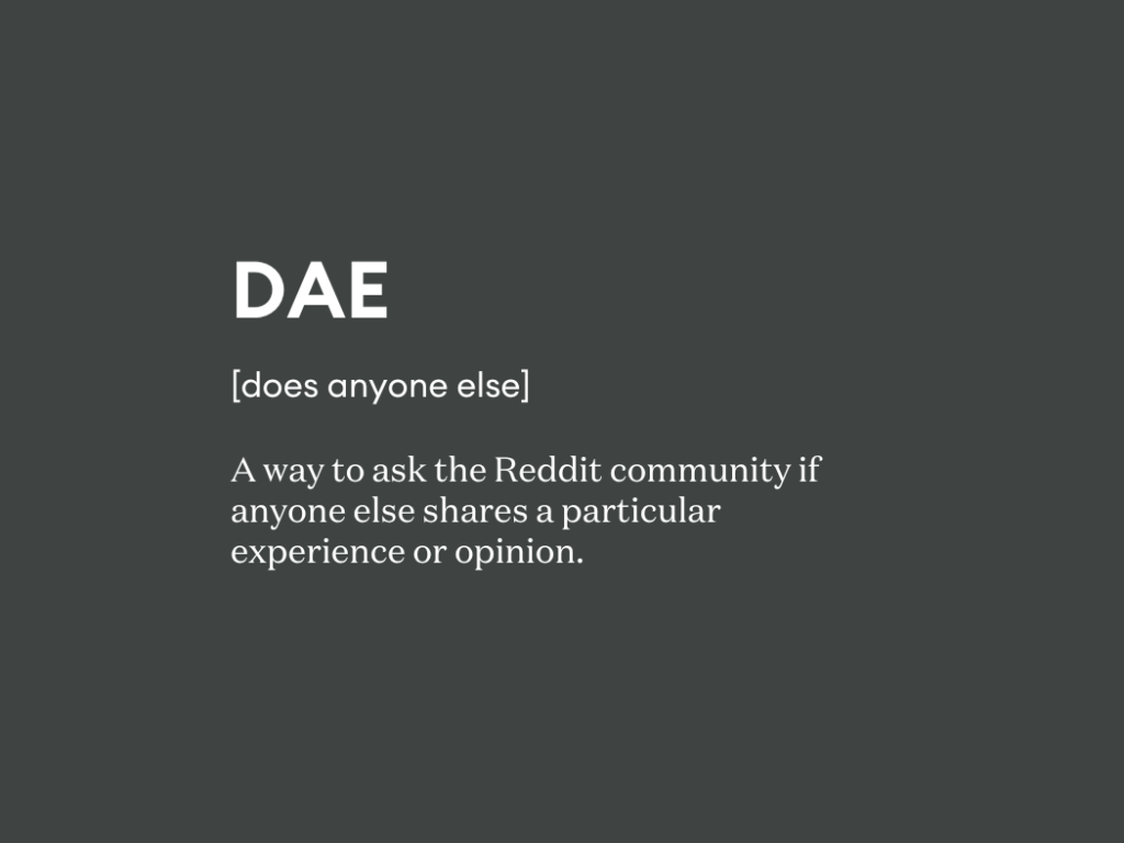
Is it just me, or DAE wonder why Reddit has become such a significant holder of SERP real estate? As a user and consumer, I’ve increasingly noticed that Reddit forums dominate the results I see for product and service-based queries, and as an ever-curious SEO and content strategist, I need to know why.

So, what’s happening here? Why has Reddit emerged as a force to be reckoned with in the SEO game? And what does this mean for us as marketers? Brace yourselves: we’re about to explore the complex and evolving world of Reddit and SEO, as well as the profound impact “the front page of the Internet” has on how users seek and interact with information.

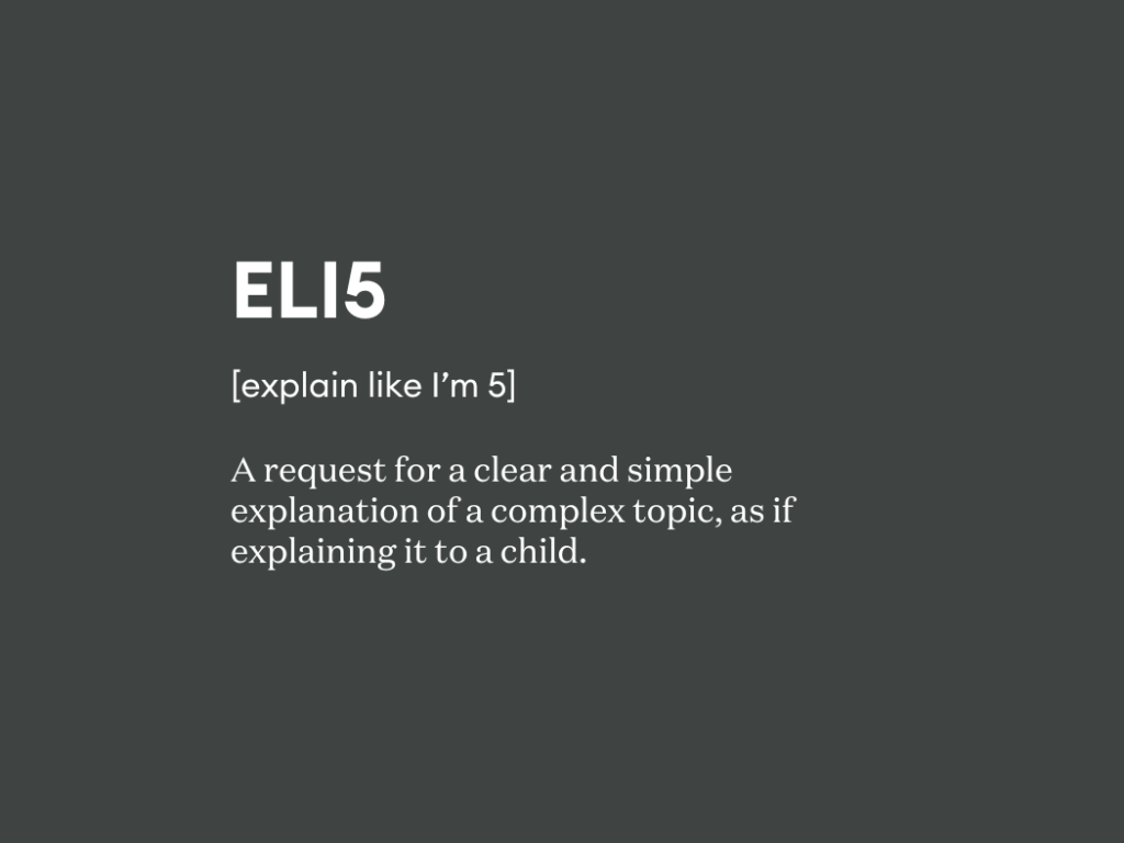
ELI5: What even is Reddit?

Before we delve into the “why,” let’s quickly recap what Reddit is for those unfamiliar with this online behemoth.

Think of Reddit as a massive, decentralized forum where users create and share content on a wide range of topics. These communities, called subreddits, cover everything from news and technology to niche hobbies and local interests. Personally, I’ve used Reddit to discuss SEO news and trends with my professional cohorts, find volunteer opportunities in my community, and, most recently, connect with a fellow “elder emo” music fan to snag a ticket to a very much sold-out show for a “bucket list” band. Simply put, there’s something for everyone (YMMV on concert tickets).

Reddit’s diverse user base has more than 267.5 million weekly active users, solidifying its position online as a veritable melting pot of voices and perspectives. This rich and varied audience actively engages with all kinds of content, creating a dynamic platform where discussions and user-generated content (UGC) reign supreme.

Why is Reddit taking over search results?

Now, onto the juicy part: why is Reddit suddenly showing up everywhere in search results? Here are a few key factors contributing to its rise:

The power of user-generated content

In its relentless pursuit of providing the best user experience, Google’s algorithm increasingly values authentic, unbiased, and people-first content. Reddit thrives on UGC, offering a treasure trove of real-world opinions, experiences, and insights that traditional websites often lack. This authenticity resonates with search engines, making Reddit a valuable source of information.

Diversity and depth of content

Reddit covers a mind-boggling range of topics, with in-depth discussions and detailed information on virtually anything you can imagine. This depth allows Reddit to address long-tail keywords and niche queries with a level of specificity that traditional websites might struggle to match.

Community-driven authority

Reddit thrives on user engagement. Upvotes, downvotes, and discussions within subreddits organically signal the value and relevance of content. This community-driven authority system likely helps Google identify high-quality, trustworthy information.

The Reddit IPO effect

While maybe not a direct cause, Reddit’s recent IPO may have contributed to its increased visibility in search results. With heightened public interest and media attention, Google might be placing a greater emphasis on crawling and indexing Reddit content.

TIL why Reddit matters for marketers and SEOs

So, what does this Reddit SEO phenomenon mean for us as marketers and SEO professionals? A lot. In fact, you might think of Reddit’s rise in SEO and SERP positioning as both an opportunity and a challenge:

  • Opportunity: Reddit offers a powerful platform to connect with real users, gather valuable insights, and build brand awareness. Engaging with relevant subreddits allows you to participate in organic conversations, address customer concerns, and establish yourself as a thought leader in your industry.
  • Challenge: Reddit is a community-driven platform with strict guidelines and Reddiquette, not a marketing playground. Spammy tactics or self-promotion will be met with swift backlash. Building trust and providing genuine value are required for a visibility victory on Reddit.

Case in point: How brands are rocking Reddit

Is your brand up for the challenge? You’ll find success stories from brands like Nordstrom, Toyota, and Xbox One that have implemented effective Reddit engagement strategies.

Spotify was a pioneer on the platform. In 2014, the music streaming service created a branded account and sparked a virtual thread asking users to share the most emotionally impactful songs in their lives, and ended up with more than 10,000 responses. Leveraging this user-generated content, Spotify made a unique playlist, demonstrating their understanding of their audience and building trust within the Reddit community. 

Other examples of brands taking on the Reddit challenge:

  • Toyota: They’ve tapped into Reddit communities like r/forumla1, r/cars, and r/trucks, providing helpful content and insights from their engineers, fostering trust and brand loyalty among car enthusiasts.
  • Xbox One: By actively participating in gaming subreddits, hosting AMA (ask me anything) sessions with game developers, and addressing user concerns directly, Xbox One has built a strong community around its brand.

But wait, there’s more. Reddit’s presence at CES 2024 walked marketers through how their platform is an essential touchpoint on the customer journey with an activation called “Key to Context.” The hands-on walk-through experience showed how instrumental the platform was in a car-buying experience and unlocked opportunities for brands to engage with consumers through UGC and strategically promoted posts.

Who owns brand Reddit strategy? It’s a team effort

While Reddit engagement might fall outside typical job descriptions, brands can create a “Reddit village” for success. This village includes passionate brand advocates (including employees, partners, and even consumers), community managers who curate content, and SEO/content teams who translate Reddit insights into broader strategies.

LPT: 5 ways to use Reddit for SEO and online visibility

Now, the million-dollar question: how can we leverage Reddit’s SEO potential within the spirit of the platform’s core values? I’ve got a few pro tips and ideas from my experience and research, as well as those collected from the SEO hivemind.

  1. Find your niche: Identify relevant subreddits where your target audience actively engages. Research their interests, common discussions, the language they are using (linguistic profiling), and the overall tone of the community.
  2. Become a valuable contributor: Don’t just drop in and promote your brand. Actively participate in discussions, share your expertise, and answer user questions genuinely. Provide insightful comments and contribute valuable content that benefits the community.
  3. Focus on long-tail keywords: Reddit excels at long-tail queries due to its in-depth discussions. Optimize your content for these specific keywords to increase your chances of appearing in relevant search results.
  4. Embrace UGC: Encourage users to share their experiences with your products or services within relevant subreddits. This organic UGC can be incredibly powerful for building trust and brand sentiment.
  5. Track and analyze: Monitor your Reddit activity and track the impact on your SEO metrics. Use tools like Semrush and Google Analytics 4 to measure organic traffic and identify which subreddits and posts drive the most engagement.

TL;DR: Reddit and SEO success requires a long-term, user-centric approach

Reddit’s growing prominence in search results is a testament to the power of user-generated content and authentic online communities. As marketers and SEOs, we must adapt our strategies to embrace this shift. Success on Reddit comes from building genuine relationships, providing value, and becoming a trusted member of the community.

Leveraging Reddit in your online footprint is a long-term integrated digital marketing game, not a quick SEO win. But by approaching Reddit with a user-centric mindset and focusing on providing value, you can tap into its immense potential and elevate your brand to new heights.

Ready to talk about Reddit and SEO? We are. Let’s connect.

Categories
Customer Engagement News Paid Media Product Design Reaching New Customers SEO Strategy

Building a business-ready website: Beyond the surface of your website strategy

In the fast-evolving digital landscape, a website is more than a digital brand extension— it’s a dynamic tool that can either advance or inhibit business. Creating a high-performing website requires moving beyond surface-level aesthetics to consider the functionality required to meet business goals effectively.

A website is arguably the most persistent external expression of a brand and one of the hardest working tools in the digital marketing arsenal. It’s the digital front door of your business and a frequent destination for customers at multiple points in their journeys. And yet, website strategy is often only skin deep, focused heavily on how a website looks rather than on how it functions. And it’s often short-term, considering the roles your website plays for your customers and your business today and note how it will need to evolve to meet needs in the future. When it comes to creating high-performing websites built to go the distance for both brands and customers, three is the magic number. 

The magic triangle: Role, goals, and audience

A triangulated approach that considers roles, goals, and audience can help you plan for successful and sustainable websites. This interconnected approach ensures that the website is not only visually appealing but also aligned with the broader business objectives. Let’s break down the elements:

Role: The purpose of your website

Understanding the role your website plays in your business is the first consideration in this website strategy power trio. At a basic level, websites can play two roles: business-enabling and revenue-driving. 

Business-enabling websites can support your business in a number of ways, including:

  • Acting as a support system for external revenue channels: Business-enabling websites act as a powerful support system for your existing revenue channels, such as your sales force. They don’t directly generate revenue themselves, but they play a critical role in nurturing leads, building brand awareness, and ultimately driving conversions through those external channels.
  • Encouraging high-value microconversions: While not the final sale, business-enabling websites excel at capturing high-value microconversions. These actions represent significant steps forward in the customer journey, indicating a prospect’s growing interest in your brand. Examples include lead capture forms, content downloads (e.g., white papers, ebooks), and newsletter signups.
  • Fueling the customer journey: Business-enabling websites are instrumental in moving potential customers through the buyer’s journey and down the sales funnel. By providing valuable content, educational resources, and clear calls to action, these websites nurture leads, build trust, and position your brand as a leader in your industry.

On the other hand, revenue-driving websites support transactions and encourage conversion, directly contributing to a brand’s bottom line. Consider how revenue-driving websites can support your business:

  • Acting as a revenue generating powerhouse platform: Revenue-driving websites are the engines that directly power your business’s revenue generation. These websites are transactional in nature, facilitating online purchases and financial transactions. Examples include traditional e-commerce stores selling physical goods, food delivery platforms where customers can order meals, travel booking websites where users can reserve flights and accommodations, and service-oriented e-commerce sites.
  • Encouraging transactions: The primary function of revenue-driving websites is to facilitate secure and seamless online transactions. This includes features like shopping carts, secure payment gateways, and clear order fulfillment processes.
  • Suiting your needs: Revenue-driving websites encompass a wide range of e-commerce models. From traditional product sales through an online store to service-based transactions, these websites cater to a variety of industries and customer needs.

Clearly defining whether your website plays a business-enabling or revenue-driving role for your business sets the foundation for the subsequent decisions in your strategy, from critical KPIs to key features and functionality, necessary integrations, and more. It also sets the stage for the expectations users will have when visiting your website.

Goals: What you seek to accomplish with your website

Now that you understand the role your website plays in your business, it’s time to define your website goals. You might consider setting these objectives with SMART goals: specific, measurable, achievable, relevant, and time-bound.

Website goals will vary depending on your website’s role and your overall business objectives. 

Consider the following examples:

  • Business-enabling website goals:
    • Generate a set number of qualified leads per month
    • Increase brand awareness and website traffic
    • Drive event registrations or webinar signups
    • Improve content engagement through downloads or shares
  • Revenue-driving website goals:
    • Increase online sales by a specific percentage
    • Grow average order value
    • Reduce cart abandonment rates
    • Improve customer lifetime value

Establishing clear and measurable website goals can help you track progress, identify areas for improvement, and ensure that your website strategy aligns directly with your business objectives.

Audience: Who your website is speaking to

Your target audience plays a critical role in shaping your website’s design, content, information architecture, and functionality. Here’s why understanding your audience analysis is vital when thinking about website strategy:

  • Tailored user experience: By understanding your audience’s needs, preferences, and online behavior, you can create a user experience (UX) that resonates with them. This translates to a website that’s easy to navigate, informative, and facilitates desired actions, ultimately influencing conversion rates.
  • Content strategy alignment: Knowing your audience empowers you to develop a content strategy that truly connects. This means crafting content that addresses their pain points, interests them, and guides them through the buying journey.
  • Personalization potential: Audience insights can unlock personalization opportunities. This could involve tailoring website elements, product recommendations, or even entire landing pages to specific audience segments, leading to a more relevant and engaging experience.
  • Search engine visibility: Understanding your audience paves the way for essential SEO optimizations fueled by linguistic profiling and search journey analysis. Implementing data-driven optimizations based on these findings can improve search engine rankings and organic visibility for your business.

Learn more about SEO and other Integrated Digital Marketing Services from Tallwave.

Having a clear understanding of your target audience is the bridge that connects your website’s features and functionality with the user experience that drives results. Effective audience analysis involves:

  • Buyer persona development: Create detailed profiles of your ideal customers, including demographics, valuegraphics, needs, challenges, and preferred online behavior.
  • Website analytics review: Utilize website traffic data to understand visitor demographics, interests, and content consumption patterns.
  • Market research: Conduct market research to gain insights into broader industry trends and competitor audience strategies.

By combining these methods, you can create a comprehensive understanding of your target audience and leverage that knowledge to build a website that truly resonates with them.

Evaluating your website’s business readiness: Beyond the surface

While websites serve as prominent brand outposts, often acting as the initial point, their multifaceted nature can pose a challenge. Teams can get caught up in the aesthetics – visuals, interactive elements, and the like – neglecting to truly get under the hood and identify underlying strengths and opportunities.

Before you put your website to work, it’s essential to get down to business and review your site under the following lenses:

  • Technical infrastructure: Is the website’s technical foundation robust enough to support your business goals seamlessly, both today and into the future? This includes aspects like website speed, mobile-friendliness, security measures, and content delivery efficiency.
  • Customer experience (CX): Does the customer journey feel intuitive and cater to your target audience’s needs? Assess whether the website is optimized for high-value conversions aligned with your business objectives.
  • Accessibility: Is your website accessible for users with disabilities? Ensure that your website’s design and content adhere to WCAG guidelines. This means implementing features like alt text for images, keyboard navigation options, and proper headings.
  • Navigation paths and flows: Does your website seamlessly guide visitors toward their next steps, building upon interactions with other digital touchpoints in your brand ecosystem? A well-structured website anticipates user intent and facilitates a smooth journey towards conversions.
  • Design: Does the website effectively reflect your brand identity? Validate your website against your brand guidelines to determine if the visual elements, as well as content, are applied consistently across all pages.
  • Marketing and sales strategy alignment: Is your website an active participant in driving your marketing and sales efforts? It is important to make sure your website integrates with your marketing automation tools, facilitates lead capture, and effectively supports your sales funnel. It’s also critical to ensure the content management system on which your website is built supports the frequency with which updates may need to be made and the level of technical skill of those who will be responsible for making them.

This multifaceted evaluation approach can help uncover hidden roadblocks and optimization opportunities that ensure your website is not just visually appealing but strategically positioned to support your business goals.

Ongoing optimizations: Sustainable website strategy

Your website is a living entity, not a static brochure. Don’t “set it and forget it.” To maintain your website’s strategic effectiveness, you must plan for ongoing and iterative optimizations. Here are some key practices to keep in mind post-launch:

  • A/B testing: Test different website elements, like headlines, call-to-action buttons, or page layouts, to see what resonates best with your audience and drives conversions.
  • Data-driven decision-making: Leverage website analytics and user behavior data to inform website improvements and prioritize resources effectively.
  • SEO optimizations and content enhancements: Regularly update your website content with fresh, keyword-rich, relevant information to maintain user engagement and improve search engine ranking.
  • Mobile-first approach: Even in B2B scenarios, first contact often happens in the palms of your customers’ hands. Ensure your website is responsive and optimized for mobile devices.
  • Security maintenance: Regularly update your website’s security measures to protect user data and website functionality, especially when relying on cloud-based tools and data storage.

A well-defined website strategy is no longer optional – it’s a necessity. By understanding the role your website plays in your business strategy, your target audience, and your desired goals, you can create a website that is not just visually appealing, but strategically designed to drive impactful results.

And you don’t have to go at it alone. Tallwave is eager to create website strategy solutions that align with your consumers and meet them where they are when they need you most. Let’s talk.

Categories
Customer Engagement Reaching New Customers SEO Strategy

Microconversions: Unlocking the power of incremental steps in your conversion funnel

Introduction: What is a microconversion?

In the dynamic world of digital marketing, where every click and interaction matters, understanding microconversions is crucial. But what exactly are they? Let’s start by demystifying this term.

What is a microconversion?

A microconversion is any incremental step a user takes to show initial interest in your brand or product. Unlike the grand finale of a macroconversion, like a product purchase or subscription that constitutes a final goal and often achieves a financial outcome, microconversions are the incremental steps along the way that lead up to those final actions. Imagine a visitor to your website as a curious explorer embarking on a journey. Along the way, they encounter various signposts, each representing a microconversion. These small actions might not lead immediately to a purchase, but they’re part of the breadcrumb trail that leads prospective customers to that final transaction.

Learn more about the power of the “micro-yes” in sales.

Why do microconversions matter?

1. Trust building and brand advocacy

Microconversions are like the first handshake between you and your potential customer. At the earlier stages of the buying journey, some common microconversions include:

  • Email newsletter sign-up: When a visitor subscribes to your newsletter, they express interest in staying connected. This small commitment builds trust and opens the door for further communication.
  • Social media sharing: When someone shares your content on social platforms, they vouch for your brand. Their endorsement reaches a wider audience, potentially attracting new visitors and signaling trust and confidence in your brand.

2. Insights into user behavior and intent

Microconversions provide valuable insights into user behavior. By tracking these smaller interactions, you gain a deeper understanding of what resonates with your audience and gain insights into the stage of the buyer’s journey they’re in and their needs at that stage. Examples include:

  • Page views: The number of pages a visitor views indicates their level of engagement. High page views suggest interest, while low views may signal disinterest. The nature of the content on the pages viewed can also illuminate stage and intent. For example, if a visitor navigates to specific product pages, adds products to a cart, or reviews a page on returns, those behaviors are all microconversions on the path to purchase that signal a higher degree of intent than a visitor that lands on your home page and then leaves.
  • Comments on blog articles: Engaged users often leave comments. These interactions reveal their preferences and pain points.

3. Optimization opportunities

Microconversions act as breadcrumbs leading you through the forest of user experience. They can also serve as a “canary in the coalmine” of your digital engagements, signaling friction that can then be resolved and highlighting areas for improvement. Consider:

  • Process milestones: These are linear steps toward the primary macroconversion. Analyzing them helps identify bottlenecks and UX pain points. For example, for one client, we pinpointed significant dropoff between the process milestones of viewing a product page and adding the product to a cart, particularly for mobile users. We discovered this was due to an issue causing the “add to cart” button to display much further down the page than intended, causing many users to overlook it and abandon the page. Addressing this issue allowed us to increase add-to-cart actions by 3.8x.
  • Secondary actions: These desirable but non-primary goals indicate potential future macroconversions. Examples include downloading an ebook, creating an account, or watching a video. Using these secondary actions as opportunities to deploy targeted outreach can be a great way to optimize the path to purchase with stage-specific content and messaging that nurtures prospective customers toward other high-value actions.

Monitoring and measuring microconversions: Enhancing your conversion insights

Understanding what microconversions are and the signals they represent is only half the battle. Unlocking their power to gain insights into the path to macroconversions and inform strategies for optimizing digital experiences to improve conversion requires ongoing monitoring and measurement. Both the types of data each microconversion produces and the methods for collecting and analyzing that data vary:

Qualitative data

Qualitative data can be invaluable for getting a sense for how effectively website visitors are navigating to and completing microconversions and where they may be encountering roadblocks in the path toward macroconversions. Here are some common approaches for gathering qualitative data on microconversions and examples of these measurement methodologies in action:

Heat mapping & scroll mapping

Heat mapping is like having a thermal camera for your website. It visually represents user behavior by highlighting the “hot” and “cold” areas of a webpage based on where users click, scroll, hover, and otherwise interact with the page (and where they don’t). Here’s how it works:

  • Heat maps: These colorful overlays show where users click, move their mouse, or spend the most time. Red and orange areas indicate high activity, while blue and green areas are less frequented.
  • Scroll maps: These reveal how far users scroll down a page. Understanding where visitors drop off helps optimize content placement.

Example: Imagine an e-commerce site. A heat map reveals that users consistently click on the “Add to Cart” button but rarely explore the footer links. This insight prompts you to enhance the checkout process and reposition critical links.

Session recording

Session recording is like a digital surveillance system for your website. It records user sessions, capturing every click, scroll, and interaction through the eyes of the user. Key points:

  • User behavior: Watch real users navigate your site. Understand their pain points, hesitations, and moments of delight.
  • Error identification: Spot usability issues, broken links, or confusing forms.

Example: You notice users repeatedly abandoning their cart during the payment step. Session recordings reveal that a confusing coupon code field is causing frustration. Fixing this leads to higher conversions.

Quantitative data

Quantitative data brings a numerical lens illuminating actions that can be counted, measured, or otherwise described in numbers. Where qualitative data can help you channel the perspectives and feelings of website visitors, quantitative can put that data into perspective in terms of its frequency and impact. Here’s how quantitative data on microconversions is often collected:

Basic analytics tools

  • Google Analytics (GA): The Swiss Army knife of web analytics, GA tracks user behavior, traffic sources, custom website conversion rates, and more. It’s free and essential for any website.
  • Built-in e-commerce analytics: Platforms like Shopify, WooCommerce, or Magento offer built-in analytics. They provide insights specific to e-commerce, such as product performance, revenue, and customer demographics.

Example: GA shows that your blog attracts high traffic, but few readers proceed to the product pages. You optimize the blog-to-product link placement, resulting in increased sales.

Funnel reports

Funnel reports visualize the user journey. They break down the conversion process into stages:

  1. Awareness: Visitors arrive on your site.
  2. Interest: They explore content, view products, or sign up.
  3. Consideration: Users add items to their carts or engage with your services.
  4. Conversion: The final purchase or desired action.

Example: An e-learning platform’s funnel report reveals that most users drop off during the “Interest” stage. You tweak the landing page content, leading to better engagement.

Remember, microconversions are the stepping stones that pave the way for macro success. By combining qualitative and quantitative insights, you’ll create a conversion funnel that’s both user-friendly and revenue-boosting! 

Making the most of microconversions: Optimizing for conversion

The final step is putting qualitative and quantitative data-driven insights to work to optimize the digital experience to increase the microconversions (and ultimately macroconversions) your audience is successfully completing. This can be done broadly to optimize the digital experience as a whole or more narrowly to optimize for a specific high-value action through two distinct but interrelated approaches: 

Digital Experience Optimization (DXO)

Digital Experience Optimization (DXO) is the strategic process of enhancing user interactions with digital technologies to drive superior customer experiences. It encompasses a holistic approach to improving every touchpoint where users engage with your brand online. DXO aims to create seamless, personalized, and delightful experiences across websites, mobile apps, social media, and other digital channels.

Why does DXO matter?

  • Customer expectations: In today’s digital landscape, customers expect smooth, relevant interactions. DXO ensures you meet these expectations.
  • Business impact: Positive digital experiences lead to increased customer loyalty, higher conversion rates, and improved brand perception.

We discovered this was due to an issue causing the “add to cart” button to display much further down the page than intended, causing many users to overlook it and abandon the page. Addressing this issue allowed us to increase add-to-cart actions by 3.8x.

Conversion Rate Optimization (CRO)

Conversion Rate Optimization (CRO) focuses on improving the percentage of website visitors who take a desired action, such as making a purchase, signing up, or downloading content. It involves data-driven experimentation to enhance user experience and drive conversions.

Core elements of CRO

CRO applies a systematic approach to increasing high-value action completion by identifying and testing solutions to resolve friction points along the path to conversion to continuously improve performance. This process includes:

  1. Setting expectations: Clearly define goals and success metrics for each conversion action.
  2. User insights: Understand user behavior through analytics, heatmaps, and session recordings.
  3. Hypothesis development: Formulate hypotheses about what changes will improve conversions.
  4. Testing velocity: Regularly test variations (A/B tests, multivariate tests) to validate hypotheses.
  5. Cross-device testing: Ensure consistent experiences across different devices.
  6. Pre-test prototypes: Validate ideas before full implementation.
  7. Limit changes: Focus on impactful modifications rather than overwhelming redesigns.

Best practices for optimization

While CRO is focused on a specific digital experience, doing it effectively requires considerations that extend well beyond the specific microconversions you’re trying to improve, including:

  • Keyword research: Understand user intent and optimize content accordingly.
  • On-page SEO: Optimize meta tags, headings, and content for search engines.
  • User experience (UX): Prioritize intuitive navigation, fast loading times, and mobile responsiveness.
  • Content quality: Create valuable, relevant content that resonates with your audience.
  • Backlink building: Earn high-quality backlinks to improve authority.

Remember, DXO and CRO are ongoing processes. Continuously analyze, test, and optimize to create exceptional digital experiences and drive conversions. Let us show you how to incorporate this must-have continuous improvement cycle into your business!

Categories
Customer Engagement Uncategorized

Tallwave year in review: Creating value, contributing knowledge, and pursuing growth in 2023

As we draw near the close of 2023, our sights are set on the year ahead and in true Tallwave fashion, we’re turning our focus to the challenges and possibilities of a new year. But before we run headlong into 2024, we’re taking a moment to reflect on all we accomplished this year. 

Our incredibly talented teams executed high-value work that made a real impact on our clients’ businesses. The brilliant thought leaders among our ranks contributed knowledge to the benefit of prospective clients, partners, and business leaders of all stripes. And Tallwavers at every level of the organization seized opportunities to learn, develop, and grow, demonstrating that our value of relentless pursuit isn’t just a series of words, but words we live by. In the spirit of honoring auld lang syne (times long past), here are the highlights the Tallwave team will be toasting as we ring in the new year.

Creating value for our clients

Looking back over our work in 2023, data enablement and modernizing the technology and strategies for delivering on customer needs stand out as themes in some of the most ambitious challenges we helped our clients tackle.  

Powering up a customer portal strategy

In 2022, we were engaged by a private, independent energy company with over 35 years of experience in the industry. They’d always been technology-forward thinkers, and their customer connect portal was already a differentiator that set them apart from competitors and contributed to their number one ranking in the industry for customer service. As a tech-forward company, they were planning for ongoing evolution of their portal into a best-in-class solution that continued to meet the needs of their customers. 

After evaluating their portal and making strategic recommendations in late 2022, the stage was set to translate strategy into action in 2023. Over the course of the year, we’ve worked with our client to design, test, and validate a new customer connect portal 3.0 solution, implement a measurement strategy to evaluate the performance of the new portal solution, and provide ongoing analytics maintenance, reporting, and strategic insights for a portal that’s always evolving, improving, and creating value for our client’s customers.

Enabling growth through an upleveled internal asset management strategy

One of our largest, most complex clients, a multinational financial services corporation, enlisted our help to establish the proper team and organizational structure, improve data quality to unlock insights that empower decision making, standardize global policies and procedures, and strengthen relationships that align into the broader enterprise with the right engagement models. These desired outcomes coincided with an increase in demand for internal technology assets, intensifying hardware budget management demands, and the increasingly complex logistics for supporting a global workforce’s technology needs.

They initially engaged us to help them create a playbook of standard operating procedures to drive predictability, agility, and efficiency in servicing employee tech needs. But as we helped them imagine the art of the possible, we set our sights higher, ultimately building a strategy for service automation and digital experiences that work in concert with SOPs and designing an MVP solution and a framework to continually build upon their internal product ecosystem to drive efficiency, scale, accuracy, and predictability. This, in turn, will help our client optimize their internal technology asset investments, reduce risk, and improve the quality of service to colleagues.

Enabling data-driven business processes by translating between business needs and infrastructure parameters

CP Skin Health Group, Inc., a division of Colgate-Palmolive focused on product and service innovation for dermatologists, estheticians, and other skin health professionals, found themselves in a position common among our clients. Rapid growth, including the merging and acquisition of well-established and high-performing brands, led to a fractured data ecosystem. They were leveraging multiple disparate data sources and systems across their business units and many of the processes required for their business relied on manual data entry, which negatively impacted their sales and marketing teams’ ability to operate effectively at scale and created a poor customer experience. They needed a partner to work alongside their Global IT team to create a more unified technology and data infrastructure to serve the needs of the business.

We brought business stakeholders together with their Global IT team to map their data environment, identify and document technical limitations and risks in their data inventory, and define problem statements. As a result of our work, the skin health division and the Global IT team were able to align on a shared data strategy and vision that would pave the way for better support for the skin health division’s business needs and lay the foundation for future data analytics capabilities. This allowed the skin health division’s marketing team to operate more effectively and efficiently and optimized sales processes to deliver better customer experiences and business outcomes.

Bringing a new mobile app to life at the speed of light

Working with one of our development partners, we embarked on a journey to redesign and develop a new mobile application for a national broadband communications provider. The new application required some complex features—like account registration and management, bill pay, service appointment scheduling, and more—that also played high-stakes roles for the customers who would ultimately use them. And the timeline for getting it done was tight. But that’s just the kind of ambitious challenge the Tallwave team thrives on.

We mobilized our wildly talented product design team to quickly develop a digital brand UI kit, UX/UI designs for 3 new complex user flows, front-end code acceleration training, and consultation on UX/UI execution, usability, and accessibility in the span of just a few weeks. The team’s work was a shining example of our ability to deliver great mobile app design at the speed of light without sacrificing our commitment to deliver a great CX for consumers.

A power-packed, end-of-year kickoff for a 2024 product strategy 

We partnered with a new client, an energy management services, procurement, and energy infrastructure development firm, in December to help them define and package their intellectual capital and expertise into an ongoing and scalable data-as-a-service (DaaS) product. Starting our engagement this late in the year, it would have been easy to assume we’d kick off in January. But with a client who shares our bias toward rapid action, we decided there’s no time like the present to get the ball rolling. 

This month, we mobilized our team to head out to the client’s offices in Texas to lead them through a full-day workshop with their senior leadership team to understand the energy ecosystem and value chain and begin to formulate ways to package their unique value to customers. Seizing the moment to begin our work now puts us in a strong position to advance our plans to design, develop, and test the product concept with prospective customers and develop a go-to-market plan that drives immediate adoption upon launch in the new year.

Contributing thought leadership to the industry

The work we did for our clients wasn’t the only way we created value in 2023. Tallwavers showed up as thought leaders, contributing their knowledge and perspectives on hot industry topics like data unification and enablement, conversion rate optimization, and more at industry events and a few of our own. Some standout moments include:

On the physical stage at Brand Innovators

At the Brand Innovators Sports Marketing Upfronts in Scottsdale, Arizona in February, Tallwave Partner, Robert Wallace, had the privilege of moderating a panel session with members of the marketing team from Riddell Sports Group, a leader in high-performance football gear.  

Tallwave Partner Robert Wallace speaks with marketers from Riddell Sports Group.

On the virtual stage at the GDS CX Innovation Summit

Our SVP of Marketing, Jessica Pumo, hit the big screen at the GDS CX Innovation Summit in May, presenting a Masterclass Keynote on bridging the data divide. The topic of overcoming fractured data ecosystems to harness the business power of data resonated so much, she gave a special live encore presentation at our invite-only dinner for current and prospective clients focused on data unification and enablement in August. 

Tallwave's SVP of Marketing, Jessica Pumo, have a keynote presentation at the GDS CX Innovation Summit in May

Spreading the word on the value of CRO

Conversion rate optimization can be an extremely effective strategy for improving conversion rates and maximizing return on investment in traffic-driving marketing. But it requires a highly integrated approach to execute, making it difficult for clients and many other digital agencies to capitalize on. Our Integrated Marketing team brought their knowledge, experience, and expertise to conversion-conscious brands of all kinds in a CRO webinar in May. 

Pursuing personal and professional growth

Our ability to do great work for clients and contribute thought leadership to our industry is fueled by our relentless pursuit of growth. In 2023, Tallwavers fed their brains, expanded their knowledge, and refined their perspectives on a wide range of topics through conferences, events, and other personal and professional development opportunities. Here are two that really blew us away:

Making quality connections at KPMG /Michigan Ross QuantumShift

Tallwave CEO, Jeff Pruitt, had the rare opportunity to attend QuantumShift, an exclusive four-day peer-to-peer learning experience for the top decision-makers of fast-growing private companies. This experience took Jeff out of his day-to-day business environment to share with, learn from, and collaborate with leading CEOs from around the country as well as top professors from the University of Michigan’s world-renowned Stephen M. Ross School of Business. It was a highly impactful experience that allowed him to live our value of thoughtful rigor in a whole new way while embracing the power of human connection.

Having flurries of fun at the Snowflake Data Cloud World Tour

Senior Data Strategist, Brooke Weidenbaker, and Engagement Manager, Rikki Ebenal attended the Snowflake Data Cloud World Tour event in Austin, Texas where they plowed through presentations, demos, and customer breakout sessions celebrating data centricity and came away with new ideas and examples to share with clients as we help them navigate the data maturity curve.

Raising a glass to the past and focusing on the future

Reflecting on all we’ve done, everywhere we’ve been, and everything we’ve accomplished, we’re proud of the year we’ve had. And we’ll be raising a glass in gratitude for the opportunities it’s brought us to learn, grow, and evolve and to help others do the same. It’s been a year worthy of celebration. But when the clock strikes midnight on December 31, our gaze will be squarely focused on the future and all the opportunities that lie ahead to help our clients dream bigger about the growth possible for their brands, discover a path to achieve it, and not just do what it takes to get there, but to constantly strive to do better together.

Categories
Customer Engagement News Product Design Uncategorized UX Design

It’s never the end: Continuously evolving product improvement

About this series: Great products are built using good problem-solving, and the best way to solve problems is to define needs and then meet them in every user interaction. Alignment across teams and channels ensures that expectations are set correctly and delivered on effectively at every stage of the user journey. Great design starts way back at defining the problem and extends through the entire product lifecycle, continuing long after launch and into the ongoing iterations of product development. Great design is a cornerstone for great products, driving great business, and creating opportunity. Read on to learn how ongoing iteration and innovation in the product design process makes great product design and the business value it creates sustainable. If you missed the first two installments, be sure to check out the other blogs in our series: 

The design journey continues post-launch

Embarking on a successful product launch is a journey that requires planning, strategic collaboration, and continuous improvement. Crafting an effective launch strategy is the foundation, involving comprehensive market research, targeted messaging, and utilizing diverse marketing channels to build awareness and demand. Integrating a motivated and informed team becomes paramount as the launch unfolds, fostering a collaborative environment where each member contributes to the product’s success. Post-launch, the journey doesn’t end; it transforms into a dynamic cycle of continuous improvement. User feedback emerges as a guiding force, steering the development team toward iterative enhancements that align with evolving user needs. The importance of great design in this phase cannot be overstated, as design systems, seamless handoffs, and branding alignment contribute to a visually cohesive and engaging user experience. 

Crafting effective launch strategies for product success

Launching a new product is challenging and the foundation for success is laid in the earliest stages of product development with a well-thought-out strategy centered around a clear and strong problem statement. That problem statement should provide connective tissue through the product development process and into planning for the product launch, including product positioning and go-to-marketing messaging. Ensuring that your product strategy as a whole is driven by a clear problem statement will help ensure consistency and alignment at every stage of the product journey. Additionally, you must leverage the right mix of marketing channels based on your target audience’s preferences and behaviors, such as social media, email, and influencers. This ensures a broad reach and sustained interest leading up to the launch. This comprehensive approach creates excitement and establishes a strong foundation for the product’s success in the market.

An effective internal launch paves the way for a successful external launch. Creating buzz and anticipation across your cross-functional team is a crucial aspect of a successful product launch. A cohesive team that is well-informed and motivated can significantly impact the outcome. Communication is key; share the vision, goals, and milestones with your team to foster a sense of unity and purpose. This will ensure that a single vision will be promoted across the team and translate seamlessly into the customer experience. When every person on the team knows how the pitch will go, they can all use their collective resources to lean into launch.

Allowing team members to contribute their unique perspectives by encouraging open dialogue and idea-sharing is also important as you consider external launch. By involving everyone in the process, from marketing and sales to product development, you harness the collective energy and expertise of your team. This collaborative approach not only generates creative ideas, but also ensures that everyone is aligned and committed to the launch’s success. Crafting an effective internal and external launch strategy is a dynamic process that requires adaptability and ongoing assessment to ensure the success of your product in the ever-evolving market.

Learn more about Tallwave’s Digital Experience Design Services.

Driving iteration with user feedback in the continuous improvement process

As a new product is launched to the market, it’s easy to assume that’s where the product team’s job ends and the marketing team’s job begins. But in truth, product launch is a phase that should bring these teams even closer together to bring the product to market while closing the feedback loop to drive continuous product improvement. Following launch, monitoring the performance of the product and features is paramount. This holistic approach to performance evaluation provides valuable insights into customer preferences and behavior. Utilize analytics tools to track key metrics, such as user engagement, conversion rates, and customer feedback. By analyzing the broader landscape, you can adapt your strategies and address any issues that may arise swiftly. 

Continuous improvement is a cornerstone of long-term success, and by keeping a close eye on performance metrics, you can make data-driven decisions to refine your product and marketing strategies for sustained growth. Regular updates and releases based on user insights not only demonstrate responsiveness to customer needs but also foster a sense of trust and loyalty. This iterative approach transforms the product development process into a dynamic, user-centric journey, where each iteration builds upon the last, leading to a more refined and valuable end product.

The role of design in continuous improvement strategies

Great design plays a critical role in driving iteration and responding to user feedback effectively. Design systems provide a framework for consistency, enabling seamless integration of new features while maintaining a cohesive user experience. Additionally, well-managed handoffs between design and development teams streamline the implementation of design changes, reducing friction and accelerating the iteration process. Aligning branding elements across marketing channels and into the product will ensure user expectations are met at every turn. During iterations, a holistic approach to design, design systems, handoffs, and branding alignment ensures that the process is not only efficient but also results in a cohesive and engaging user experience.

Product success factors and the pursuit of excellence

In the ongoing journey of product development, launch is never the end; it’s the beginning and it launches the team into a cycle of perpetual refinement. Our products can exceed audiences’ expectations by embracing user feedback and integrating it into the continuous improvement process. The collaborative spirit within teams and the strategic planning behind launches form the basis of success. Throughout this dynamic journey, it’s important to celebrate the milestones achieved, learn from the challenges faced, and remain committed to the pursuit of innovation. The combination of effective launch strategies, user needs-driven iteration, and thoughtful design ensures that  products stay relevant and evolve into solutions that resonate deeply with users. Here’s to the continuous pursuit of excellence in product development and the exciting possibilities that lie ahead on this ever-evolving path of innovation.

Are you ready to pursue product design excellence with a team that understands cross-functional teams and embraces continuous innovation? We are. Let’s talk.

Play Video

Bunger Steel

Doing some things and making some impacts